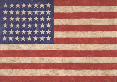
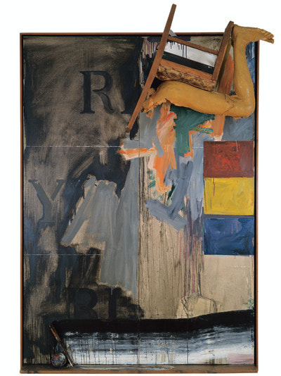
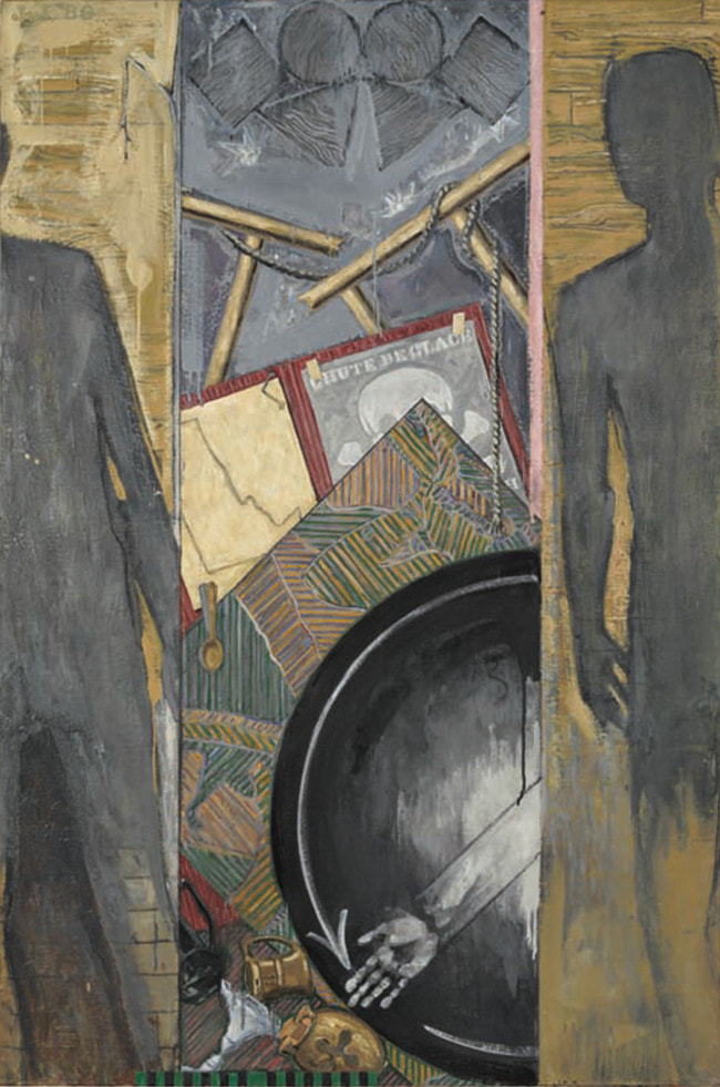
 I had of course heard of Jasper Johns, he of the American flags but as well having it recommended to me by others (mainly Hugh Mendes) and being intrigued I went along at the same time as making it to the Matisse show. Jasper Johns uses encaustic allot which is basically melted coloured wax and produces as you would expect a waxy textured surface which is not something you see too often. That in itself is interesting. The first rooms are a number of American flags and targets. There are themes that occur again and again with Jasper Johns, Flags and Maps of the USA, the three primary colours (red, blue, yellow) and the numbers 0 to 9. With occasional exceptions these themes continue through his entire career. He is still alive, being now in his late 80s and still producing work). 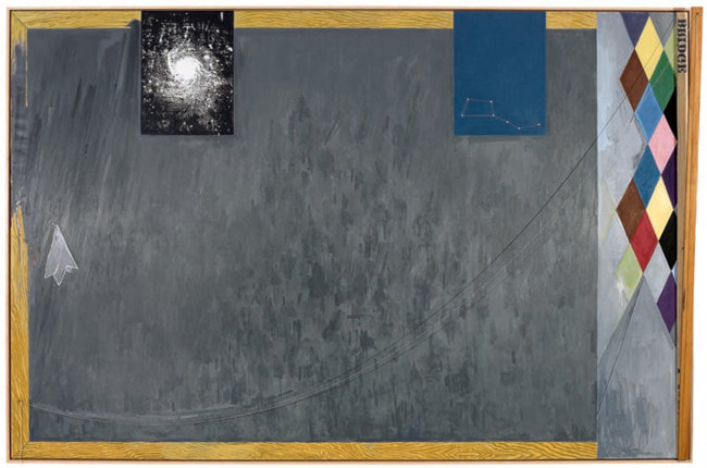 There are other features of his work that I really like. So for example there is a work called No, which uses the shadow of the word “No” dangling on a piece of string against the canvas. He does this a few times and has a habit of sticking things like cutlery to the side of paintings. Another trick is to stick hinged pieces to the side of paintings, so they look like windows, or at least they look like that to me. 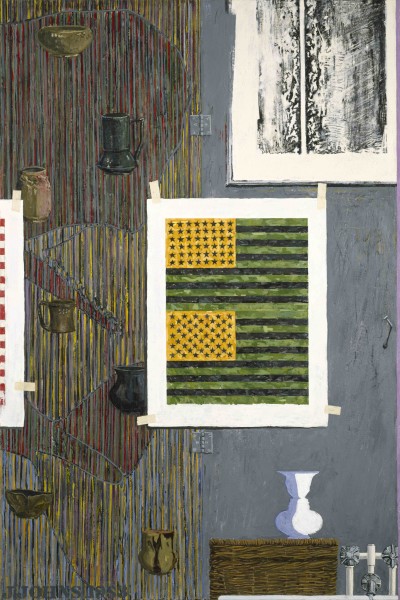 He also can do Tromp Loil well, particularly showing masking taped images within the paintings, incidentally something that this man does very well. Ventriloquist (above) is a good example of this.
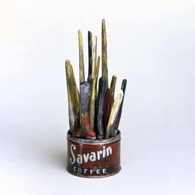
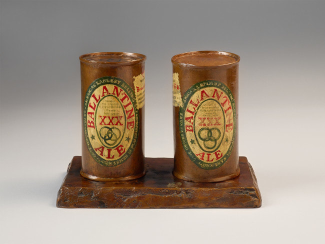
In a much more sensitive version of pop art he does drawings, paintings and bronze sculptures of larger cans and also paint brushes in a Savarin tin. My favourite of these is a black and white graphite sketch of the self same tin.
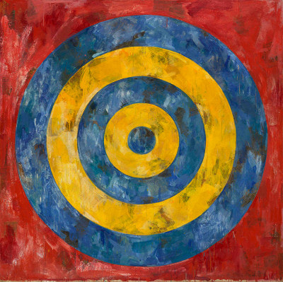
The numbers 0-9 appears in his early works. It appears in paintings and drawings sometimes with the numbers drawn on top of each other. The best of these was a series of bronze castings of the numbers with subtle details imprinted on the bronze, and different bronze colourings. In a similar way he plays with red yellow and blue, the colours and also the words (in their own colours or one of the other primary colours) appearing again and again. There was even a three dimensional version with the words appearing vertically using various different media. The Red for example was in neon and the switch, to turn it on, was incorporated on the left hand of the picture, as part of the piece.
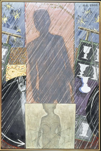
One of the stand out pieces is a series of four works depicting the four seasons but in characteristic Jasper John style with this strange shadow figure and arms pointing as if like a clock. 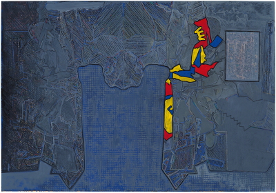 To show that he can still knock ‘em out there are some recent works called Regrets. They are based on a picture of Lucien Freud and there are a series of aquatint prints of differing intensity and contrasts in which the figure leers at you like a weird alien. Opposite this on one wall is a large mainly blue painting showing the same thing in scratchy marks and highlighted around one side in the three primary colours, shapes reminiscent of the US east coast.
I’ve been thinking about that show a lot since I went. I recommend you do to. It is on until 10th December so chances are that by the time you read this, you will have missed it. Also I am supper happy as one of my paintings is up in the Indo bar in Whitechapel as part of a winter group show.
0 Comments
Leave a Reply. |
Archives
June 2024
Categories |
 RSS Feed