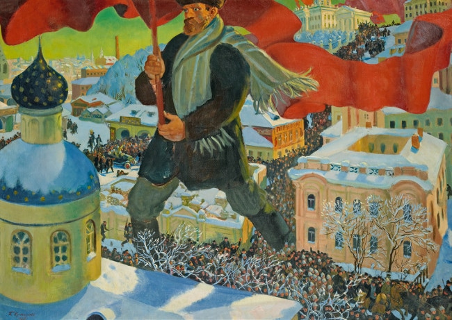
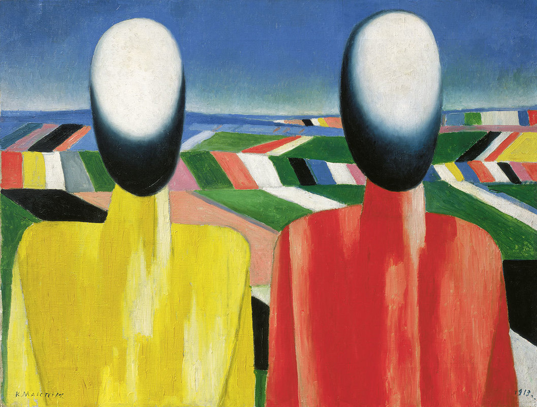
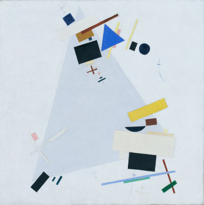
 Is a very large exhibition at the Royal Academy, showing as one would expect Russian art until 1932 (after which presumably the Stalinist purges were so intense everyone was either dead or had emigrated). The show takes up substantially the same space as the summer exhibition so there is a lot to see. You will have to hurry as it closes on 17th but they have added late viewings tonight. It is arranged mainly chronologically but also by theme (such as sport), so you start off with the outset of the revolution, onto the death of Lenin, the rise of Stalin, and there it rests. As always in these shows it is the introduction to new artists and art forms are one of the draws for me to this exhibition. This one did not disappoint in that many people came to my attention. A great deal of them in fact. There were also famous names such as a film by Eisenstein. I shall trot you through the others that caught my eye. One of the pieces that grabbed me early on was called the Labourer by Nathan Altman an abstract piece done in wood, with stripes of mahogany and other strong lines with numbers and Cyrillic letters painted on it. Pleasing heafty shapes, I particularly like the soft blue square. 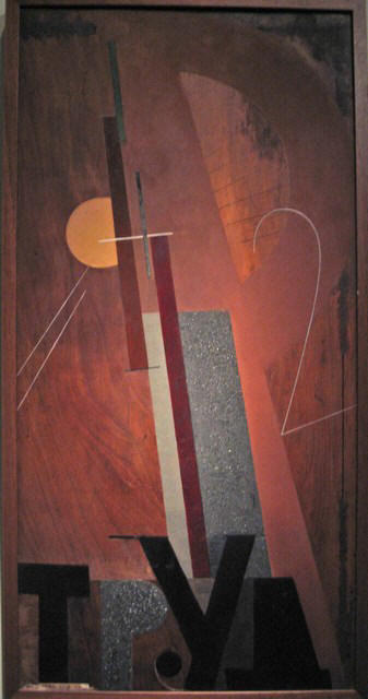 I have an interest in this period of history so could go on for ages about the purges, shock workers, farm collectivisation and particularly the annihilation of the railway workers. This exhibition had this extra interest for me then, so there were a number of pieces that I found historically interesting even if they were not particularly artistically striking (on the five year plan for example). Some of it was also similar to an exhibition of Soviet Illustration that I went to at the House of Illustration last year. Mikhail Matyushin’s Movements in Space is in contrast entirely abstract. One doesn’t associate abstract with the earlier soviets but in fact they were nuts for the stuff. It is a simple piece. It is a series of diagonal lines from lower left to mid right, sitting on top of one another, of graded colour. The colour composition is good. It is a good example about how something that looks simple can be an effective work of art. Alexander Tyshler is a surrealist (or was rather). His rather moody looking piece is called Formal Colour Contrast of Red. The title rather says it all. It has a sort of burnished red background with differently red huge geometric shapes. Better just to show it to you. 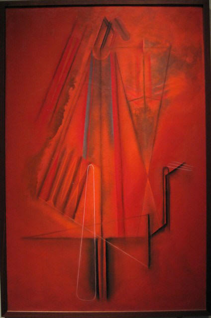 When you are going around an exhibition like this you can tell which artists are the real masters because they stand out from the rest. Roaring out of the background was a Kandinsky, called Troubled, swilring colours on a grey background looking like fighting seagulls. There is another Kandisky, later in the show, equally impressive. 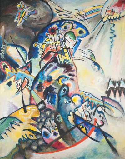 Standing next to Kandinsky, snapping at his heals in terms of quality are two works by Lyubov Popova. It is worth saying that there are quite a few women in this exhibition, still in the minority but a refreshing amount. Is this a choice by the curators or does it reflect the mix of soviet artists of the time? I’m sure I could find out. Anyway, two of Popova’s works stand next to the Kandinsky. My favourite had a beige/brown background covered in triangles and curves of various colours. Like Kandinsky they are never a solid block but graded colour. Pavel Filonov was another welcome discovery with his two works, Formula of Spring (below) and Formula of the Petrograd Soviet. Formula of Spring was one of my favourite works in the show. A sort of pastel shade background with intricate geometric spaces looking a little like a street lay out. The Petrograd Soviet one even more so. 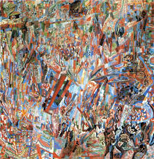 Kuzma Petor Vodkin, the winner of the most Russian name in the exhibition contest features a few time. His is the slightly mad red horse painting (below). Actually I much prefer his still life paintings, which feature later in the exhibition. They are intimate and interesting. He is particularly good a reflective surfaces and things refracted through glass and liquid. So there is often a glass of something with a spoon in it or similar. I really like these. I would like to own one. 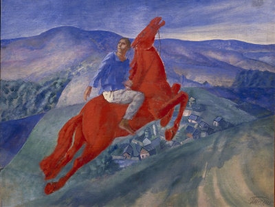 Kazmir Malevich is a name that was sort of in my brain before I entered the exhibition. It certainly rang distant bells and he is the father of the superbly macho named Suprematism movement. He is sort of a more dynamic Mondrian, although he also does figures (below left). I prefer those his more abstract geometric works (below right). Some of his designs and indeed novel designed were rendered into porcelain by a N. Suetin. These were covetous objects to behold.
Actually I thought Malevich was outshone, in this exhibition at least by Ivan Kliun, who had two works on display. I think his works have better composition in terms of colour and geometric placement. The colours also blend a bit more (like Kandinsky) which I think is better. An example is below 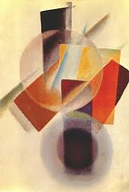 Runner up for the most Russian name in the exhibition is Konstandin Rozhdestvensky for whom if he were alive today, telephone banking would have been a real pain in the arse. Anyway his peasant propaganda piece called Family in a Field was all red and gold, with thick paint and was very pleaing. There are many more such as V Tatlin and of course Chegal (who I don’t like) and a number of others including some whose names I have noted down so badly that all I can decipher is Igor. If you search for Soviet Artists called Igor in an attempt to work out who it is the list is, well quite long. There are other good things about this show. There is a mocked up concept Russian apartment. There are posters and a surprising amount of pottery and porcelain. There are also films. It’s a big show so allow yourself plenty of time, but go before it disappears (which is tomorrow, but it is open late tonight 16th April). I will leave you with a looming portrait of Lenin by Brodsky 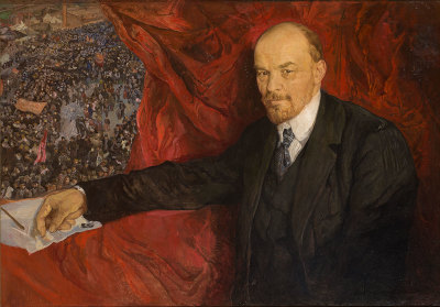
0 Comments
Leave a Reply. |
Archives
June 2024
Categories |
 RSS Feed