|
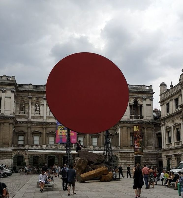
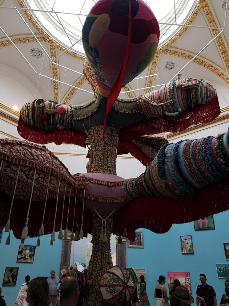
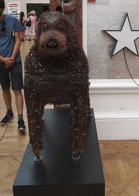
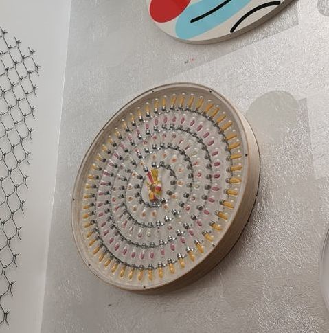
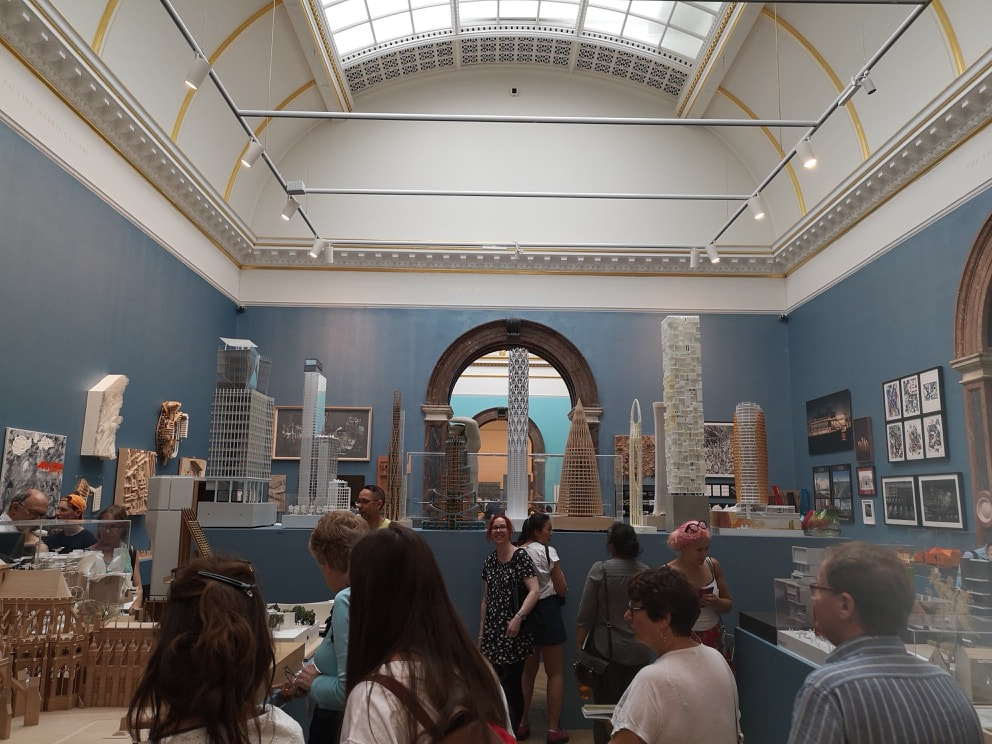
The Summer Exhibition always has something monumental in the courtyard, and this year was no exception with this large red sunlike circle looming over some collapsed column. It is the work of Sir Anish Kapoor and is very him. I like it I have to say like it. I like his work anyway, structural and substantial. Then in the exhibition proper, dangling from the ceiling is this enormous, bulbous, balloon like somehow elephantine structure. It looks very comfortable and the tassels dangle down temptingly. It is called Royal Valkyrie and is by Joana Vasconcelos. I suspect it was commissioned especially for the space, which it occupies like some upholstered deity. Who doesn't like a dog made of nails. Well probably lots of people, but I liked it. Appropriately it is called Gnasher (presumably after the Beano dog that it closely resembles) and is the work of Timothy Blewitt (above). He had two dogs in the show and they had been cleverly placed flanking the entrance to the room, like some weird guardians. This one I much preferred though. It has bags of personality and a savagery. A solid piece of menace. Up on the wall in the same room is the oddly named Karmic Sweetshop by Daniel Hogg (above). Hogg is interesting in that he started art relatively late in life (at 40, he is now 48). As an older entrant into the art world that can be inspiring. This hypnotic clock like piece provokes thought rather than a strong emotional response and it was only after looking at it for a while and vaguely wondering did I realise it was a spiral. It is difficult to take these things in, during the bustle of the show so I suspect it would do better in a sparse minimalist gallery. I said last week that the best room in the show was the architecture room (above). I shall now set about justifying that. One of the things that made it was the way it was laid out, so much credit to the curators. There are items around the walls, and four low tables with models but the tour de force was having a high platform, at about eye level, no which were displayed models of skyscrapers, so you get a feeling of height. There was also an arch in the platform so you sneak underneath, and many children delighted in this feature. Smart, very smart.
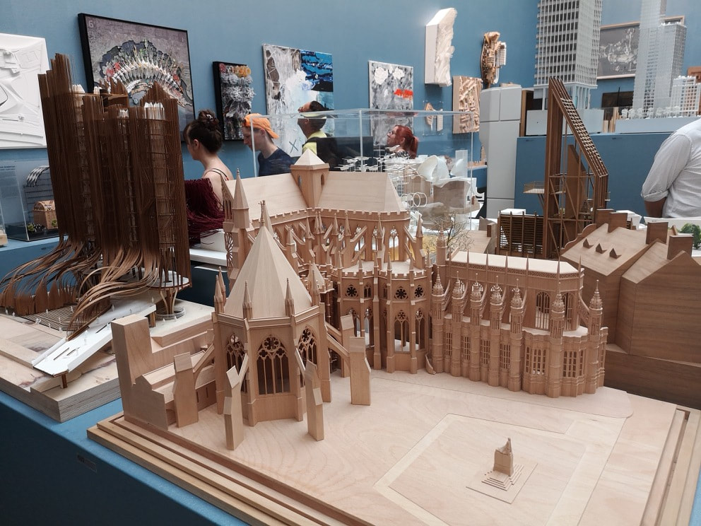
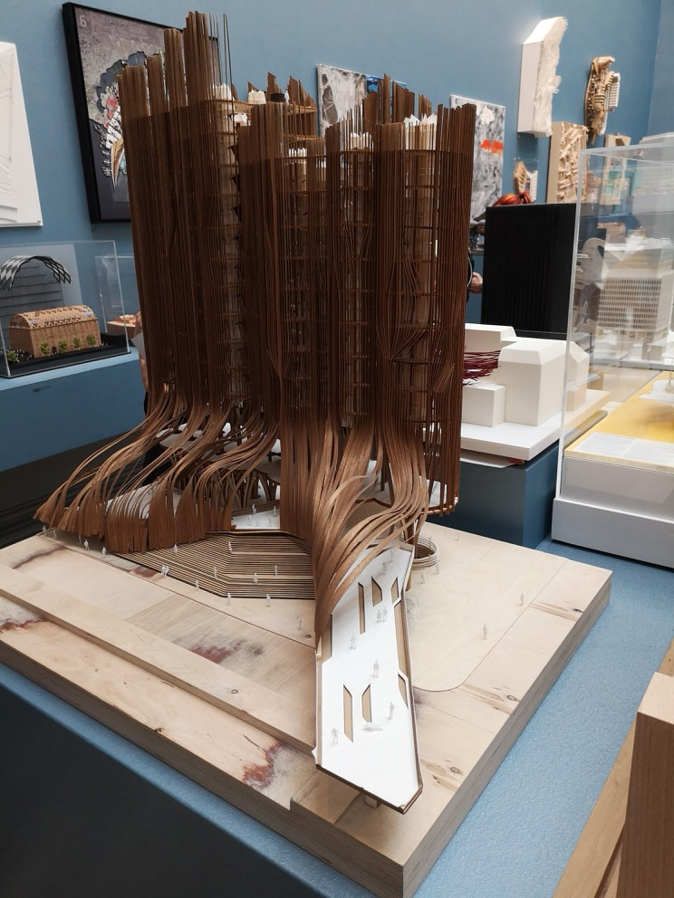
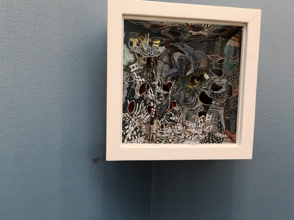
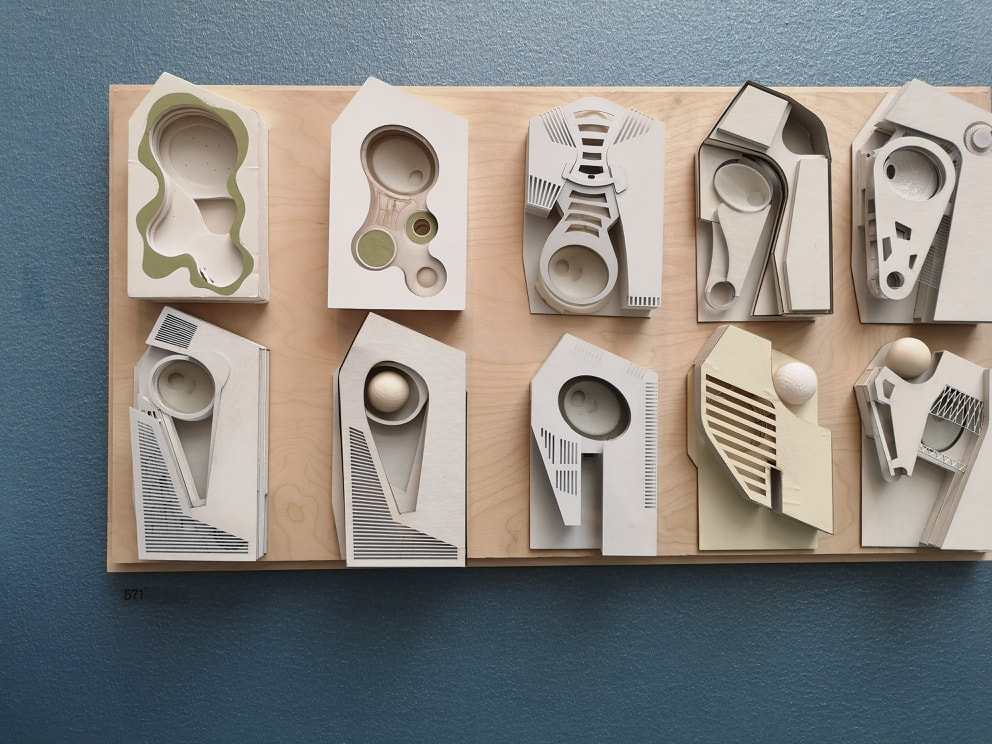
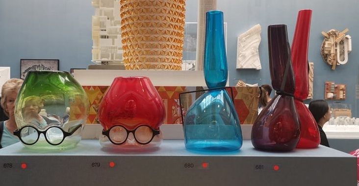
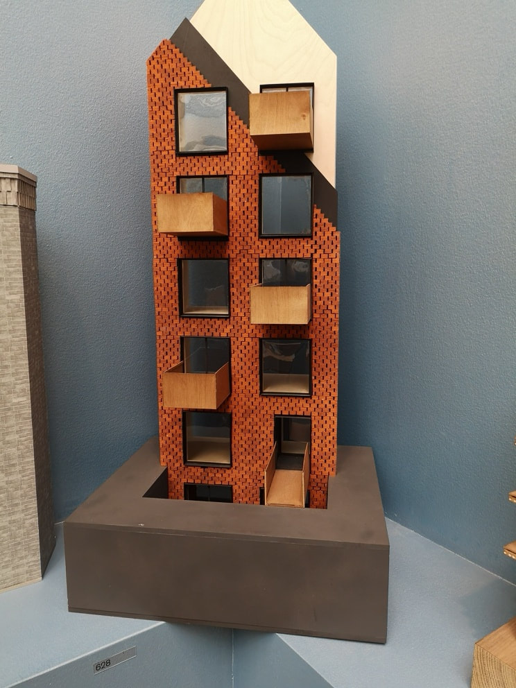
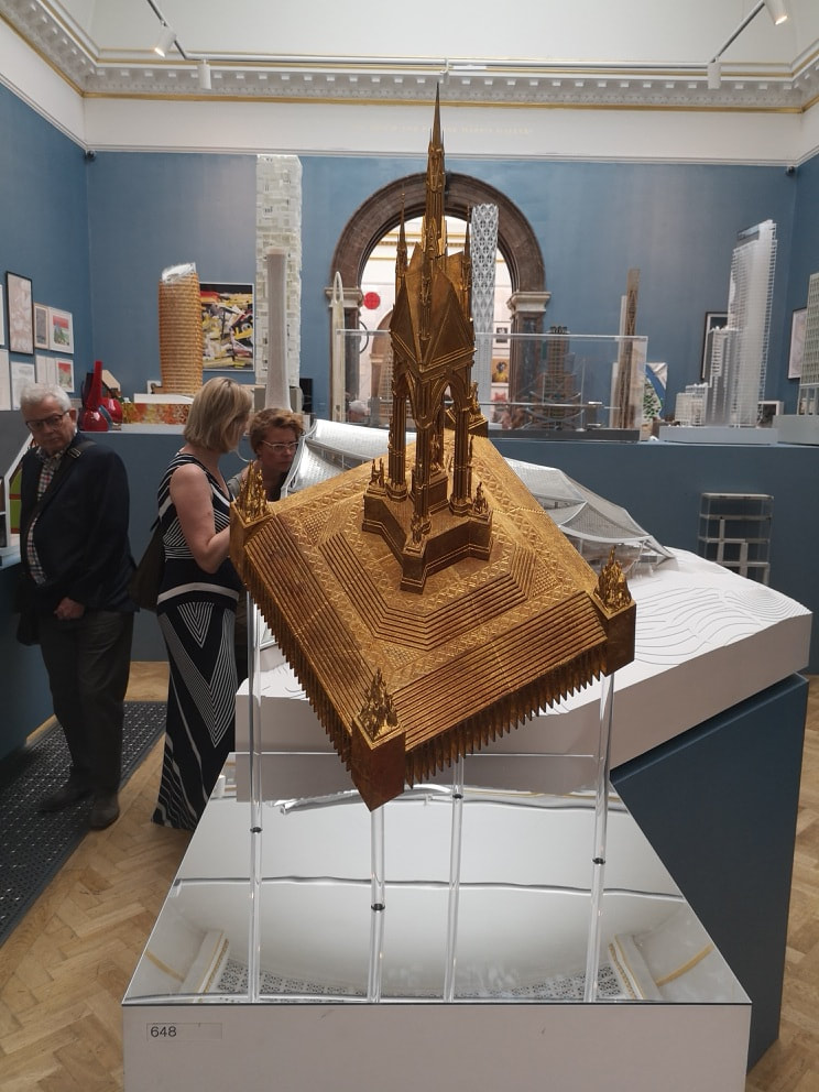
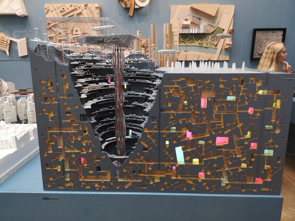
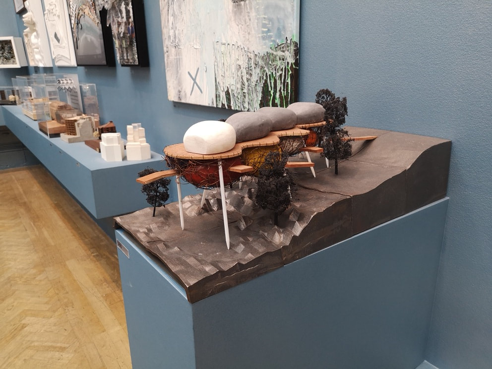
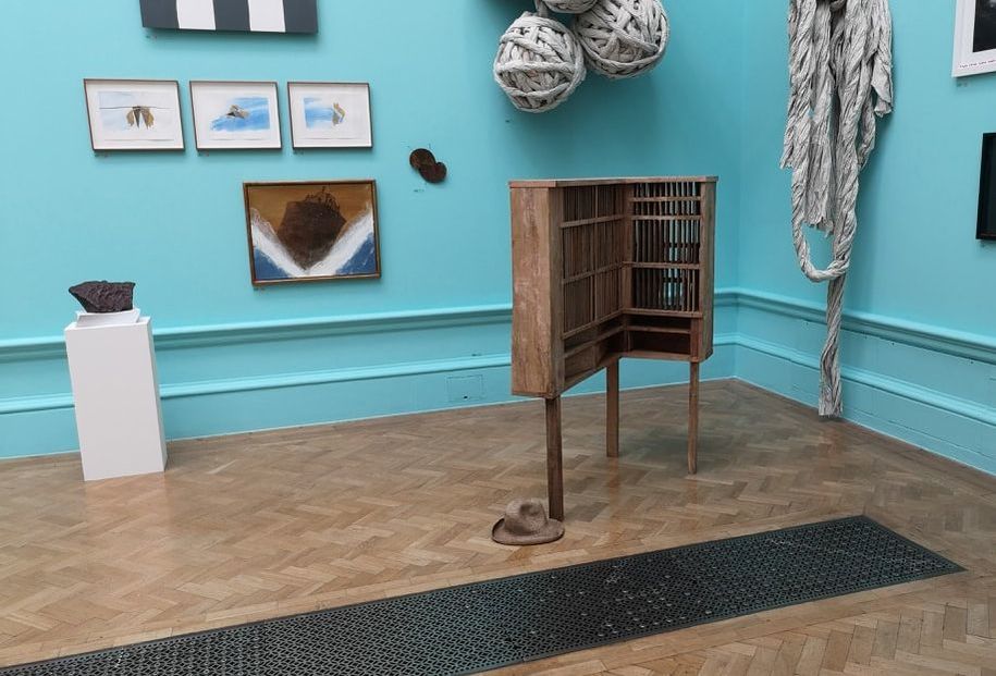
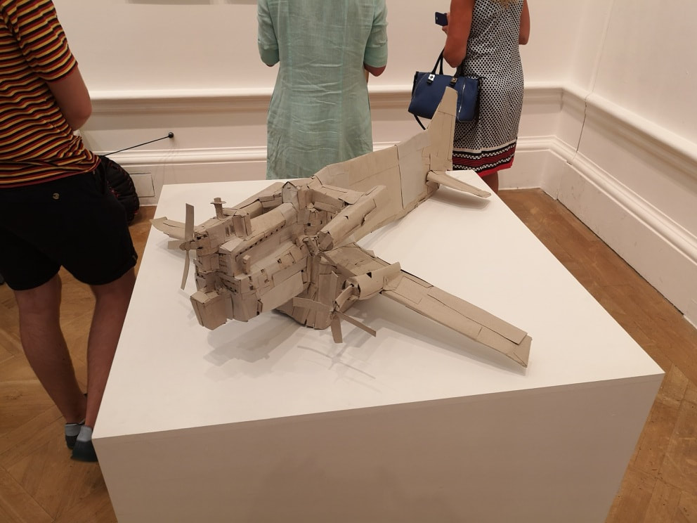
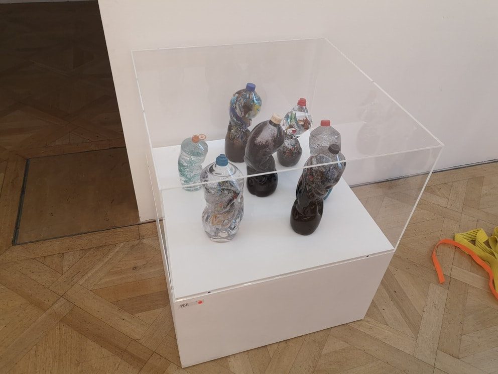
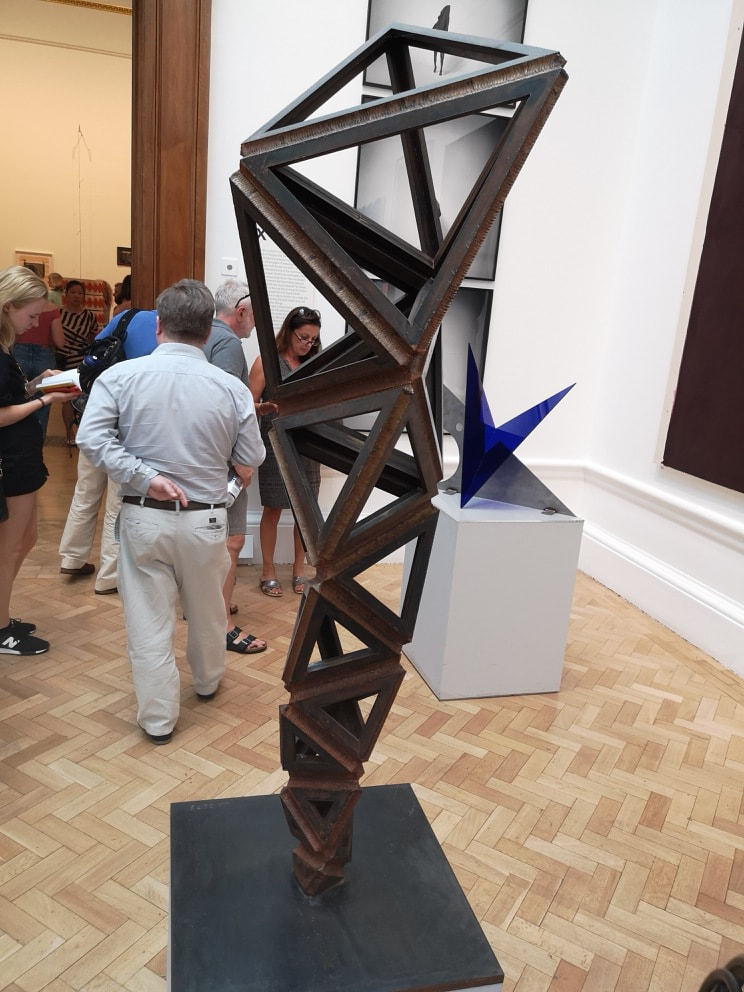
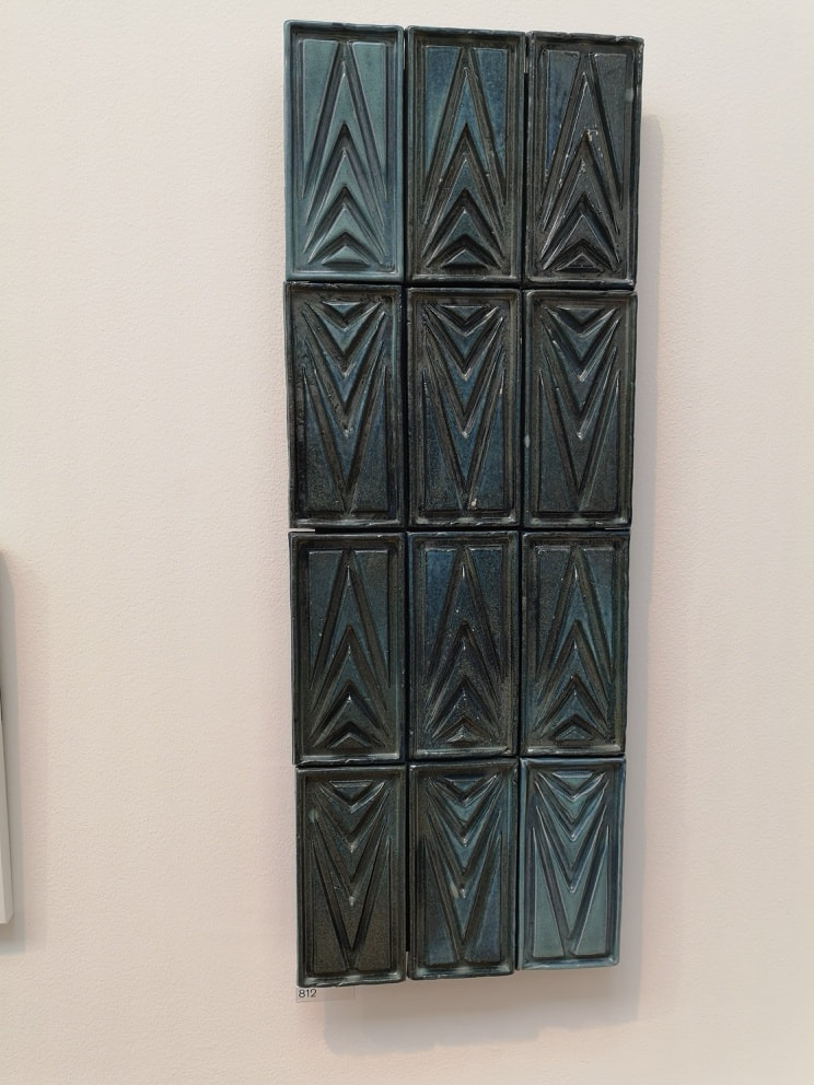
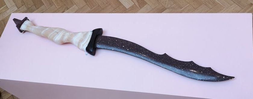
Several of the exhibits in this room wander the line between sculpture and architecture and back again so on the theme of sinuous and organic we have this 3d picture of a sort of landscape by the late William Alsop (above left). Suggestions of buildings and roads intermix with fantastical creatures and landscapes. Next to it we have SIr Nicholas Grimshaw's designs for the Philip and Patricia Frost Museum of Science studies. These all remind me of giant ears. They also remind me of the components of a pin ball machine. You can imagine that ball like structure careering around between them all. and some of them, like the one top right, do look like those flippers. It is one of the thing I like about the architecture room. Although there is often only one persons name on the work, this is the result of collaborative effort. Science, an art and high levels of skill, working to a brief to produce something wonderful. Silliness and humour are for me , greatly to be appreciated in art. The above are all called Where are my Glasses by Ron Arad and was not even slightly surprised to see that they had all sold. Playful, skillful, nice glass objects in themselves, turned with those glasses into an amusing story. I chose the one above left because it is a model of a building that is near where I live, and I like that building. I remember admiring it when it was constructed, particularly the wicker effect balconies that protrude from the front, and the honeycomb brick work. It won an architecture award and rightly so. I was nice to see it in concept form. The staggered stripy roof is particularly effective. It is called Barret's Grove and is the work of Groupwork and Amin Taha. Well done to them. Changing tack rather is this made golden form, which turns out to be a different perspective of the Albert Memorial by DSDHA (snappy name guys, above right). They have done the nice trick of rendering something familiar in a different way, forcing you to look at it again. The original in my view is somewhat ugly, but this looks like some alien sigal. I could see it hanging behind an overly made up actor in an episode of Star Trek. All of these elements are good things by the way. These the are last two from the architecture room before we head off to briefly scamper round the rest of the room. The 19th August is the last day of the Summer Exhibition so chances are you have missed it, but it is worth going, just for this room. Anyway, space, futurism and futuristic buildings have always appealed. Above left is Chthonoplis by Nic Clear. I suspect give the layout and the name it is inspired by ants or termite mounds. It reminds me of the subterranean lab in Black Panther. As an object in itself it is beautiful. Grey and gold is a winding combination and then they are punctured with these slabs of pastel colours, with then the conical cross section on the left taking you into the depths. The one on the right also has a futuristic feel to is, the modular feel of a space habitat. It is however intriguingly the design for a private house call Robin's Wood by William Alsop. I hope it gets built. The next exhibit is presented (above), not so much for the exhibit itself which is all very well and good, but for the hat that lies next to it. The hat was provoking much debate when I arrived in the room. It is a fairly matching colour to the bookcasey thing it lies next to. The question occupying people was, is it part of the exhibit or has it just been dropped there? The question resolved itself when I came back through later on, and the hat had gone. The fact that this occurred at all tells you everything you need to know about the Summer Exhibition. Hans-Jorg Georgi managed to get a badly made lopsided model of a plane (above left) into the show. It is called untitled because it is obvious what it is, but I enjoyed it for the sheer childish joy of the whole thing. it is also worlds away from the stomach-churning seriousness of the next piece (above right) called the Seven Stages of Degradation by Sophie Thomas and Louis Thompson. It is a mixture of found bottles and blown glass. It was the latter that attracted me to it. I am a fan of glass and there was a lot of skill that had gone into those melting and distorted shapes. Conrad Shawcross featured allot last year, and had a large sculpture in the courtyard. I like his use of triangular weathered steal so it was nice to see it again (above left). The way the triangles get bigger to make the sculpture appear larger than it is, is particularly effective. Then tiles, who doesn't like tiles? Only morons. This is called modular Ornament - TIle XI by Joseph Armstrong. The tiles have a good luster to them and I like the increasing triangle design. I shall leave you with what Stephen Cox would present to us as the Sword of St George. A savage serpentine blade, mixture of light and dark is no doubt ominous.
Anyway next week will be the final week on this massive show and will deal with the prints, unless that it I have got bored of writing about it and decide to do something else.
0 Comments
Leave a Reply. |
Archives
June 2024
Categories |
 RSS Feed