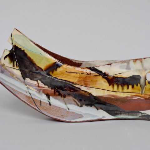
 Over the weekend 22nd - 24th March at Central St Martins in Kings Cross (what I still think of as the new development but has been there at least 6 years now) has been the rather fabulous Ceramic Art London. So of course I went and of course I bought thing. In this blog I have gathered together the people I liked. The photos, where they are any good I got from the Ceramic Art London website. Those that are rubbish I took myself. There were various activities and lectures and if you timed your visit right, which of course I did not, you could observe various kiln firings. If not there is still all the exhibitors to see, of which there were 80. 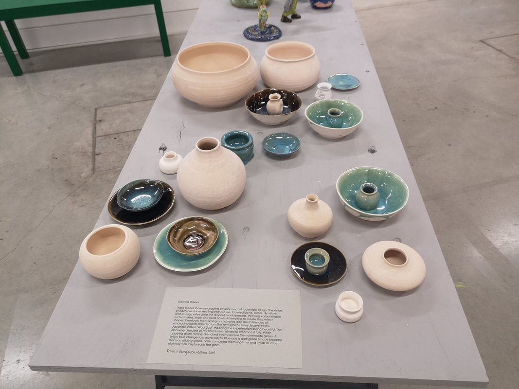 Actually there were slightly more than that because off the main concourse in a side room was what they had charmingly termed "Future Masters". These were students in their final year of the ceramics degree. There were I think about 8 of them but the one I liked the most and was instantly drawn to were by Georgia Davis (above). The pink ones are presumably bisque fired (that means have been fired once, ready for glazing and the final firing). Davis has some nice shapes going on there but it is the lustre on the finished products I really like. There are 2 elements that particularly appeal to me and that is the blue tones in the small bowl sitting on top of the plate on the left, and the turquoise veins on the bowl on the right. Davis might indeed be a future master and it was only a shame that none of her work is for sale. I will try to remember to go the degree show later and the year and maybe they will be then.
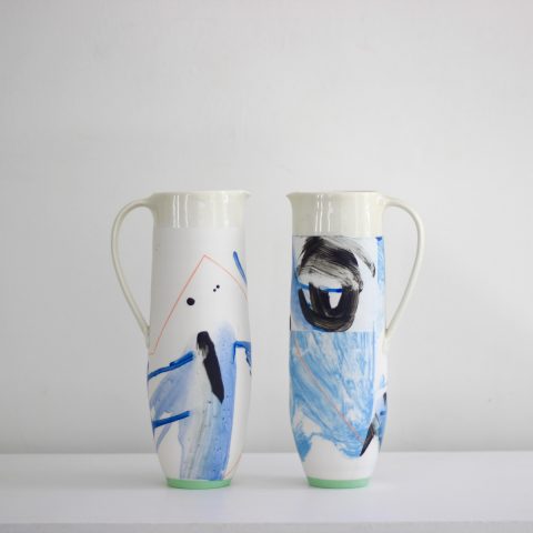
Back to, as it where the main event. There were lots of high quality things on display. Some of it was well done and well executed but not to my taste for various reasons. This is a personal take and so I have included things here that appealed to me or caught my eye for some reason. To begin with we have some long vases that look like legs of Dalmatians who have been let out in the rain before their spots have dried (above left). It is fact the work of Karin Bablok. I like both the dripping black patterning, slightly Rosharc test like and the tapered shape with the squared mouth. Next to this we have the work of Richard Phethean (above right) has a colour scheme that works very well, this combination of black, blue, yellow and pink. It is the pink that works well, sitting there as a back ground on which the other colours sit. I also like the curling ends to the teapot, a feature that occurs on other pieces as well.
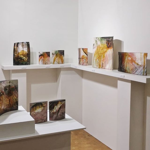
One of the stars of the show was Kristy Macrae (above left and right). Her work is sculpture, paintings on ceramics, rather than functional objects but they are glorious. I was very drawn to them but she was having a good show and my favourite pieces (the large one at the back on the left, and the one nearest one on the right), had already been sold. The stripes and streaks of black, yellow, pink on a background of white and grey. The more successful ones suggest figurative elements, flowers and trees, that kind of thing. I shall keep an eye on Macrae.
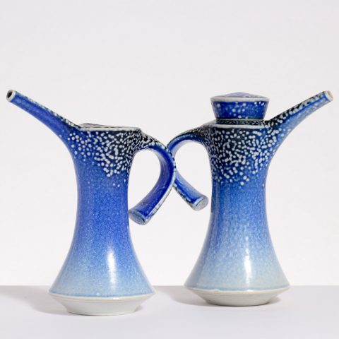
Another stand out for me and who made my nearly bought list is the augustly titled Richard St John Heeley (above left). Indeed he might have made a sale if his stand wasn't abandoned for such a long period. It has a Japanese feeling. The ones that most appeal to me are of the type you can see in the picture. These subtle blue shades on white. The darker blues really hit. Adam Frew (above right) makes slim jugs with soft blue scrubbing on the surface. The light green base sets it off well and the geometric lines particularly the red right angle on the left.
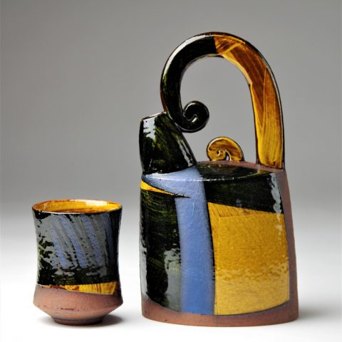
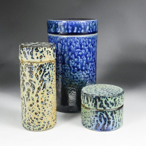
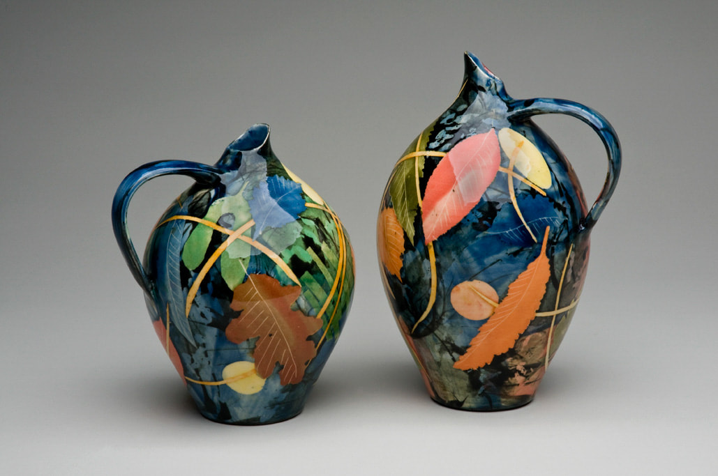
Peter Beard (above left) produces very finely wrought, beautiful quite delicate pieces, with this bubbled patterned surfaces. They are very nice but expensive. He has these fluted vases which were among my favourite. Another start, and in fact someone who made my buy list is Daniel Boyle (above right). The patternation is produced by a salt glaze apparently. The containers that you see here are very nice and tactile and there was a piece of stacked containers that appealed to me greatly. Deep blue really works for me. I went away with a lovely mug. 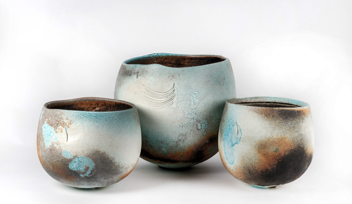 Jack Doherty's (above) work is like washed stone, or burnished if you will. The combinations of black and orange that orbits the bottom of two of the pots set up the piece well. The variation of the surfaces make each piece individual as does the scratches indentation, those feathery marks in the middle piece for example, and the bumps and lumps make them stand out.
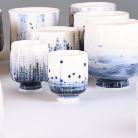
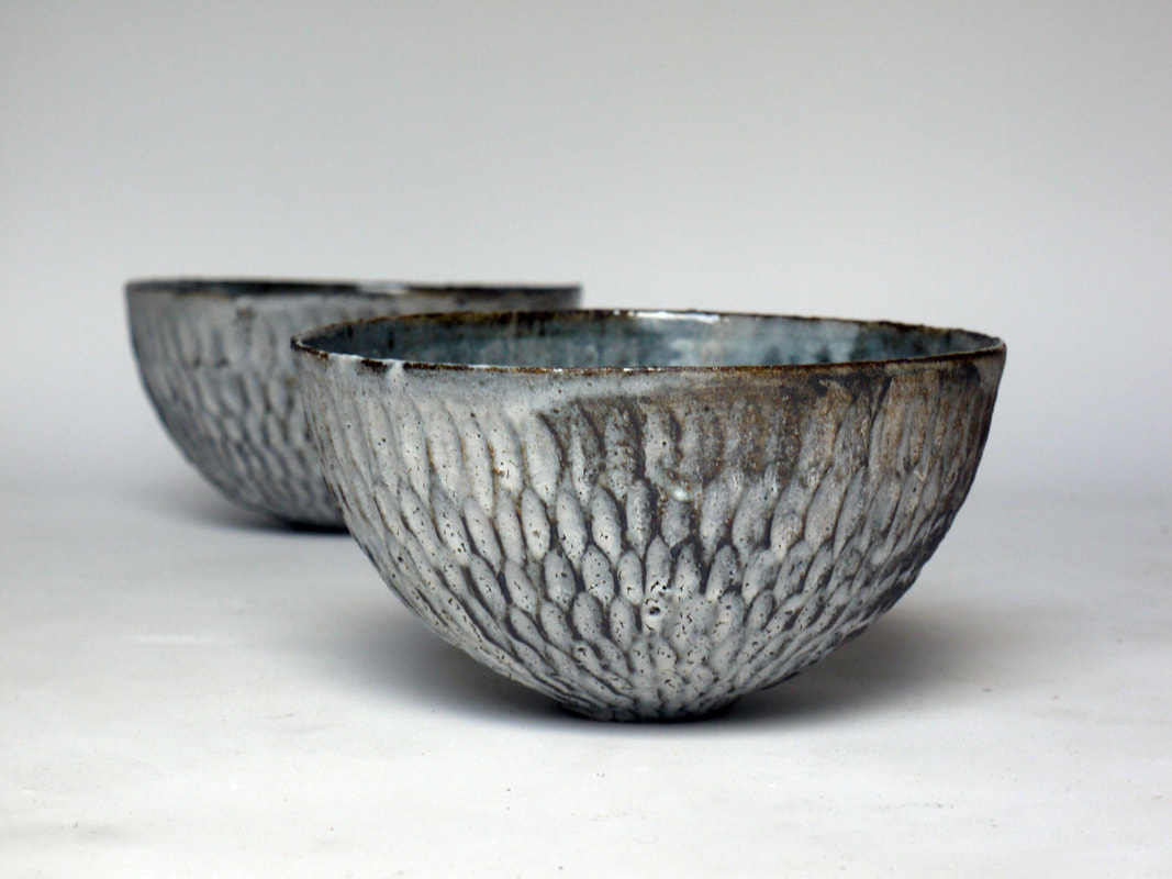
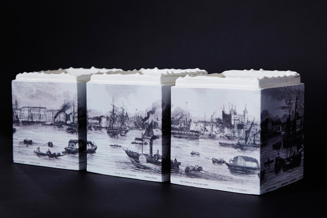
Akiko Hirai was the one of only two people in the show that I had seen before. Indeed I have a small beautifully turquoise blue interior (that I brought from her at a studio sale), which is what is inside the bowls that are picture here (above left). I do have a preference for abstract decoration on my pottery but every so often figurative works do catch my eye. One example of this is the work of Raewyn Harrison (above right). I like the way they work as set and the square serrated tops. An oldy timey scene of ships in a busy port (is it London) fits the general ascetic. Reminds me of Turner.
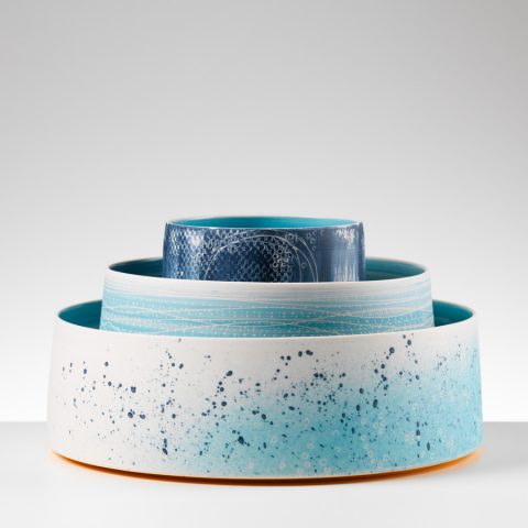
Nested! A smart way to display your wares, particularly if they match or grade in colour i the way Juliet MacLeod does (above right). There is more detail to each one than you might expect, you can just about make out the hatching on the centre piece in the photo. If you want to really spoil your dog maybe get them a large one to sup out of. Of course you really do want to get a set and they certainly benefit from the cheerleader effect. Rhian Malin produces mainly vases, both cylindrical and more bulbous like the ones depicted above right. It is these bulbous ones that I prefer particulars where you have the contrast between the blue caps and white body. It is also very clever how the line colour change your perception of the whole piece, so for example the ones with the red lines have a very different feel and look to the blue ones. I like also the way the lines take you round the piece.
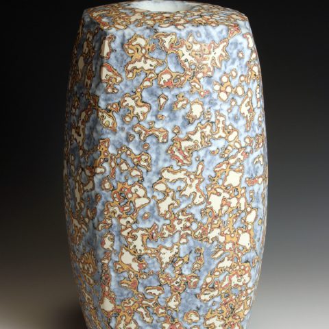
More substantial and earthy and scored with claw like slashes is the work of Matthew Blakely (above left). Firm and solid, with drip like decorations and smudges that are reminiscent of paleolithic hand prints. The vases feel like they have been unearthed from an ancient archaeological site. Another stand out artists for me is Martin Mindermann (above right), and made my almost bought list, and indeed might have gone further if the budget hadn't been spent elsewhere. They have a luminescent quality, often gold flecked, or with gold plated interiors. My favourite of these are like the one depicted above have an undersea feeling, like waving seaweeds. Very nice. Maybe at some point in the future.
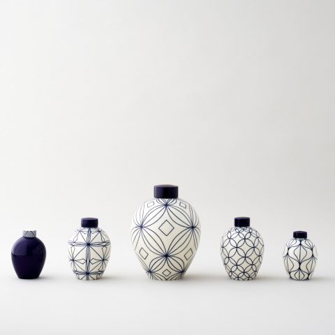
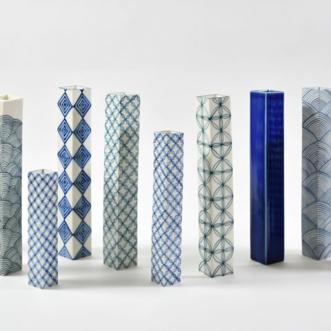
Blues in this segment. Starting with the small square vases by Miju Kurihara (above left, although not all blue). They are simple almost stark object and where they are decorated with repeating geometric shapes. An example where simplicity works well, and again they work well in a set. Arabic styled are the sweeping curved crescented blue pieces. Sometimes they can be a bit spikey but I prefer the more curved elements, even if they are quite sharply curved. The rising darkening blue emphasises the shapes of the pieces.
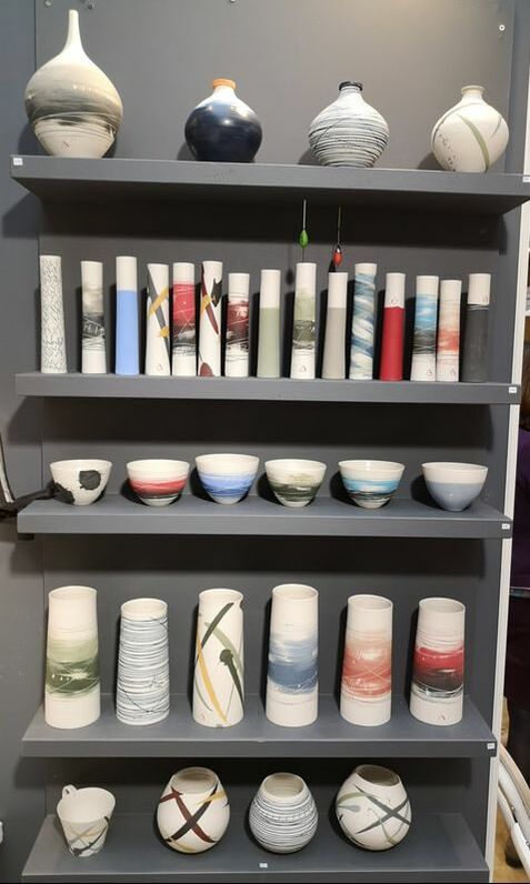
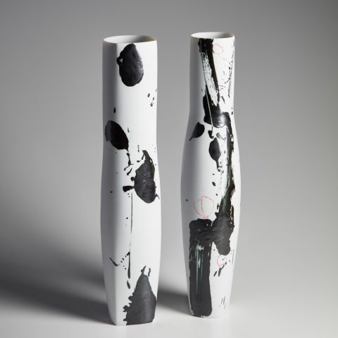
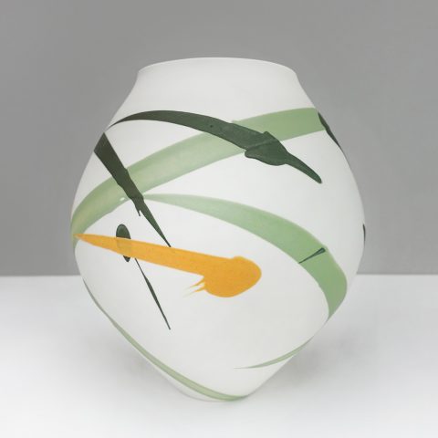
I knew when I walked by Alison Thomson's stand (top of the blog and above right). Simple, plain shape, decorated either with blurred edged fields of colours or simple brush strokes of colour across the pieces. They look better I think against the grey background in which she displayed them. After strolling around the fair I returned, and after much erring and an interesting discussion with the lady herself, I came away with three small slim vases (below), which are my favourite of her works. I also as you can see got myself a small Daniel Boyle cup. 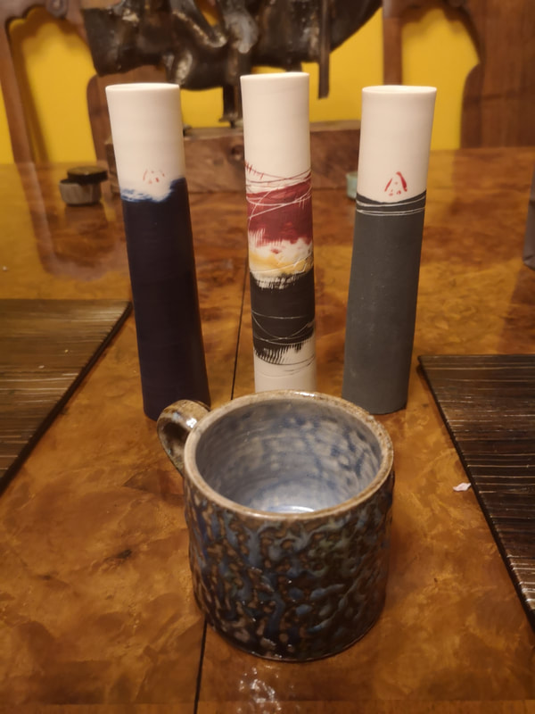 I shall leave it there. There were many fine people there who I haven't mentioned. In the event that you are reading this on 24th and still have time then I recommend going along. There are other events going on as I mentioned. Also if you are interested in seeing a chubby middle-aged white man and his art come and see my show ‘Upstream and Downstream’ The Old Fire Station Gallery, Henley-on-Thames, 52 Market Pl, Henley-on-Thames RG9 2AG 9.30am to 6pm: Daily from Thursday 18th to Tuesday 23rd April 2019- 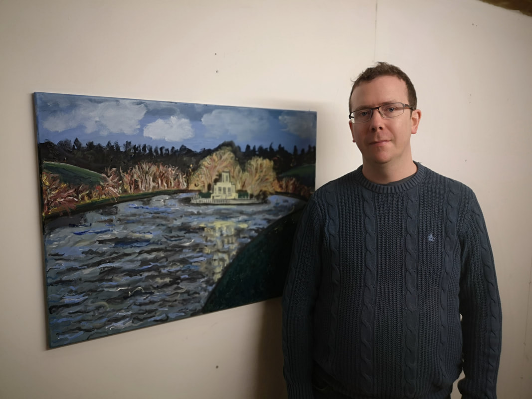
0 Comments
Leave a Reply. |
Archives
June 2024
Categories |
 RSS Feed