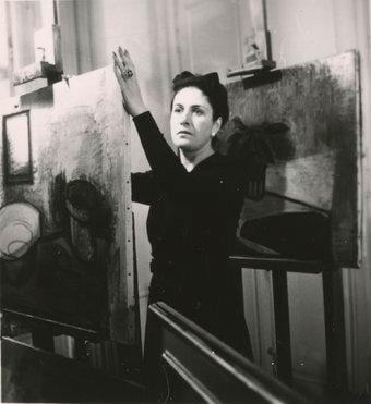
 Dora Maar, a name I only heard last year, but who it turns out has a face that I have seen in a number of different forms, has a show of her work at the Tate Modern. She was annoyingly talented both as a photographer (for which she is arguably more famous) and as an artist. In addition to this, you will have seen her head mangled in various ways countless times as she was a repeated muse (and lover) of Picasso. Several of those paintings are in the show, as are her paintings of him.
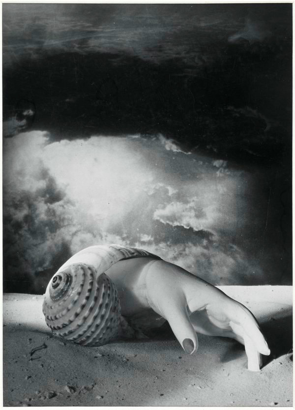
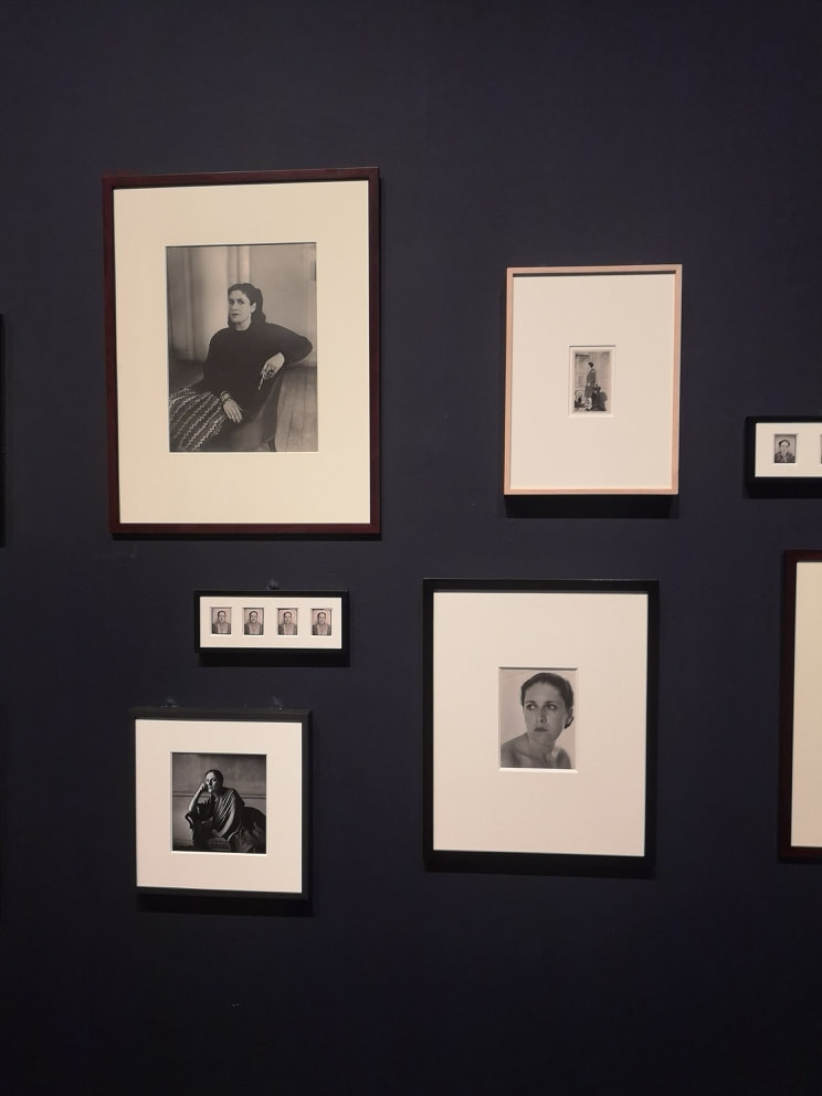
She did both fashion, portrait and art photography. The last of these was the most engaging and she produced a number of striking images, like the hand reaching out of the shell (above left) with the two-toned ominous sky. There were some others that really appealed to me: a knight on a chessboard with an equestrian statue in the background and one of her face doubly reflected as though viewed through broken glass. She photographed herself a number of times and there was a fine wall showing these in various different sizes. She had a strong face.
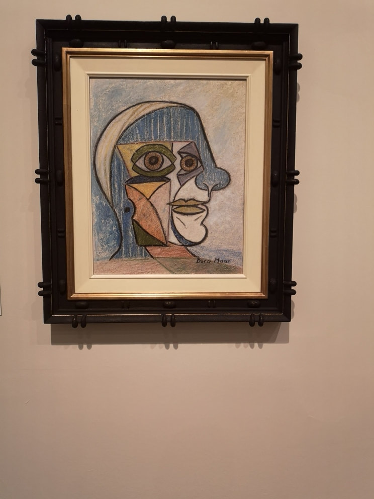
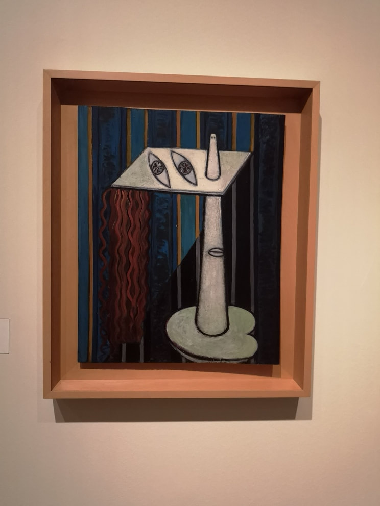
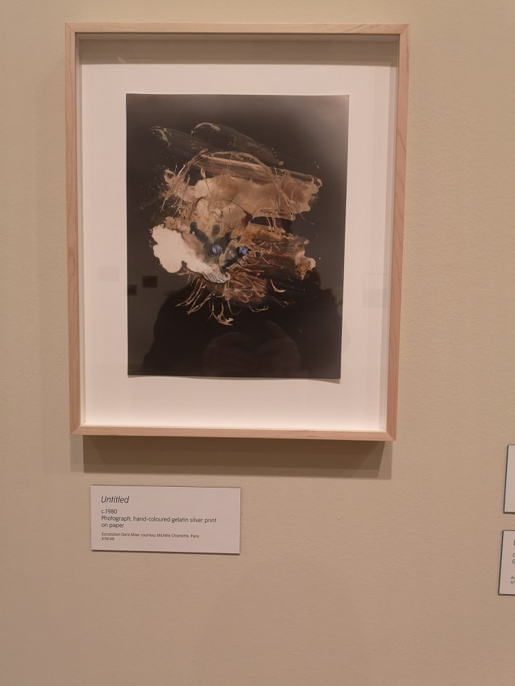
The photographs are good, and if you are a fan of photography then I highly recommend them. However, for me her drawings and paintings are much more interesting. She turned the table on her erstwhile paramour rendering him in much the way he rendered her, dissected and disjointed (above left). He looks like a camp clown. I like the box on the left cheek like some invading coffee cup. One painting really struck me (above right). It is, I assume, a portrait of a woman. I like the straight lines of alternating blue and gold that descend into the shadow of the strange face/platform. I also like the way the cone contrasts with the wavy hair. I found this fairly captivating and spent some time in front of it.
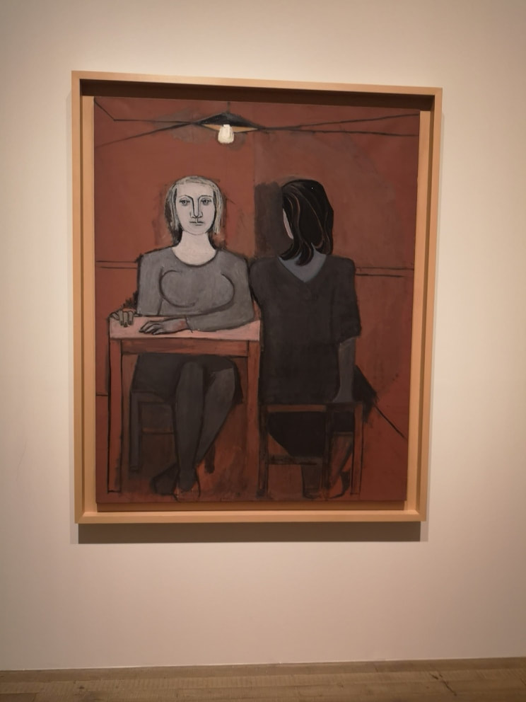
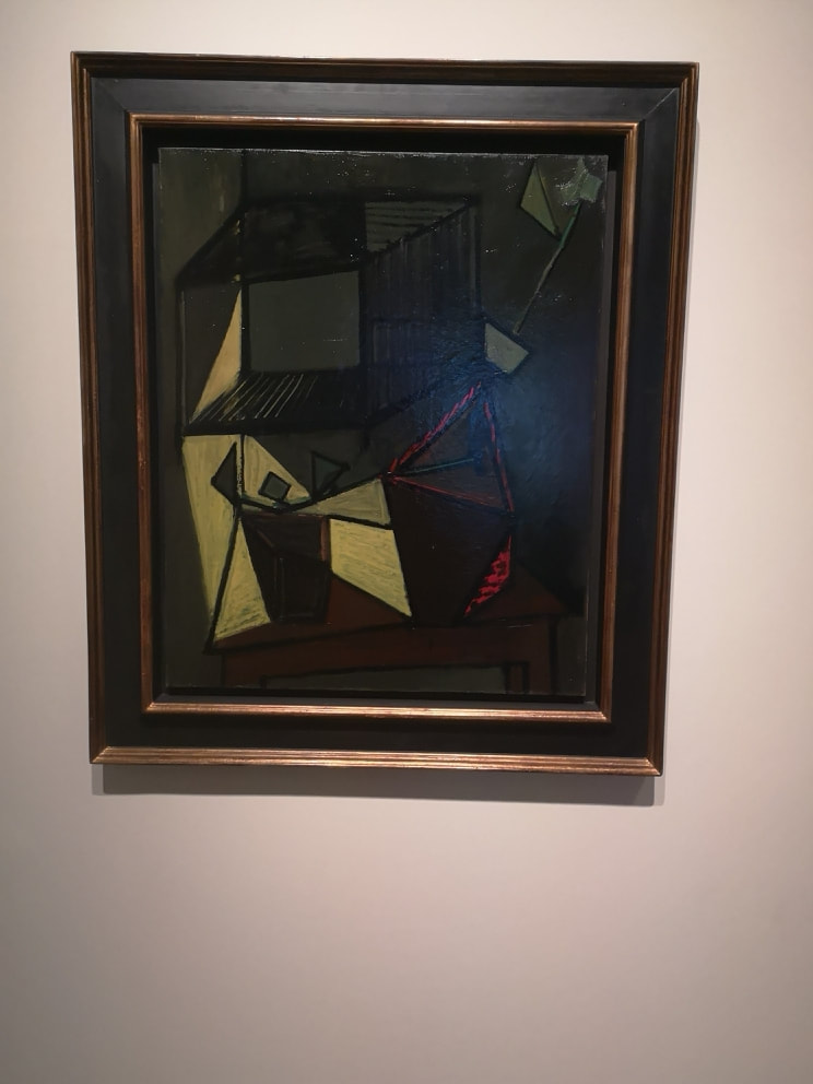
The exhibition then shows Maar's journey from the cubist and abstract (above right) to a more realist and social, observing style (above left), shown excellently by this striking double portrait of two women. I like the two-tone red. It can be very effective having an almost constant backdrop colour. Of course, it is in fact not all one colour. The red bisects along the middle changing tones from dark to light. It is a scheme I have seen a number of people deploy and I may give it a try. This painting is also deceptively simple, but it is a piece of gentle contrasts.
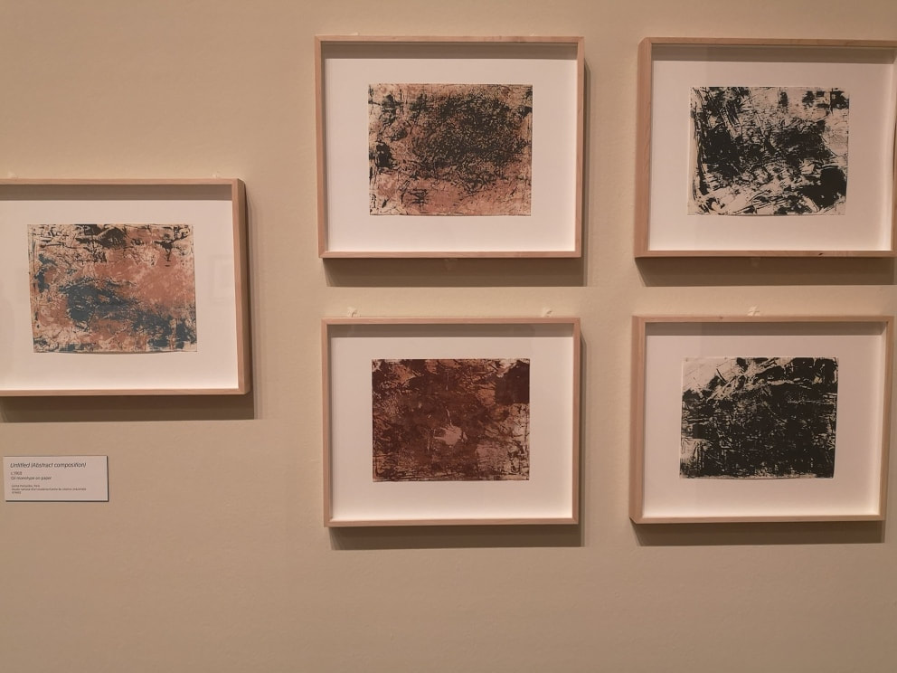
There are a number of paintings like this, some more figurative, some more abstract. Some of them work very well, some of them are not very interesting, but some of them have a very dynamic quality that makes them interesting. 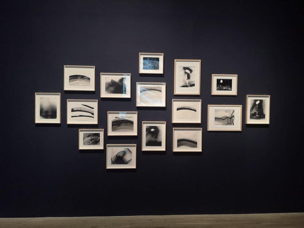 In the final room there was a large rectangular screen on which was projected, changing every few seconds, large and mainly monochromatic abstract pieces. They are quite effective displayed in this way, but facing them was this display above. Again, it is a combination of simple-seeming ink paintings and very yonic photographs. Messages are hidden within the blurs. I have been wittteringly pretensious , but this particular display very much appealed to me. I have always been drawn to Korean/Japanese and Chinese ink paintings, and some of these had the same aesthetic. It was also a very good move mounting them on a black wall.
This post has probably obscured more than it has revealed, but Maar's body of work is a very interesting one and is worth seeing.
0 Comments
Leave a Reply. |
Archives
June 2024
Categories |
 RSS Feed