|
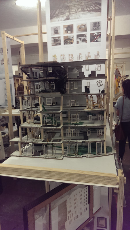
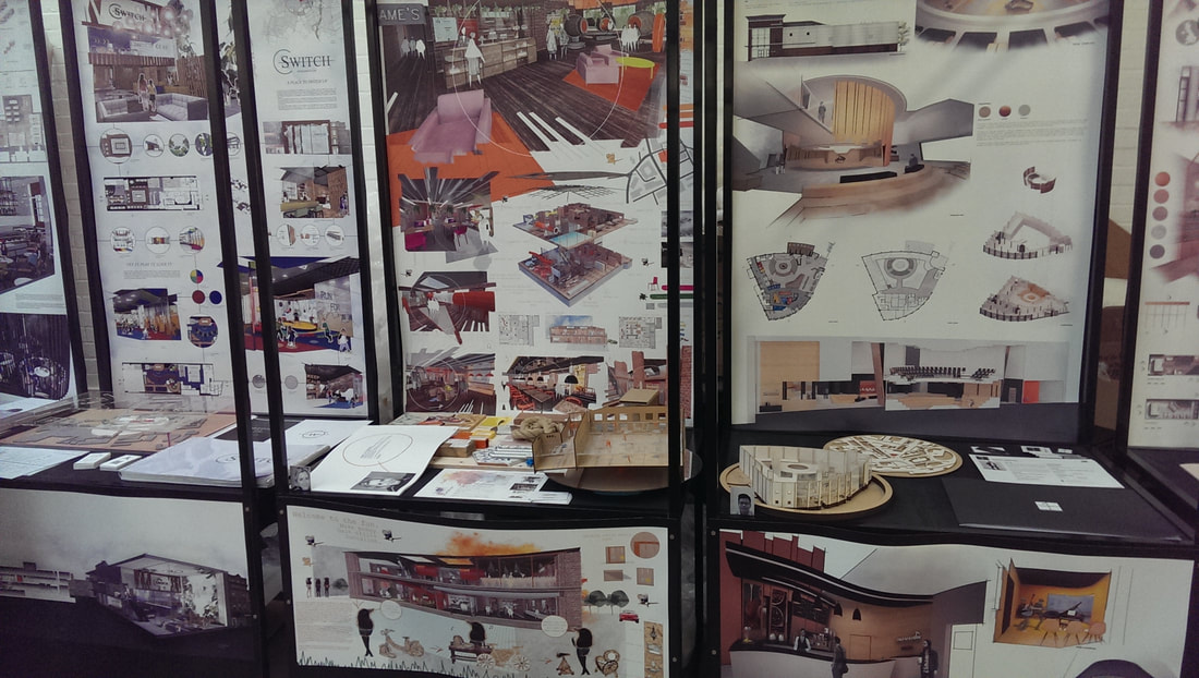
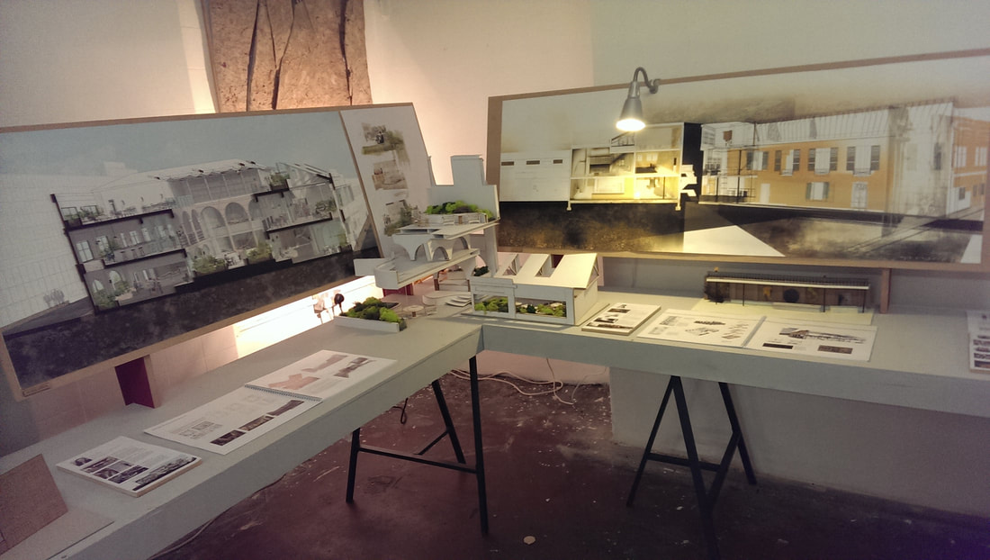
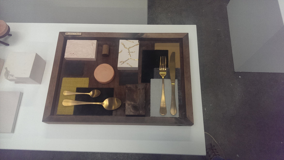
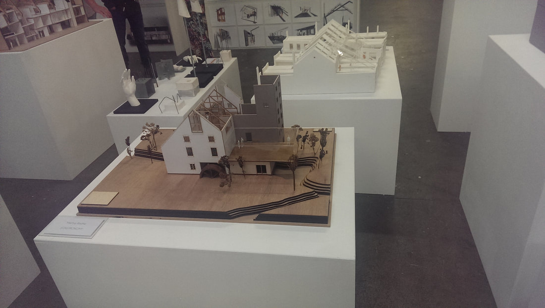
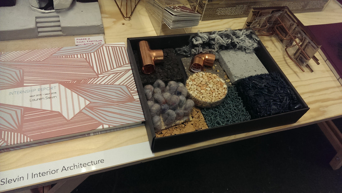
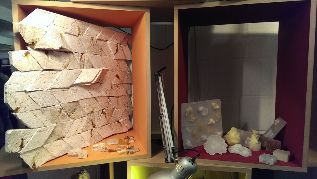
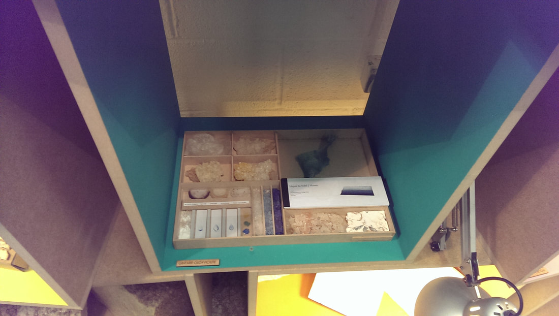
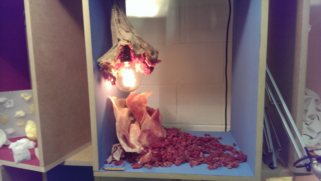
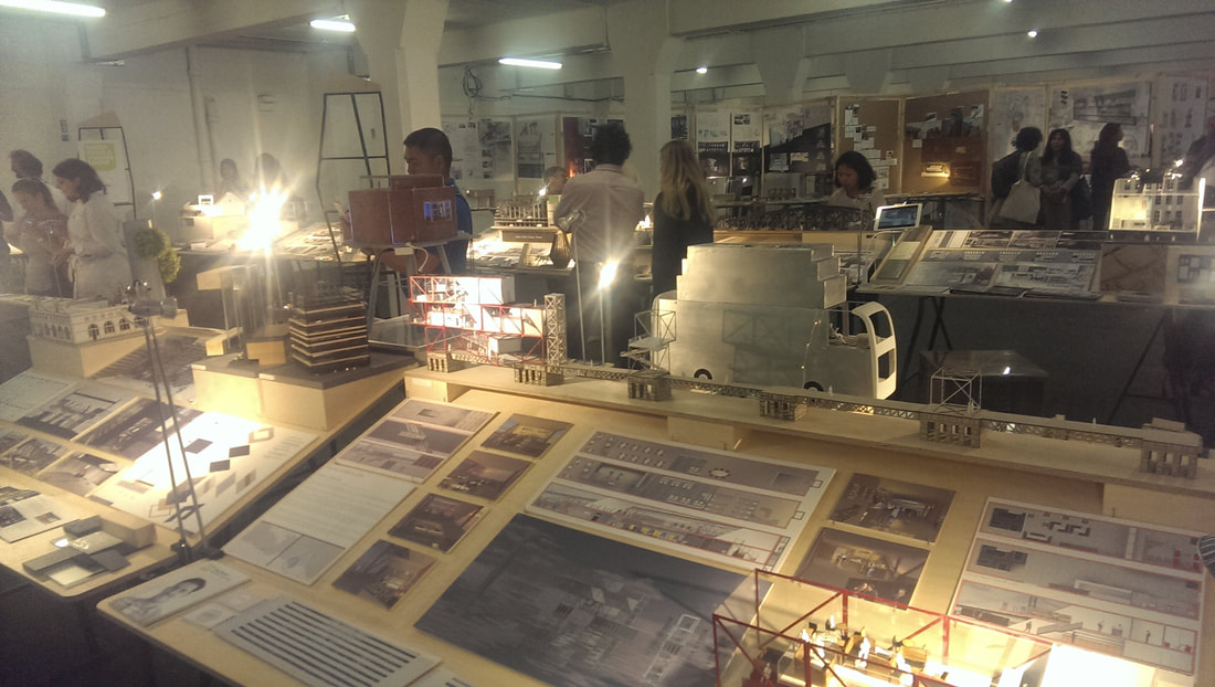
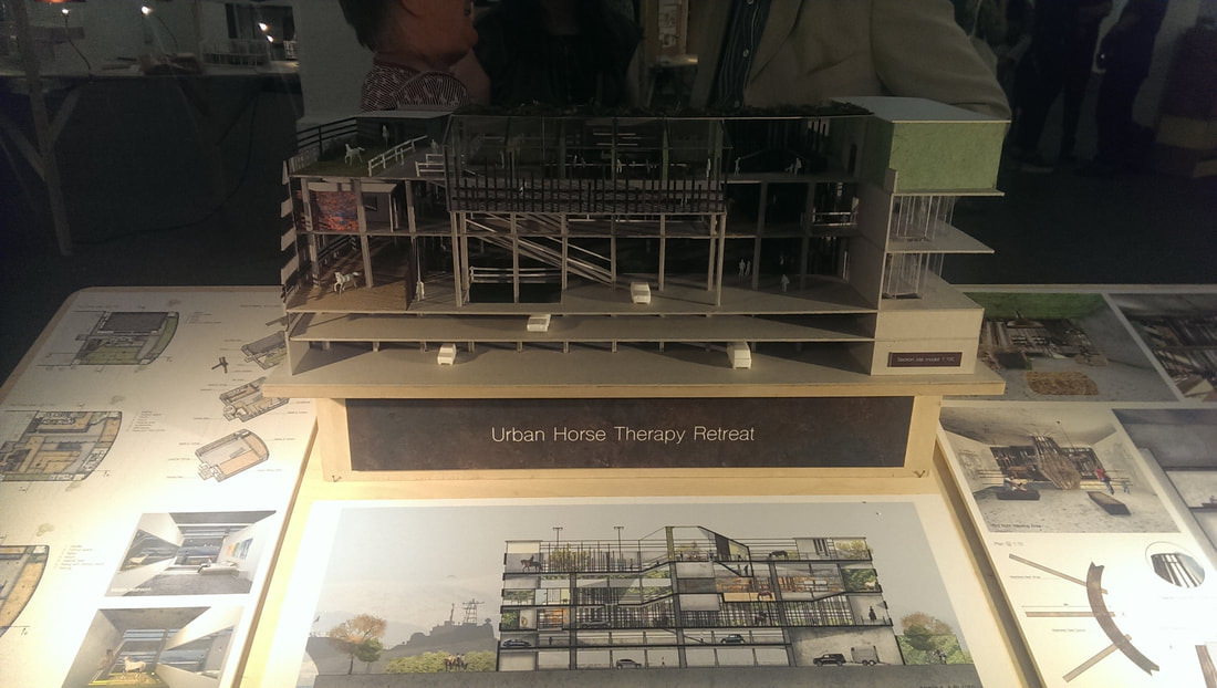
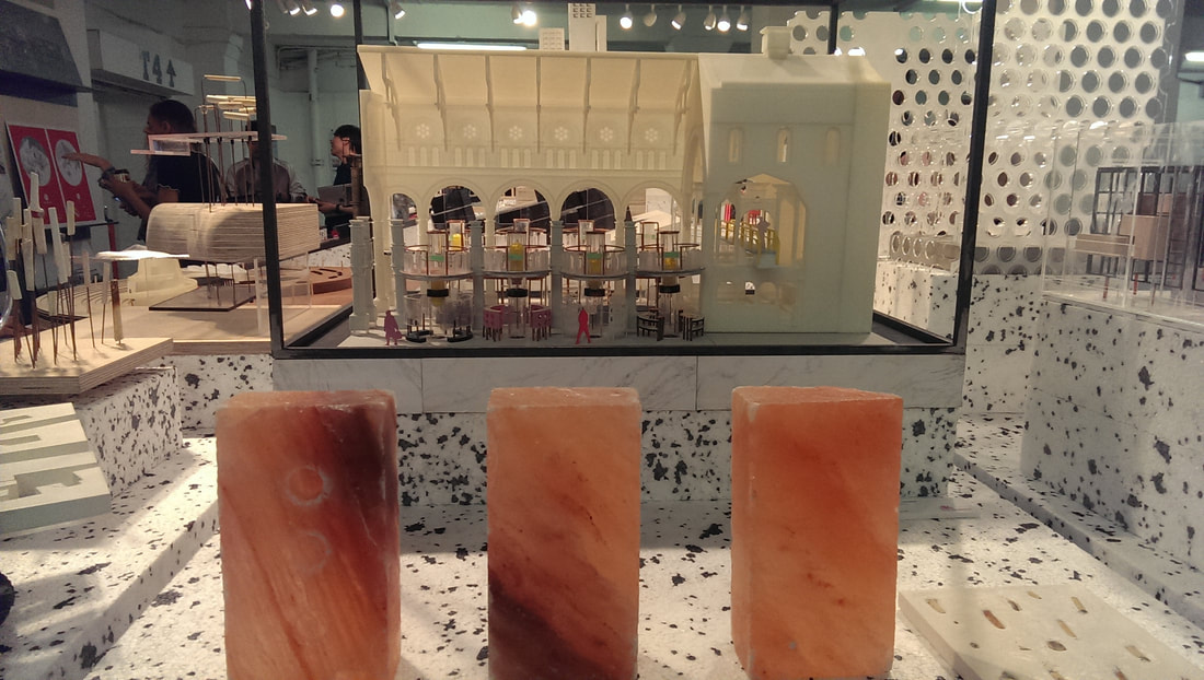
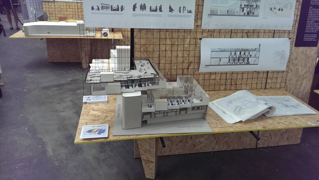
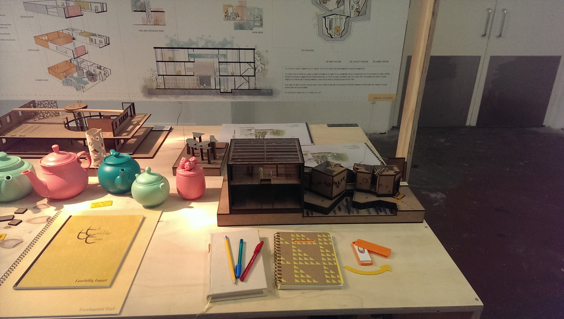
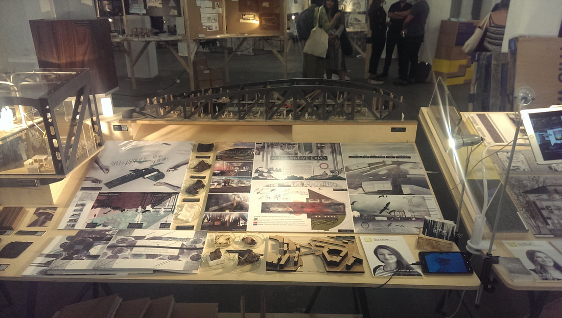
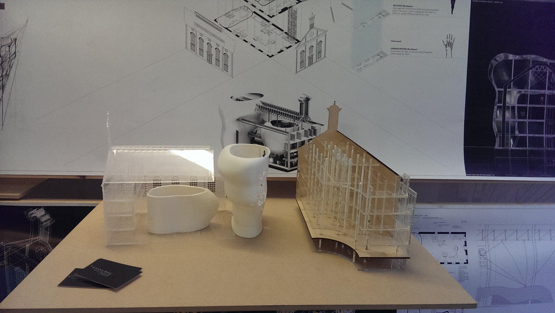
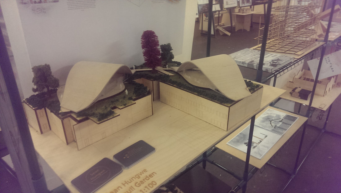
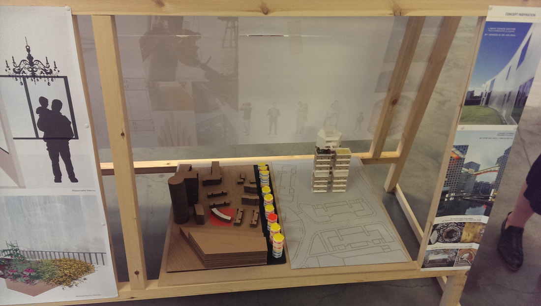
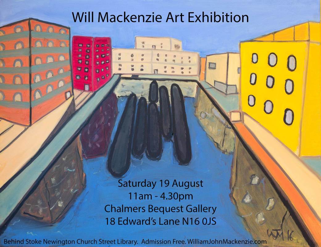
If you want to show the lie to the common modern myth that the millennial generation are feckless and lack focus then pop down to Free Range at the Truman Brewery on Brick Lane. You don’t have long as the last day is 17th July so chances are you are reading this blog after it has finished. I didn’t know about this show, I stumbled on it by chance as I was wandering down Brick lane, saw an advert saying free exhibition so in I went. What they are showing, and have been for the last few weeks, is an enormous graduate show from various universities. There are a number of them there and they send their best students to show at this fair. This week, the last week is the turn of the architecture student. It is an enormous show, occupying all of the gallery space in the Truman Brewery. It is a little overwhelming when you first arrive met with as you are by a myriad of stands and, at least when I went, hordes of people wandering around. I confess, I don’t have much interest in architecture. I’m not sure I can tell what is good architecture and what is bad so I was more drawn to those stands that appealed to my artistic sensibility which is basically, imaginative, colourful and funny. There are basically five elements to each stand. The model, the concept drawings, the plan drawings, the materials tray and then a load of words setting out how they had approached the whole thing, the philosophy etc. I didn’t read the words. Interestingly, or interesting to me at any rate, the exhibitors were predominately women. The materials tray was something I hadn’t encountered before and I found them quite intriguing. Some people had put a real effort into making them a work of art in themselves. One exhibitor whose name I have mislaid had instead of putting in gold, had put in gold cutlery to her artfully arranged board and it really draws you into her stand. Good work Others had deliberately set out to arrange interesting boards. There was some sensationally detailed models, ranging from the ecologically inspired pieces with curvey lines, to the starkly industrial. As well as the frankly bizarre (but very funny) Each university had their own patch and one of the element that interested me was how they made it a cohesive display UAL (below left) had done well with their polkadot foam thing but the best one was by Nottingham Trent University (below right, sorry for the poor photo). Top of the class, at least I thought was Sanna Ali with The Teatotaler’s Tavern (below). This works on many levels because it is a tearooms you see. Extra points therefore for having a pun in the title. The model and the design was good but what was truly excellent and my appalling photograph entirely fails to capture was her stall, brightly coloured engaging, and with teapots with teabags in them which you could take away and a brilliant same saying “Please take one, and only one :-)” . I had a brief chat with Sanna and she was entirely baffled as to why I found her sign so amusing, but gave some interesting insights into her design. Sara Kliczka who managed to eclipse the hilarious (but rather good) Horse Sanctuary (See above) with what I thought was a lovely but simple bridge design. I like the rising structure. Look at all that detail (below) Cansu Bal (below) had designed this laboratory complex and I really like the organic brain like structures framed by a more formal building. I also think it works really well having the model in front of some of the drawings. Sean Hungwe produced this flowing arching structures as a garden pavilion. I like the lines (and have to say the trees below). Finally the excellently name Chantelle Flunt who was the only one that I saw attempting the tower block. It looks actually good but also functional. I really like the way she has shown both one standing alone and in situ. All very interesting and has given me some ideas that I think will difuse into my painting. Speaking of which, I have a show on 19th August
0 Comments
Leave a Reply. |
Archives
June 2024
Categories |
 RSS Feed