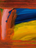
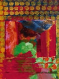
Until 18th June the National Portrait Gallery is showing a retrospective of Howard Hodgkin’s work. The man himself was involved in putting the show together but sadly died shortly after it opened. It is though, a fitting eulogy. I had heard the name before, new a couple of his pieces but beyond that I went in pretty cold. The work takes you chronologically right up to the last picture he ever painted. There is quite allot to see and like all National Portrait Gallery Exhibitions it is reasonably priced. I went in and decided only to make a note of those pieces I liked. I ended up making quite a lot of notes. In the first room there were these delicate pencil sketches. It shows the man can drawn in the classical sense well. Pretty soon though you are into abstract work. Some of them can be a bit hard to take. For example there is Girl in a Bed which is covered in these tiny coloured dots which is literally difficult to look at and provokes an almost migraineous response. Even backing a way and looking at it from a distance causes problems. But enough of the criticisms let me tell you about the work I like. I am a big fan of humour in art and there is a great deal of humour in Hodgkin’s paintings. He seems, at least it so it seems to me, to have a great affection for his subjects. This is demonstrated nicely in a painting that greatly appealed to me call the Tilsons. Hodgkin has this technique he uses a lot which is loose brush strokes setting out abstract features and the covered with and slightly obscured by dots of colour, that you have to almost look through. The Tilsons has some of these elements. They are a couple (obviously) the male figure who was apparently a surgeon, is the most beguiling with a joyful, perhaps malevolent look. The whole think made to pop by arcs of red and yellow. The portrait of Rhonda Cohen had a similar look but much more muted. In a similar vein and Mr and Mrs EJP which has the characteristic dots. It also has a very effective creation of a sense of depth in that the wall on the right hand side of the painting seems to stand proud of everything else. When I first saw it I thought it was perhaps a piece of painted board stuck onto the main picture and had to get close to see that it was not. The effect was achieved both by the use of shadow and change of colour, but also by a change in colour of the little dots that cover the painting. Next to this was a picture called Talking about Art which had bold geometric colours and sitting opposite it a picture called portrait of Mr and Mrs Burkley which has a striking strip of turquoise across the top third of the painting. As these are called portrait you find yourself looking at them as your brain struggles to identify the figures, or what could be the figures. In some paintings it is easier than others. I could see how some people would find this level of obscurity or abstraction off putting. I did not. An example if you like of the formal abstraction is the portrait of Nicholas Munro which with its intersection geometric shapes of circles and squares reminded me of Picasso or Miro. The white background to it really made the colours pop. Incidentally as many of these are large pictures they reward viewing from a distance, as well as close up, although if you step across the easy to miss wooden line on the floor an attended comes up and gently asks you to back off. Two of my favourites are on the wall next to this, and are next to each other. My preferred of the two is called simply RBK. Instead of the dots this one has green lines, or slats covering over the painting which you have to peer through, giving the impression of looking through shutters into the room beyond. Behind it is an orange floor, a blue chair and a red heart shape. The one to its left is Mr and Mrs P Caufield. This has two strong central L shape marks with two peeking figures, which despite being abstract are still somehow gendered, by playing on cultural accepted shapes and coloured. She is turquoise. This is one of the few paintings where they are so. Sometimes, as with the picture R Denny and K Digy there is a very good sense of an internal space. One of the things I got from this exhibition is how paintings can be used to reflect and also to inspire mood. Rothko does this too, rather overwhelmingly for many people. Hodgkin certainly in his later works does this to, a little more subtly. My absolute favourite painting the exhibition, which I kept coming back to does this. It is called simply Interior with figures. It is done in mainly red and pinks with the characteristic spots in green and blue. It is recognisably an interior with recognisable objects in it and a sort of smoky effect on the middle background. It is very sensual and sexual and there is a suggestion that the abstract figure in it is naked. It conveys all these things very well and I liked it very much. The smoky background plays an important part here suggested the post coital fag or perhaps merely a relaxed intimacy. Next to it and somewhat different is the First Portrait of N MciNery. This is very different. An actual balaclavared figure looms out in red and purple. Hodgkin has a habit of using active frames. What I mean by this is the paint extends from the canvas over the frame and the frame becomes part of the picture. This is such an example (many of his works have it) and it can be very effective. The figure is more recognisably one from a distance and the balaclava coalesces into a sort of empty screaming face. Good but you wouldn’t want it in your home. Amongst all this bright oil paint. Which is a fair assault on the visual senses and can be a little overwhelming and a bit much after a while, press on though you will adjust through this, is a singular Self Portrait. It is figurative but interestingly is done using makeup, the first and only time I have ever seen this. Later in his career he becomes more gestural and fluid such as in the piece Chez Stanos which has an enormous blue curve and the characteristic spots, like large blue thumb prints, or Double Portrait which shouts at you with so much orange. All of them using an active frame. He has this technique of using overlapping and underlapping colours so you can’t quite tell what is painted on top of what which gives a complexity to it all. 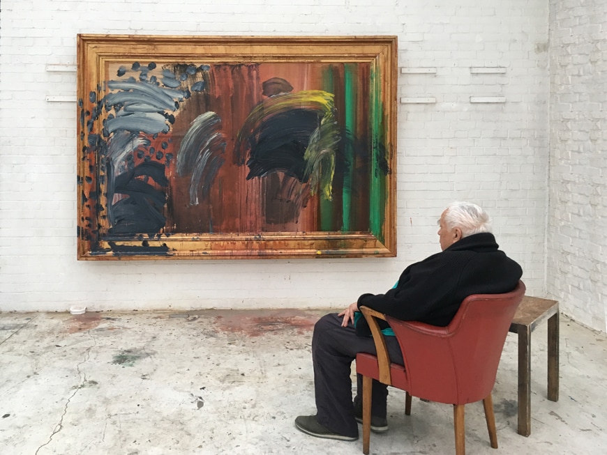 In the last room is the last painting the man made, called Portrait of a man listening to music. It is a self portrait with sweeping arcing paint conveying a figure in wheel chair (above).
It is on the whole though a happy exhibition. Going round in different directions caused me, as always to spot different things. It is also an exhibition that rewards spending time with it. It takes a while to get used to his visual language and then, when you do, you either actually see more or think you do. Either way the effect is the same. It is on until 18th June 2017.
0 Comments
Leave a Reply. |
Archives
June 2024
Categories |
 RSS Feed