|
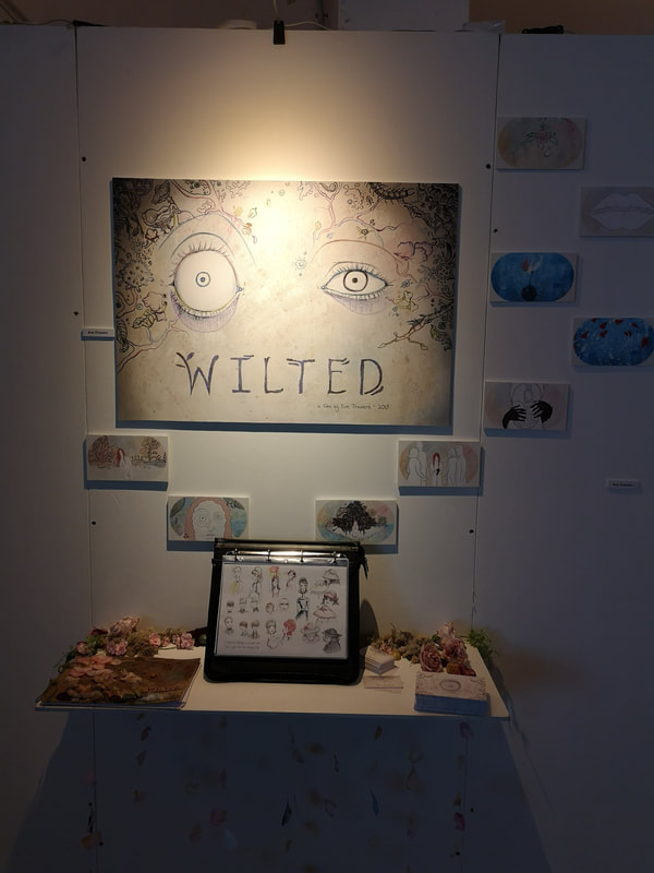
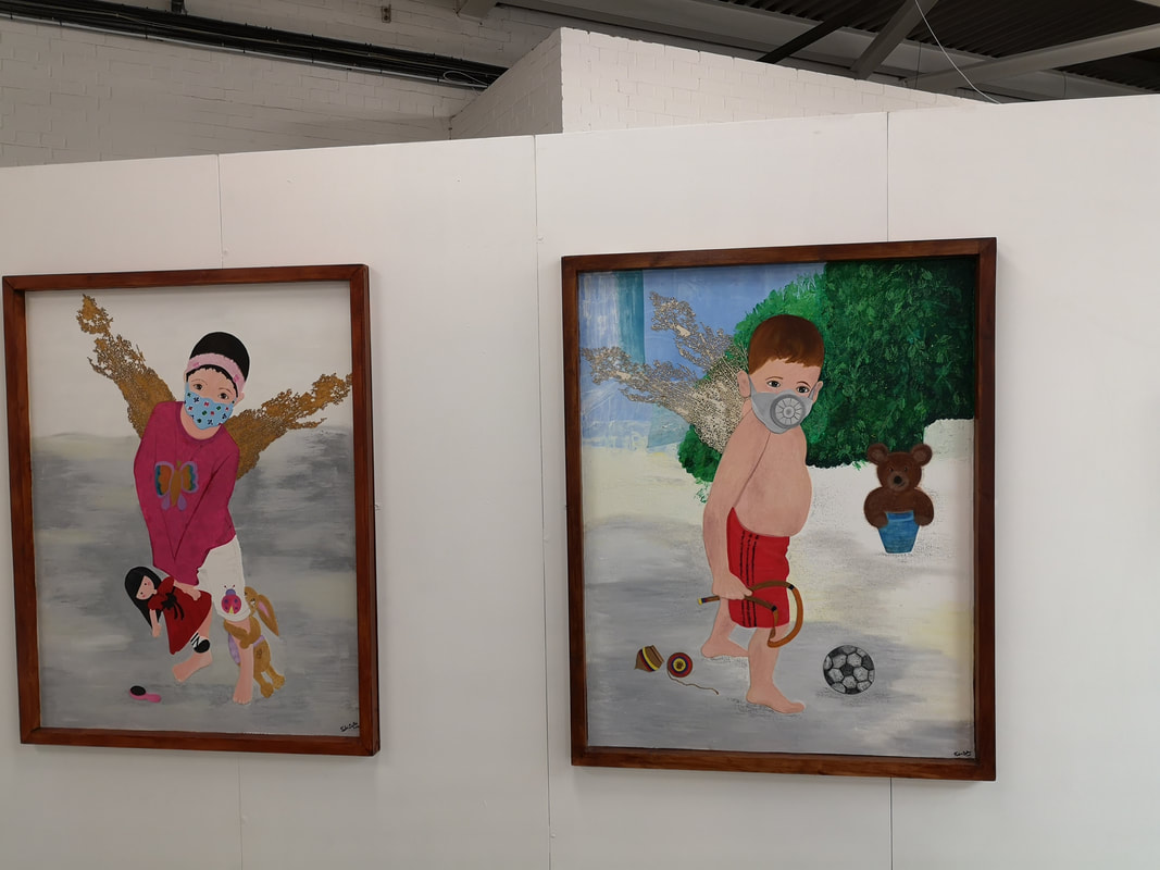
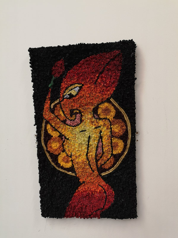
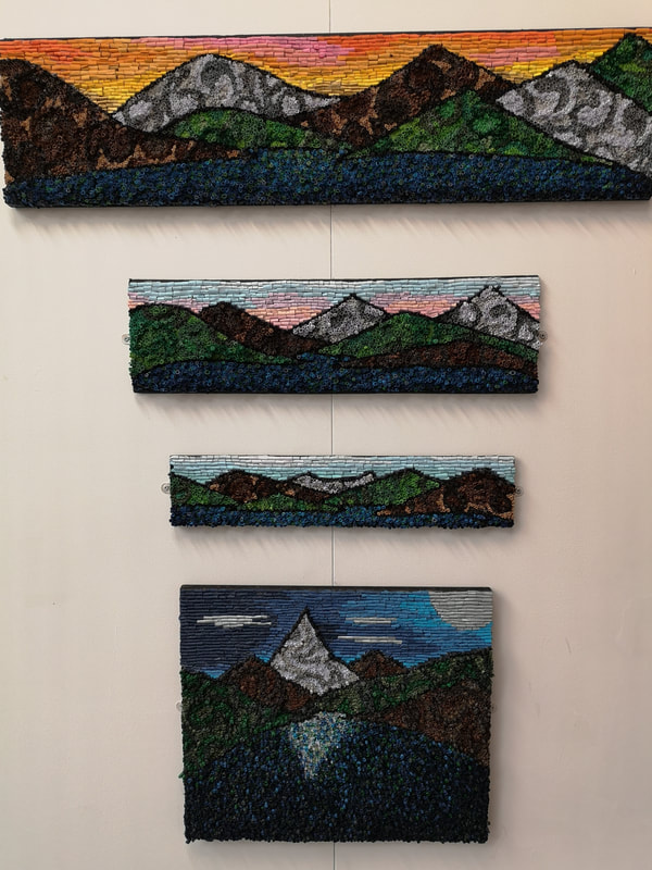
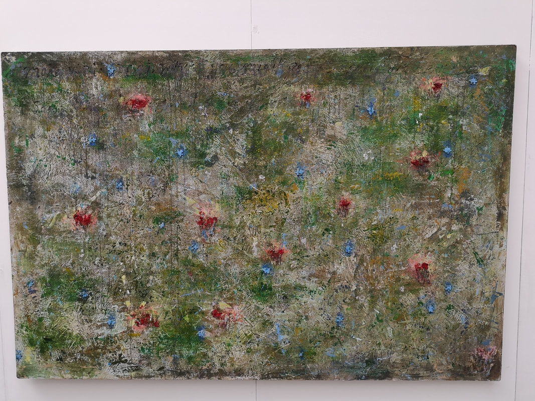
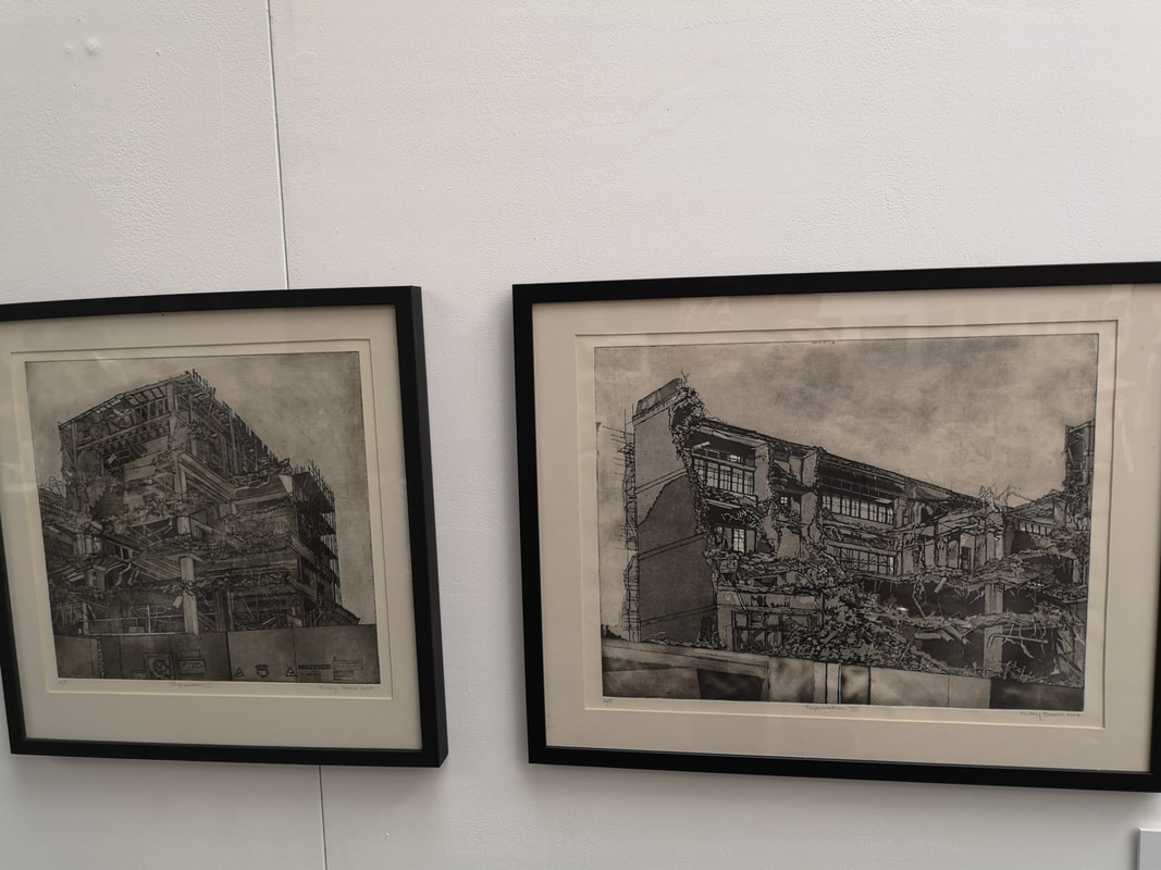
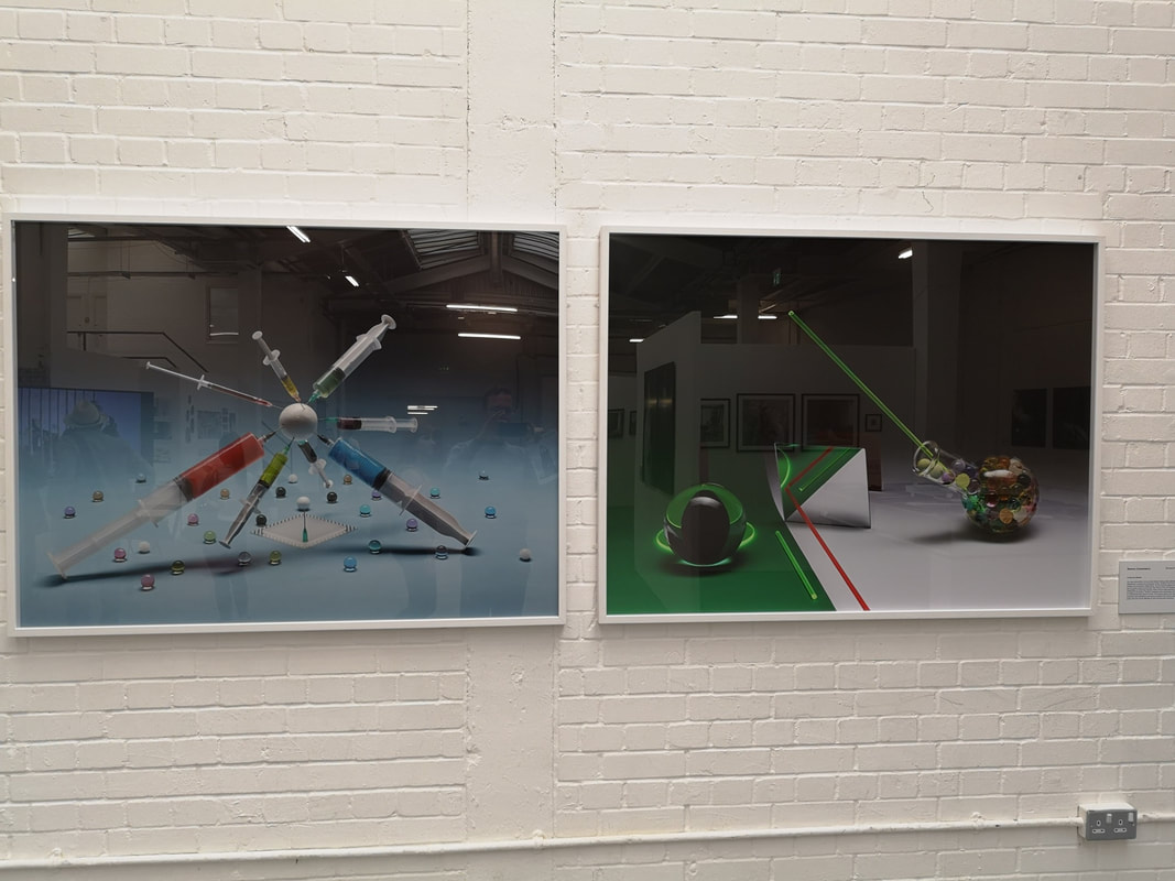
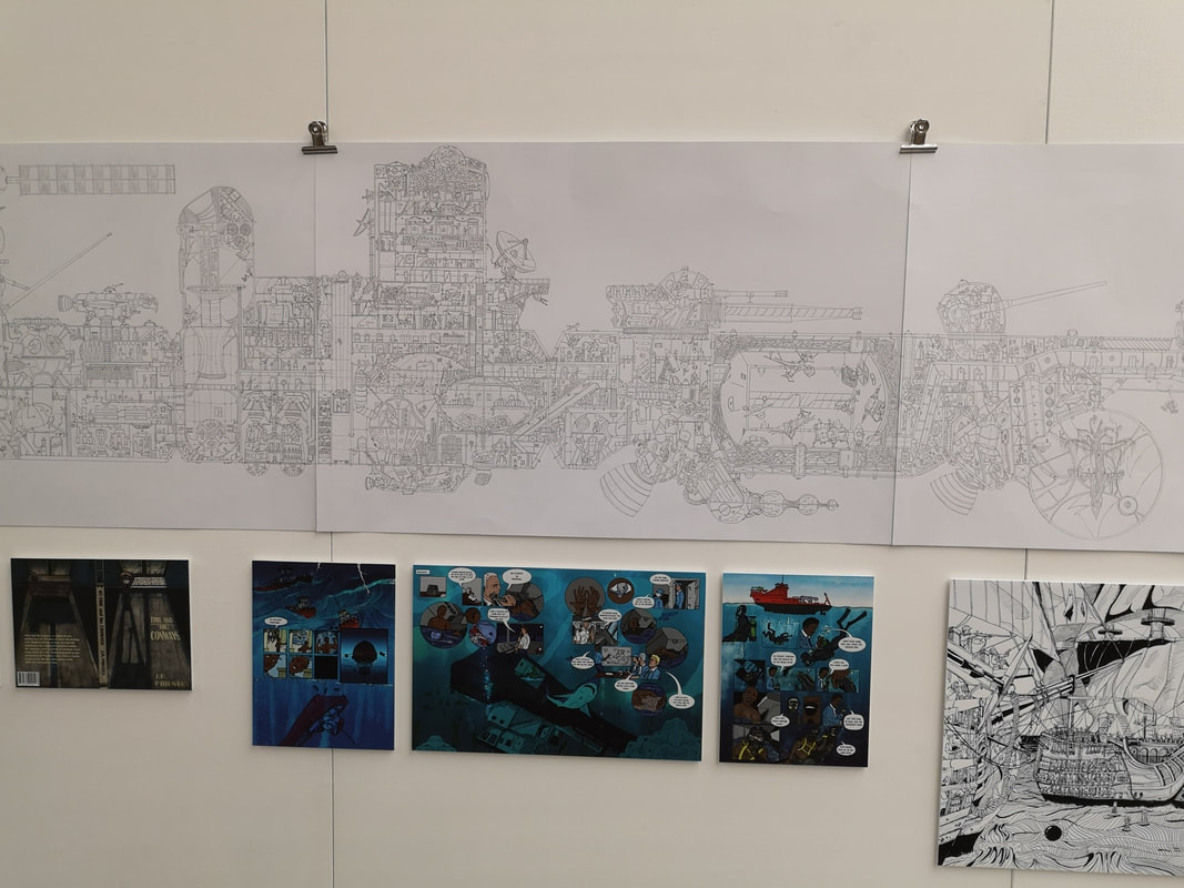
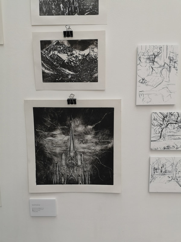
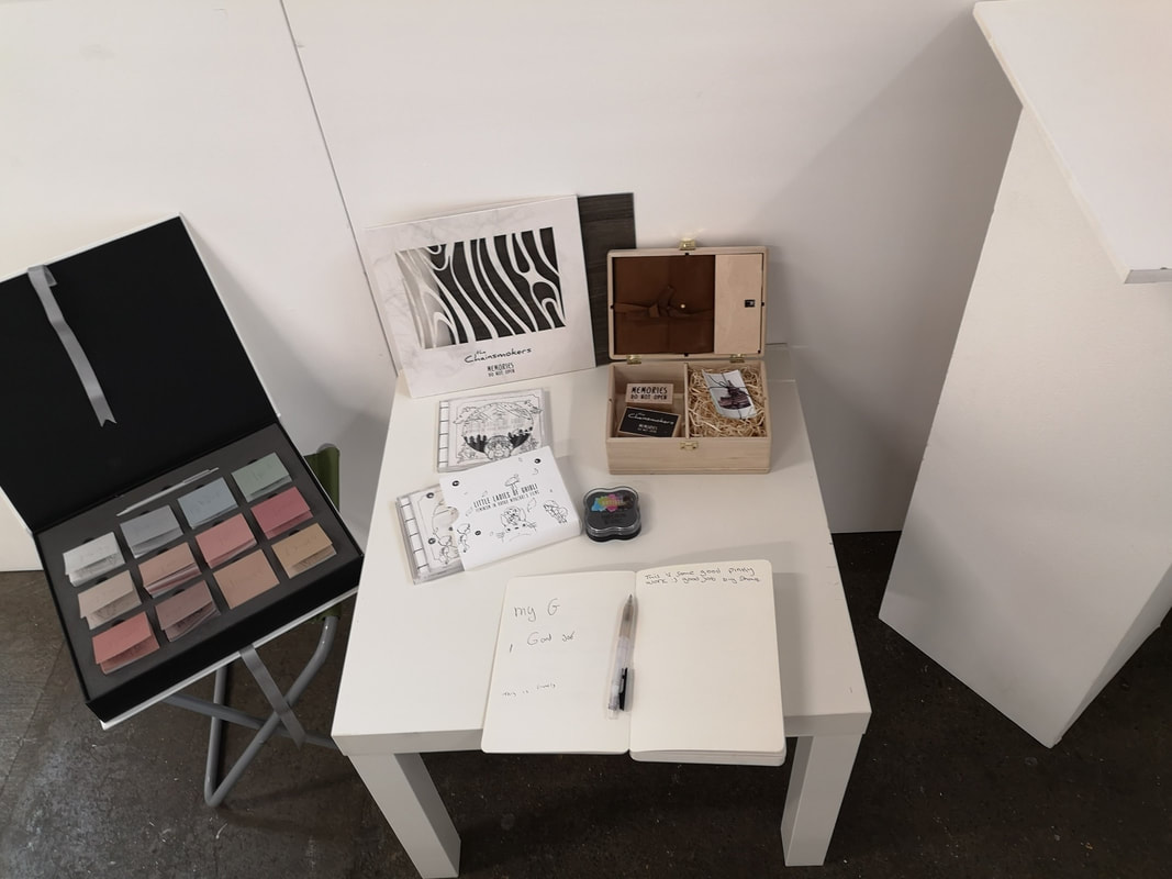
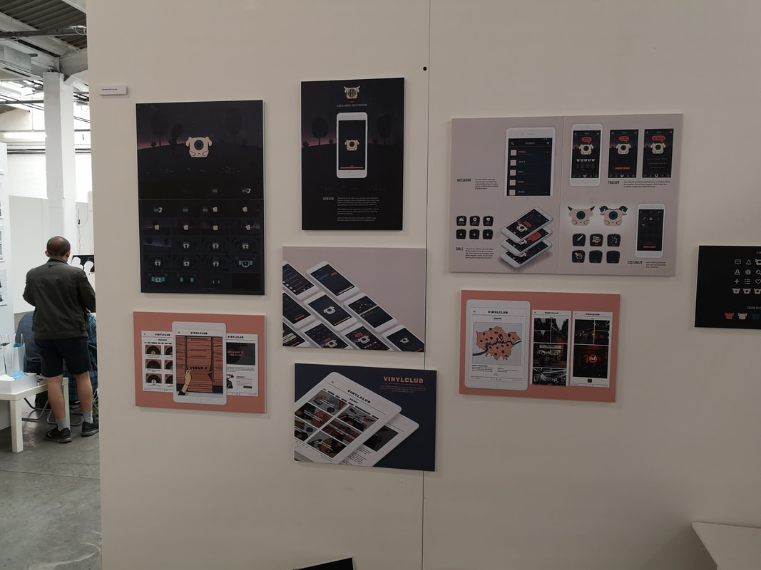
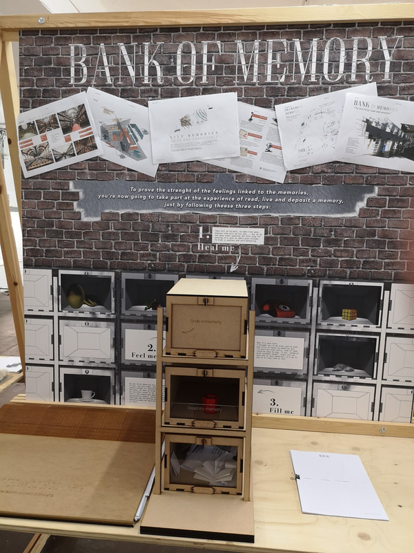
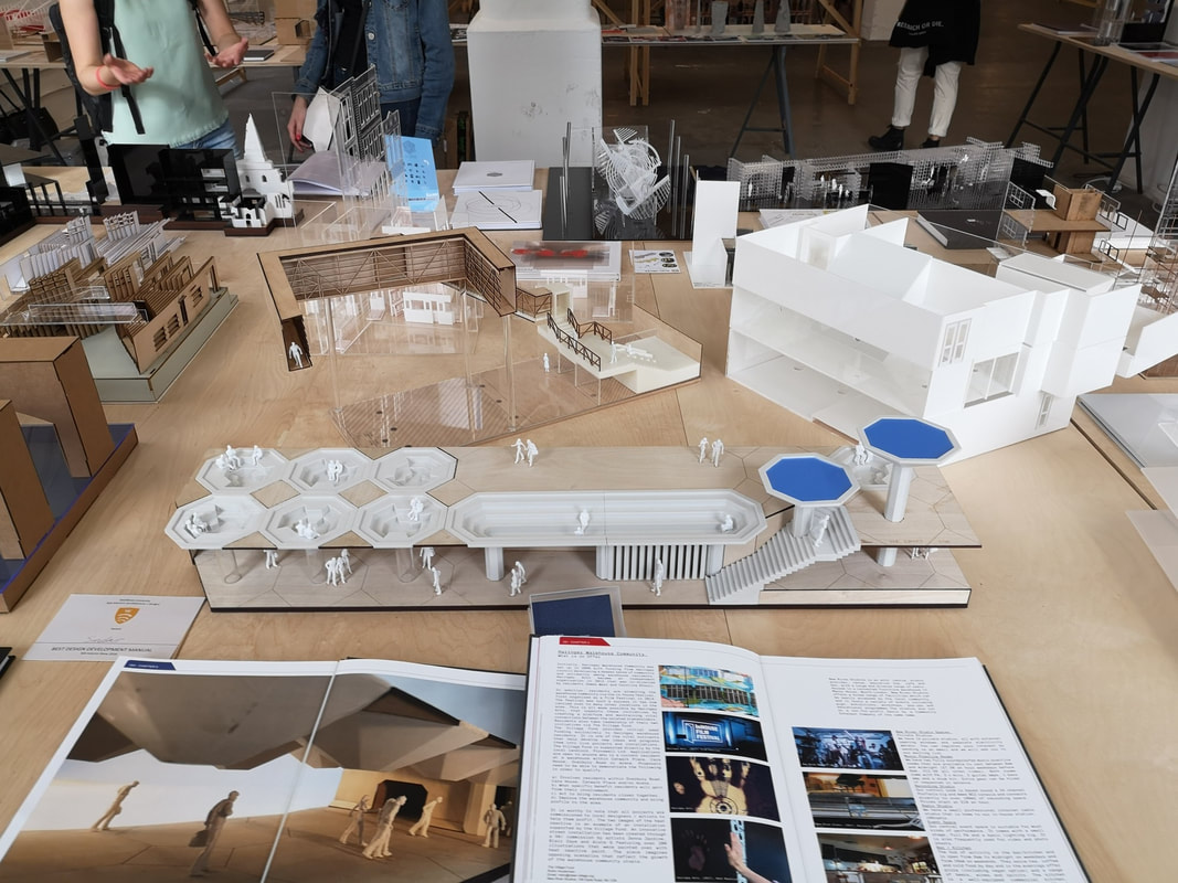
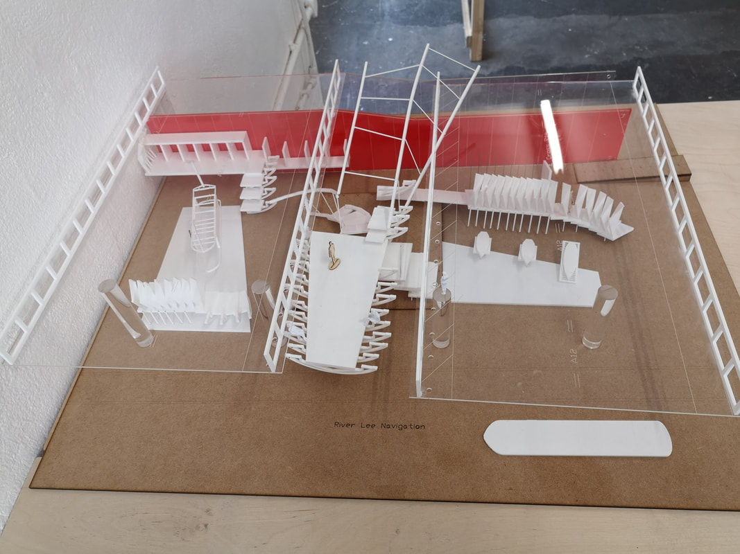
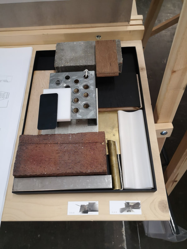
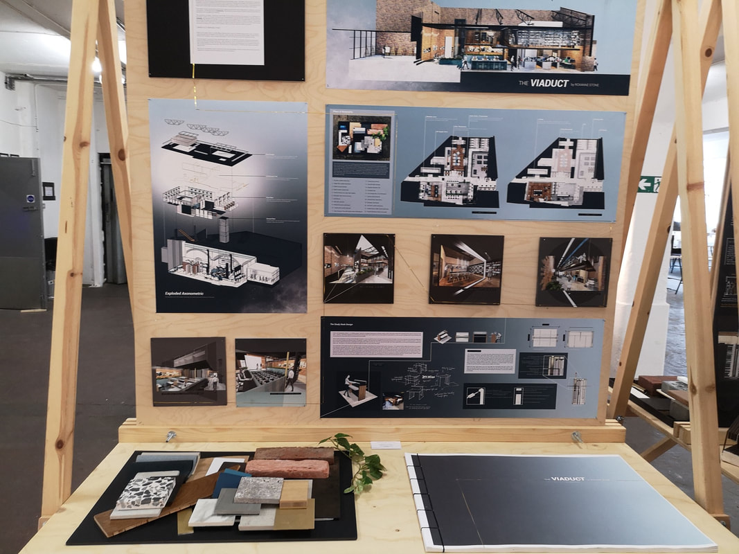
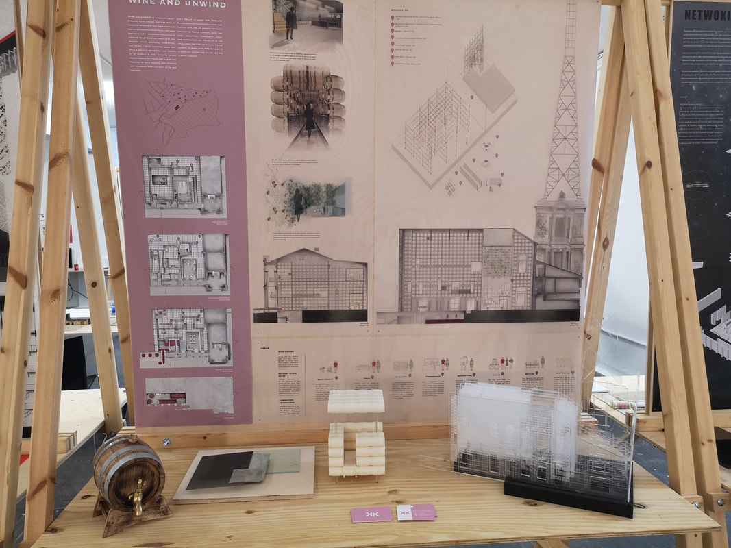
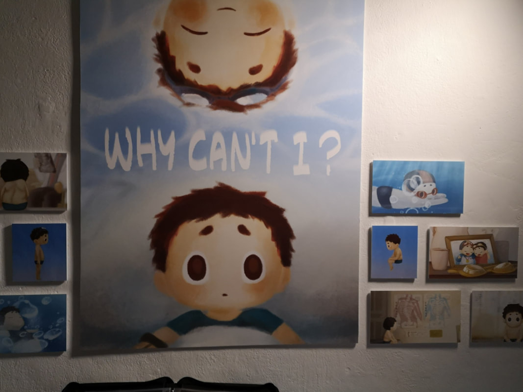
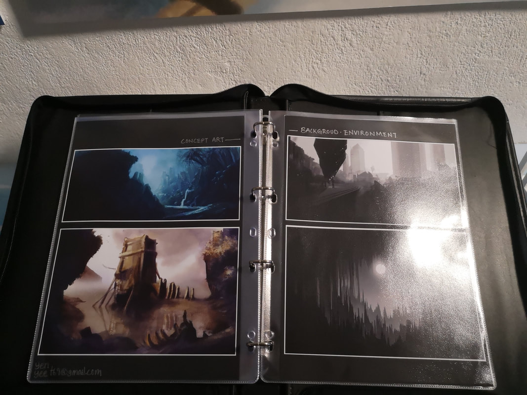
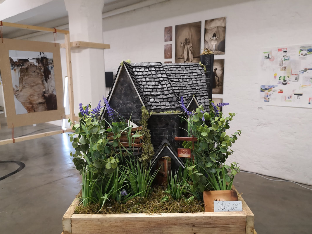
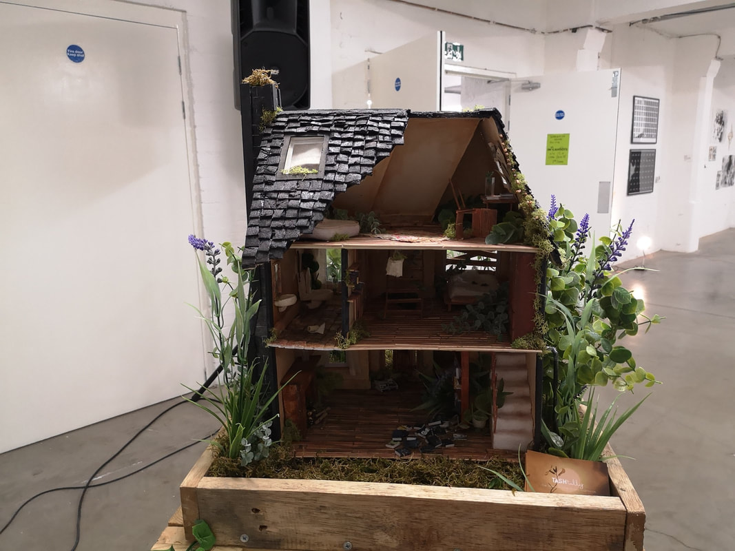
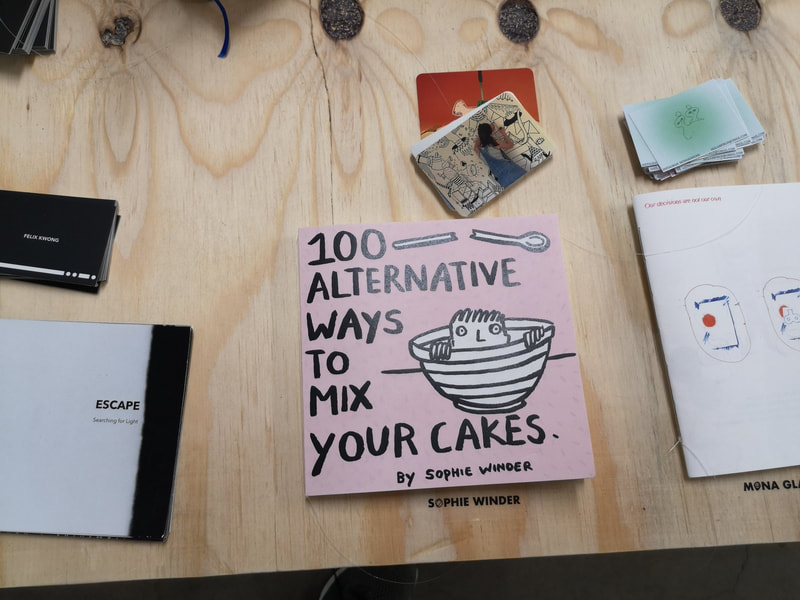
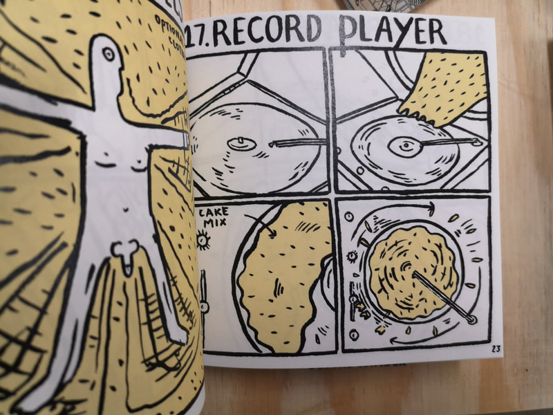
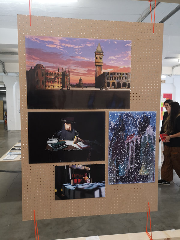
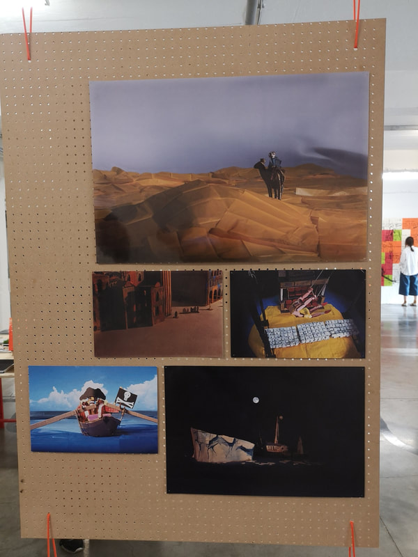
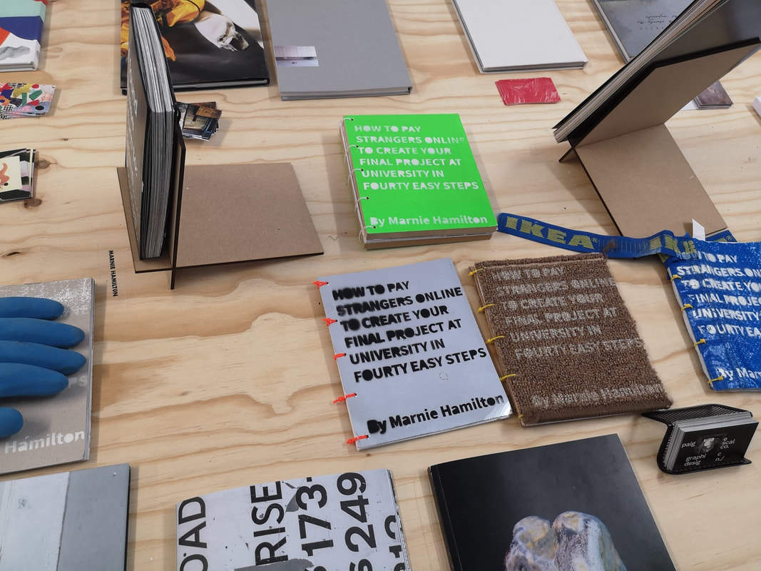
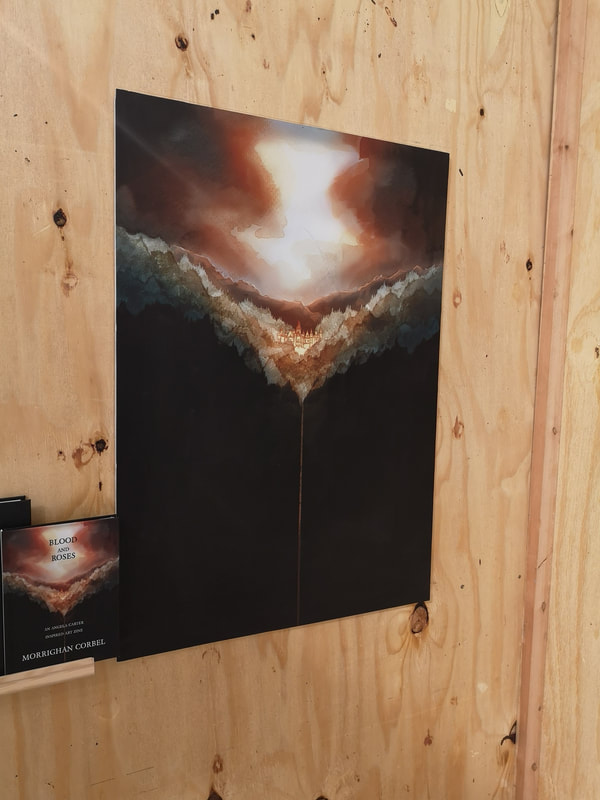
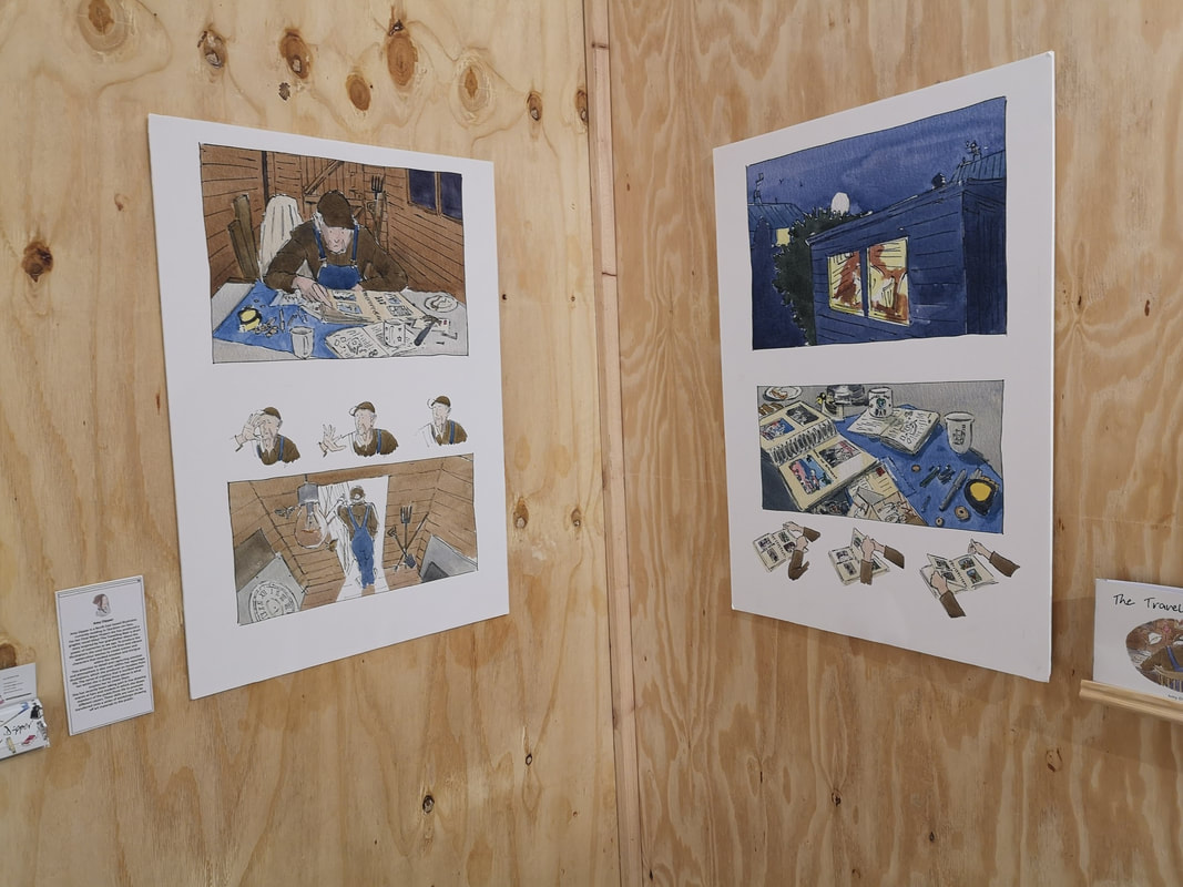
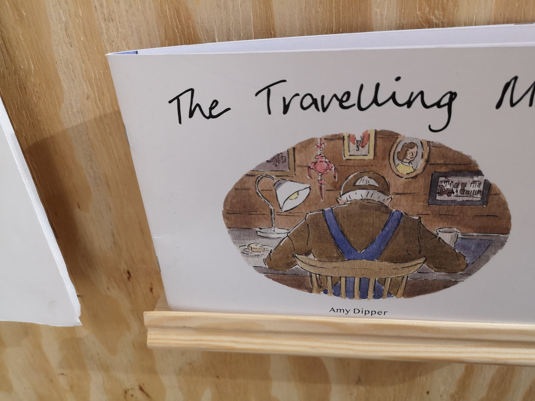
I discovered Free Range for the first time last year, when I caught the architecture show, and was seriously impressed. The concept is simple there are a series of roughly themed weeks in which various art and design schools put up their degree shows. It is free to go and the amount of talent on display is simply sickening and inspiring. It both makes me thing I should give up given what's coming up behind and pleased at the talent and work ethic of the next generation. This week was design week, although it featured photography, fine art, indoor architecture, animation and illustration. There were three universities displaying, Middlesex University, Brighton University and a small but intriguing illustration show by Cleveland Colleague of Art and Design. Middlesex were first out of the block. I was seriously impressed. There was a small fine art display and I was intrigued by these post apocalyptic semi angelic masked children (above), playing in this semi desolate landscape. I particularly like the desperate bunny clinging to the girls leg. The artist is Fedra Jimenez Castro. She is someone to watch, unfortunately I could not find a website only a facebook page. The above colourful textured pieces are not textile as they first appear, but consist of small, coloured, rolled up pieces of paper. I like the way the colours transition particularly in the alien figure. Elsie Macdonald. Elsie is very and it would appear very patient. Her facebook page is worth checking out as she shows you some of how these pieces are put together. Azalia Barad works with miasmic splotches of coloured, textured with puzzle pieces for some reason but it produces a nice effect (above left), like a semi-dessert landscape viewed from above. Hill Barnes produces these very detailed drawings of ruined buildings (above right). I am drawn to scenes like these and so these appealed to me greatly. Texturing the sky with that smudgy gray sets it off very well. It is the kind of drawing you can look at for ages. Sadly I can find no website of any kind for Hill. Photography doesn't do much for me. But I did like the above by Remus Comanescu called "A Plan for Britain". They are well composed, with a good eye for colour and structure. Drwa allot from still life I think but it is donw very well and photographed well. Jamie Pryor produced this super complex design for a Robo-Tech style ship as part of a design for a comic strip. It is intricate and technically superb, crammed with amusing little details, as was the block of flats that was next to it, but which in my excellence, I failed to photograph. For a similar purpose but with a very different style is Sarah Kadrnka's looming dark gothic church. I like the scratchy trees grasping at it, and I also like the sparer sketches you can just see on the right hand side. Around the corner from the Comic/graphic novel/book illustration section were design concepts. It varied from things like night club events to my favourite a health app to help you quite smocking among other thing (above). Michelle Mei Fan Fu. It is a very attractive coherent looking design. Well thought through. Sadly I can find no online details for Michelle. Indoor Architecture is next up and my first encounter was with Frederico Luciano Nunziata with Bank of Memory. An attractive piece but I also really like the concept. You take a "memory" out of the top, read it and then post it into the bottom. The one I took out said "This Project Makes Sense" that made me actually laugh and I still think is very funny. Credit to Frederico. The joyous thing about architecture is the depth of talent on display. You have these intricate plans, bold concepts and then little rendered models. Two such models called out to me. One by Sinclair English (above left) with a communal space of some kind. I like the hexagonal blue shades and the way they are reflected by the 6 hexagonal seating pods in on the left hand side. The other one that appealed was by the superbly named Bounthavy Malavong. I was extra delighted when I peered closer to reveal that it was to sit next to the River Lee Navigation. Nice to see the place inspires not just me. The other joyous element of architecture is the materials board (above). They are like a tactile still life and can be if done right a covetous item in their own right. The whole thing pulls together in a the whole stand. What is very easy to do is to overwhelm with information and make the whole thing a confused mess. The two above are, to me, examples of very attractive, enticing, well laid out boards. Very different approaches but both effective. The one on the right is by Kornelija Kopustaite. I can no longer remember who did the other one. In a baffling state of affairs, many of the students have business cards but surprisingly few of them put websites, or even instagram pages on them. This is a really missed opportunity in my view. 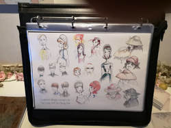 After the computer game section, which while impressive didn't really interest me, was the animated section. The first one that caught my eye was Wilted by Eve Travers (at the top of the blog and above). There is a sweetness to it that doesn't seem contrived or saccharine and a very pleasing and coherent overall feel. Having the close up concept drawings for the characters was also a nice touch. It very much bought them to life. A very different style with the big eye school of animation is Why Can't I (above left) by Yen Yee Tan. Instantly your inner child (or indeed any form of child) is drawn to this drawing particularly surrounded by the concept drawing. Yen Yee Tan does a particularly good bubble in water effect. What I liked about in fact all of the animation displays is that they were very intelligibly laid out. You could instantly grasp what was going on. The one above right is close up stills from the work of someone else but because the other photo I took is just of my thumb, I don't know who they are or what it is. I do like the moody, medieval mistyness of it, particularly the forest by moon light in the bottom right panel. Now we are on to the University of Brighton. I found there display generally more confusing. There was allot of information presented and it was often quite difficult to work out what was going on, or to actually see things properly. The were some exceptions though. The was so good I had to photograph it from both angles. It is a miniature house constructed for use in her animated film Shelter and is by a women called Tash Tully. It is wrought with such loving detail and the use of real plants around it is a very nice touch. Allot of skill going on here. Humour and silliness is always to be rewarded, particularly when done with a level of charm as in the case of Sophie Winder's 100 Alternative Ways to Mix Your Cakes (above). I could easily see this selling in bookshops. It was very well done, the little man peering out the bowl instantly drawing you in. Sadly I can find no online details for Sophie. Someone, I am afraid I know not who (above) also know how sot charm, with these well constructed and well shot stills from a stop motion animation. The figures are blocky paper characters which somehow makes them more engaging. I particularly like the pirate in his little boat. The background scenery, especially the snowy one are stunning. Marine Hamilton, also very funny. The title page (above) tells you all you need to know. These were scattered all round the show, the covers in various different substances. The final part of the show, which took some finding, it is sort of opposite Big Chill and Rough Trade and you can only access from outside the building, is a discrete offering from Cleveland Colleague which I had not heard of before but which is in Middlesbourough. From the show there were two things that caught my eye. The first was this design for Blood and Roses by Morrighan Corbel (above) who has the perfect name for producing this sort of gothic horror. The way the sky bleeds into the shiny city and then this line of light taking you into the darkness is very convincing. Stylistically very different, and it seemed to me very much in the English illustrated tradition was the Travelling Man by Amy Dipper (above). Characterful, muted colours, fine lines and full of pathos (is that the right word?) it reminded me of several books I had as a child. Again I can see this actually selling. All in all an impressive show.
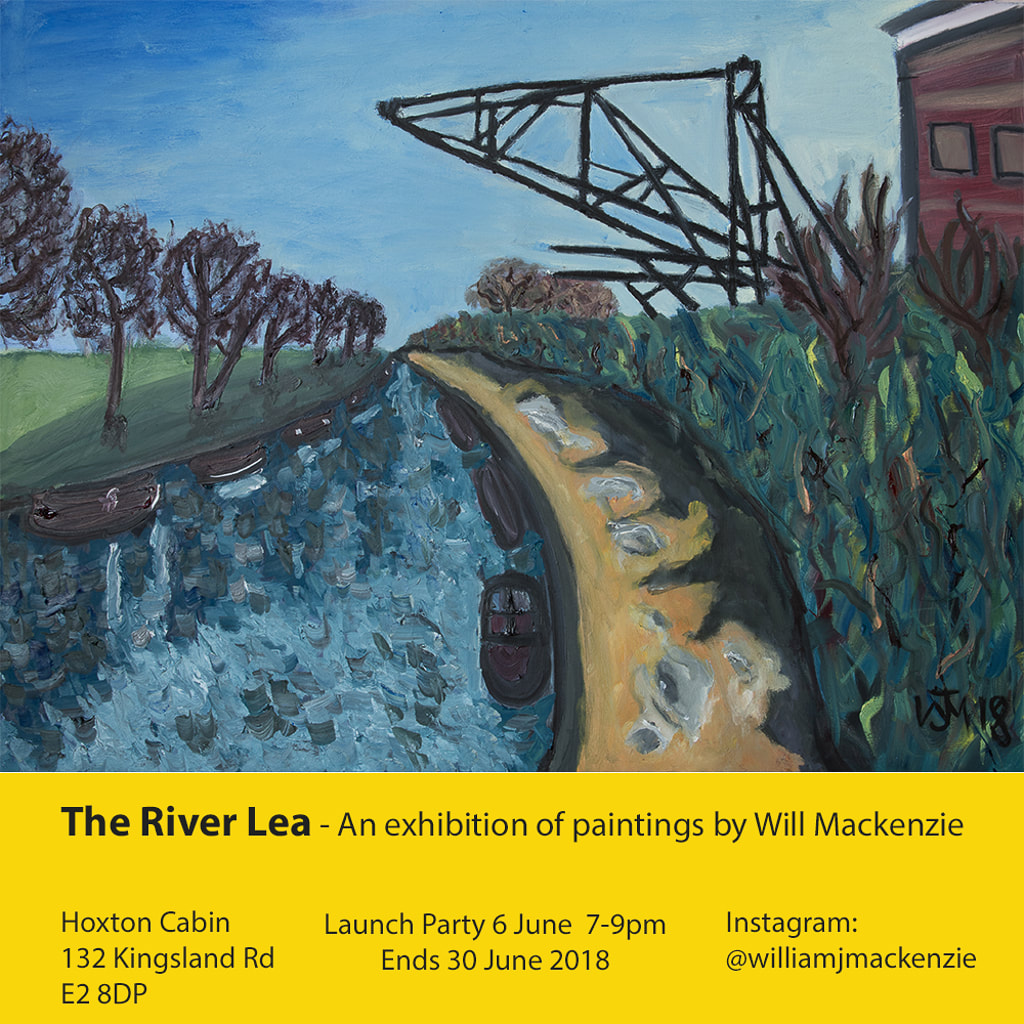
Speaking of shows, mine is still going on at the Hoxton Cabin and will be until 30th June. Details below.
0 Comments
Leave a Reply. |
Archives
June 2024
Categories |
 RSS Feed