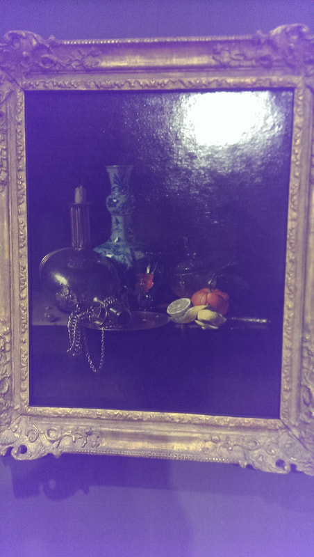
 The Guildhall Art Gallery is one of those overlooked gems. Overshadowed by the much bigger London art museums it is none the less a good gallery. It has an excellent selection of mostly British art and in the basement the ruins of a Roman Amphitheatre. It is free to get into and I highly recommend a visit. On a weekend it is a nice quite refuge from the rest of London. Currently it is showing an exhibition called Nature Morte, which is basically a still life exhibition so off I went. It is a quite a sizeable show set out by themes which are basically, food, fauna, flora and so on. It is well curated, apart from the labels, which tell you what the work is and who is by and in tiny tiny type what the medium is, but the rest is art guff, especially with the contemporary work where they feel the need to try and explain the piece, which for me defeats one of the major points of contemporary art, but there you go. They have however nicely mixed the modern with the old master in a very effective way which allows you to draw your own conclusions as to influences, themes and so on. I liked that. I spent a happy almost two hours there and encountered lots of people, none of whom I had ever heard of or seen before (that I can recall anyway). 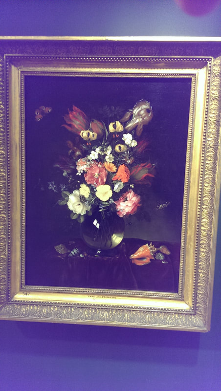 Willen Kolf piece is called Pilgrim Flaks, a tour de force in glass and silver (top of blog). A nice touch is the artist (at least I presume its him) is reflected in the jug. Showing the Dutch really knew their reflective surfaces. Opposite this is a piece by PIetr van De Venne (above). A simple looking classic Dutch still life but I kept on coming back to it again and again. Particularly effective was the warm glow of the light from the vase. Digital art is difficult to do well, but Jennifer Steinhauf’s piece was quite good. It was a projected image of flowers and branches moving and swirling on top of each other and had a nice hypnotic effect. What was nice was the pattern never seem to repeat itself. 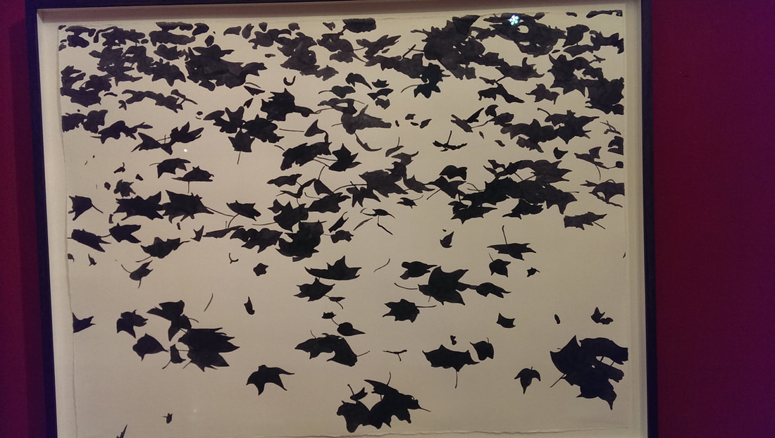 Out into the main room and the flora theme continues with a piece by Sue Arrowsmith (above). It is deceptively simple in that the piece is just black silhouettes of leaves against a white background, however the leaves are all expertly placed and rendered so they appear to be blowing in the wind (which is I believe the title). There is something quite Japanese about it.
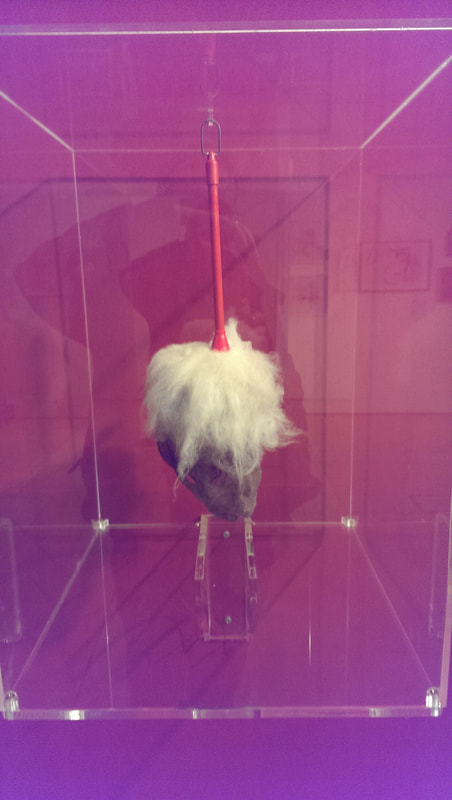
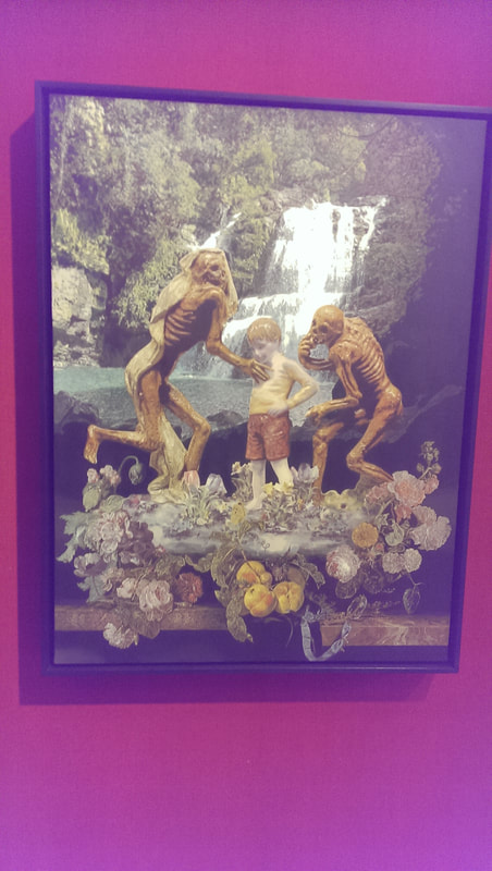
As you follow the wall around, things begin to get a bit weird. For example Paul Hazleton (above left) has produced a mask and wig made entirely out of dust which is just plain upsetting. A couple of places along from this is a disturbing pieces by Matthew Weir (above right) which shows some very odd looking skeletons playing with a ceramic doll like boy in front of a tropical rain forest. Advice, don’t read the label it spoils it. 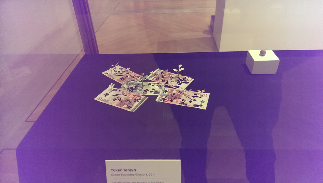 The label also spoils Yuken Teruya’s Green Economy Group (above) which has small flowers cut out and stick out of various Euro notes, the holes they leave behind making very convincing shadows and the colours of the notes used to good effect to make the flowers. 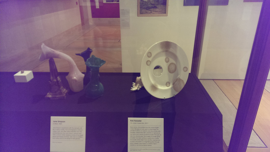 Teruya's piece is housed in a vitrine (pretentious word for art display cabinet) with works by Jane Simpson which are tentacle octopoid like apendages made for rubber and a plate by Rob Kesseler which is quite well decorated but also has in it a magnifying glass, which enlargens the shell behind this (both above). I found this appealing. 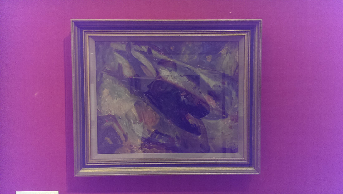 On the wall opposite these are some very well rendered and oddly delicious looking Mackrel by Vera Cunningham (above). The way the multitude of colours and the different textures swirl together to make the mackerel is very effective. 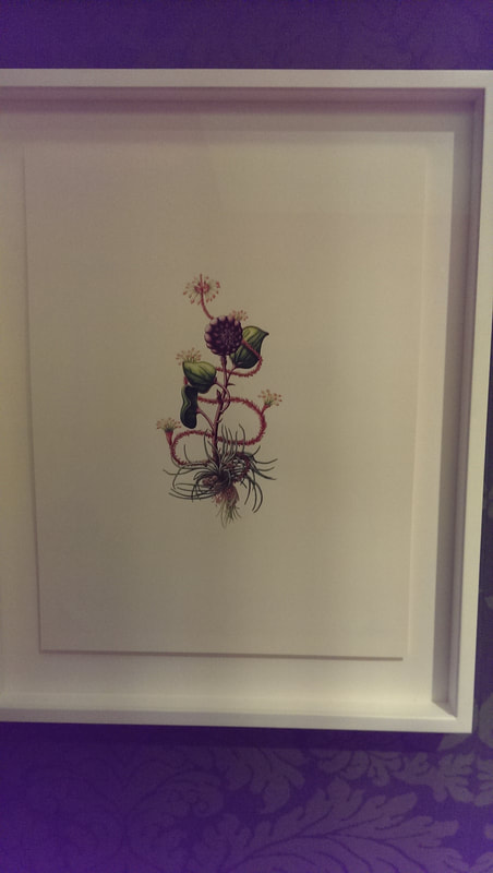 Around the corner is some very good botanitcal art by Helen Goldhart (above), with an excellent composition and use of colour. She has called it Jaunty which caused the curators to make a bid for the all time prize for art guff in the label.
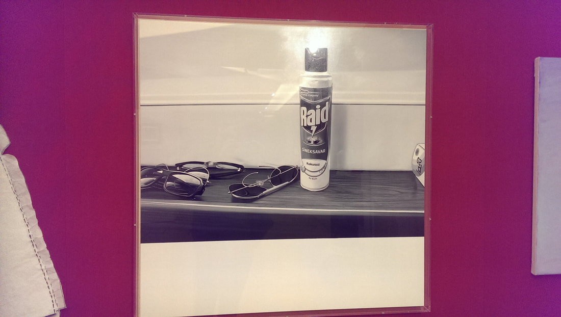
Moving round the outside wall there is quite a nice abstract by Lisa Milroy (above left) which makes good use of shadow, and next to that a picture called Raid (above right) which is just a photo of the self same substance but is somehow a terribly effective photo.  Before you leave this room you should orbit the middle section, particularly the part near the door. On the left hand side is Cynthia Grieg’s Nature Morte no;3 (above)which is a very sparse painting of some fruit, which just the outline and the suggestion of internal texture and colour. The kind of minimalism that draws you in (as opposed to being boring). 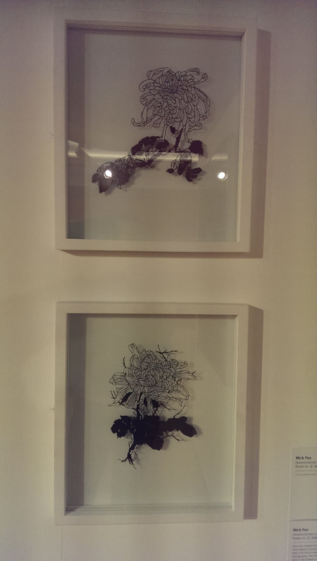 On the other side are two pieces by Nick Fox, which are really worth looking up close. From the distance they are some nice outlines of plants, effective enough, but when you get close you realise they are slim slices of acrylic mounted between two pains of glass and you realise how painstaking this must have been  Next to this is a piece by Kim Baker which is a small painting of sensous flowing flowers (top of the two above). On your way out look out for Peter Jones Ollie Mack which is very disturbing picture of a toy monkey and some delicious looking cheese by Floris Van Schoeter. 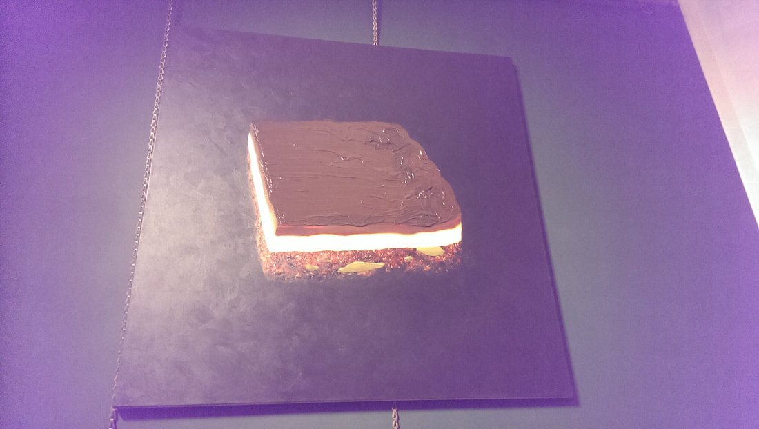 Not all of the exhibition is in the exhibition space. There are two paintings in the gallery proper of which the best is by Andro Semeike. It is basically and enormous chocolate bar. It is deliciously rendered with superb use of texture to produces the different layers of the cake, with the glowing yellow middle layer to the gloopy shiny looking chocolate surface.
The show is on until 2nd April and I suggest you go and have a look.
0 Comments
Leave a Reply. |
Archives
June 2024
Categories |
 RSS Feed