|
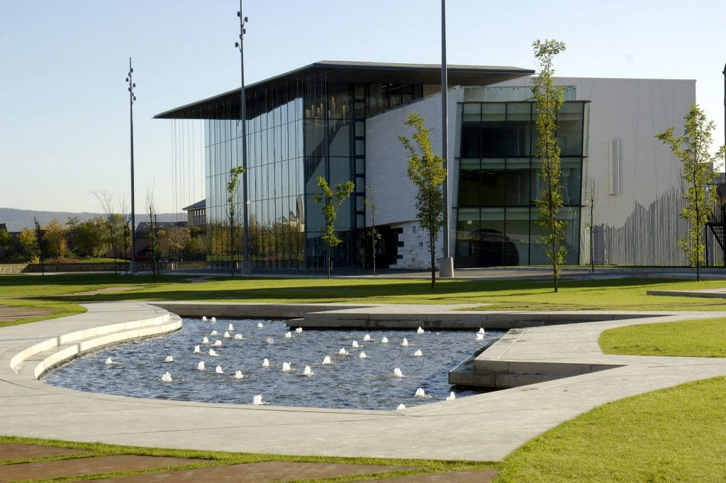
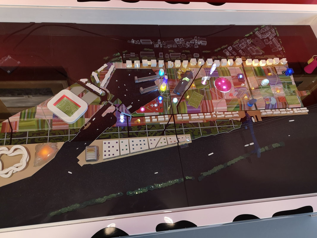
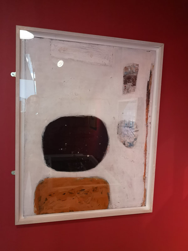
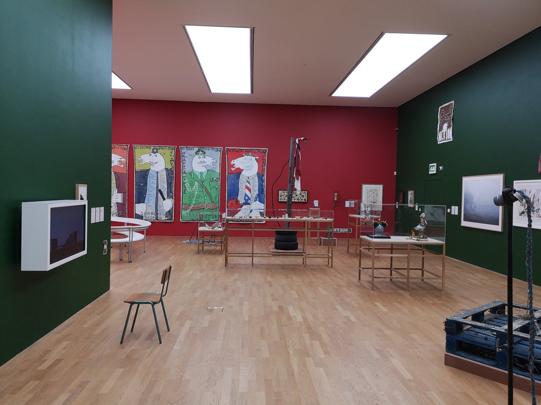
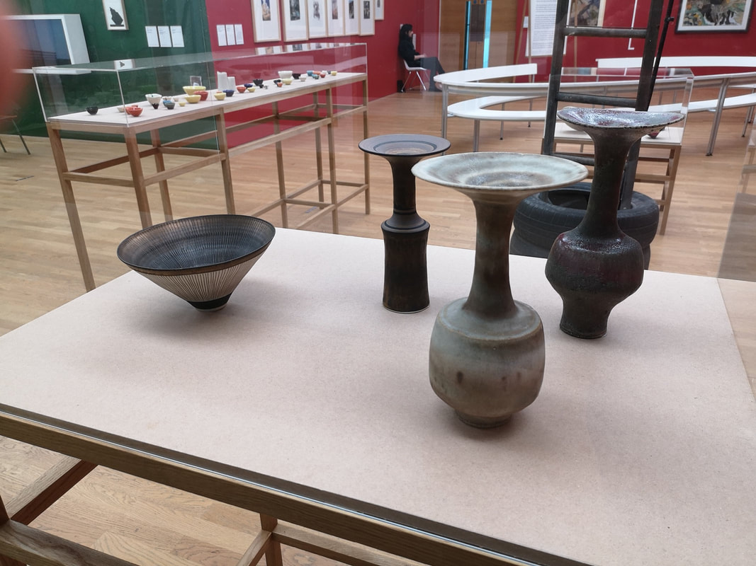
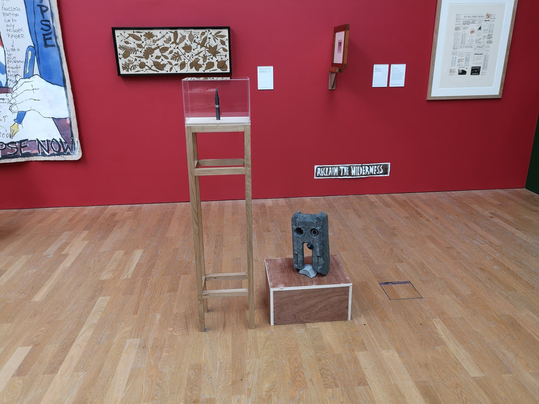
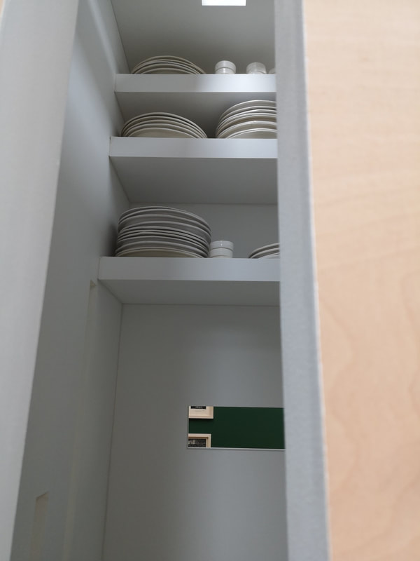
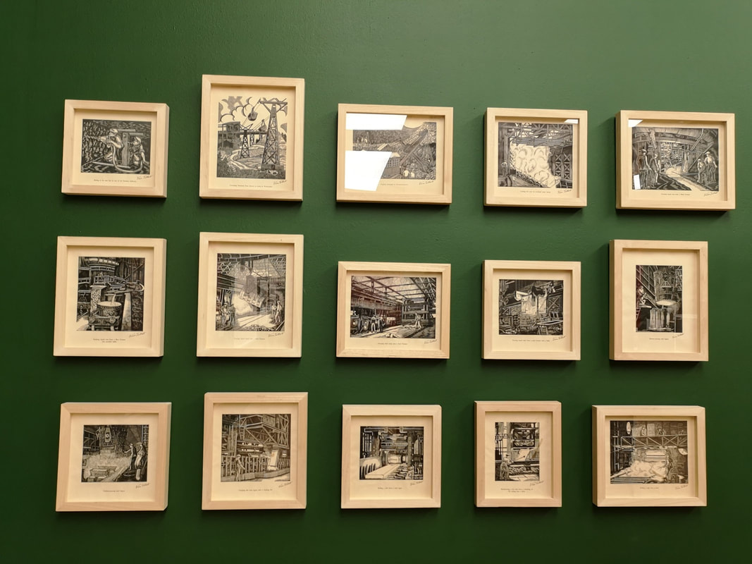
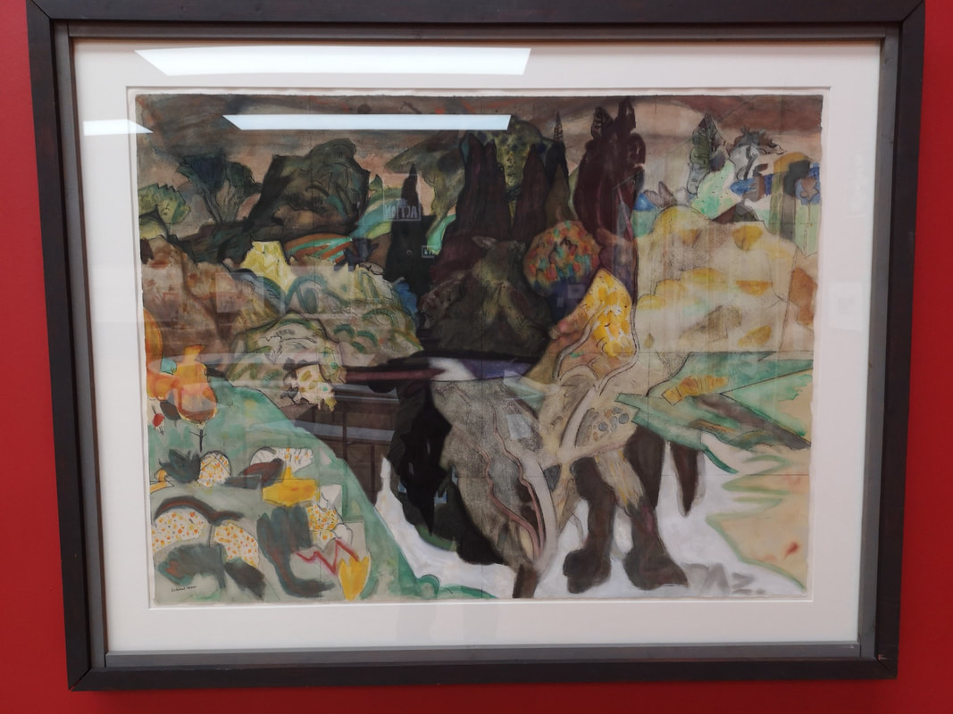
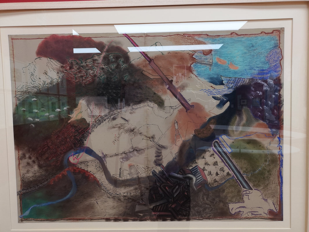
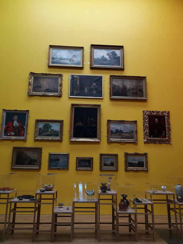
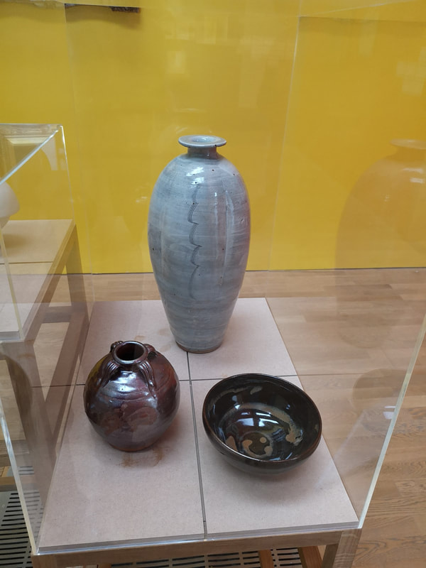
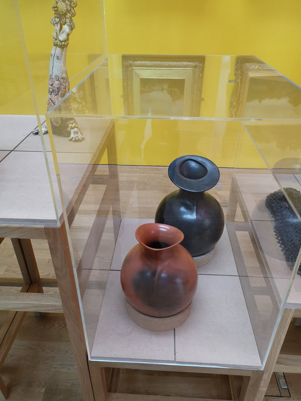
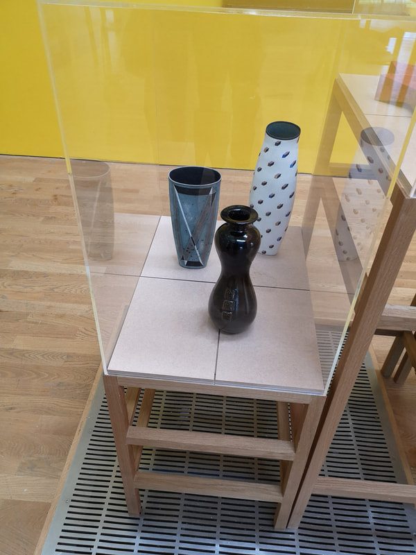
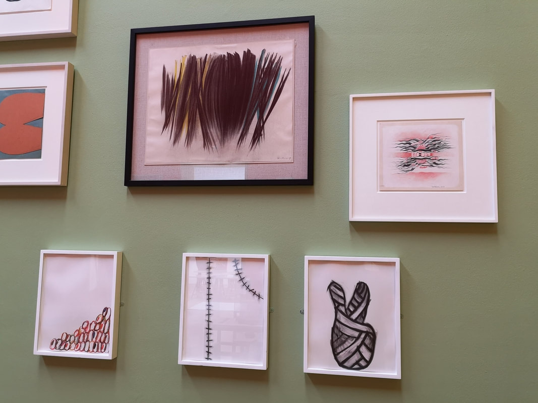
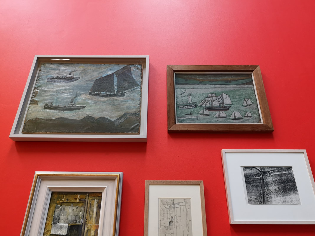
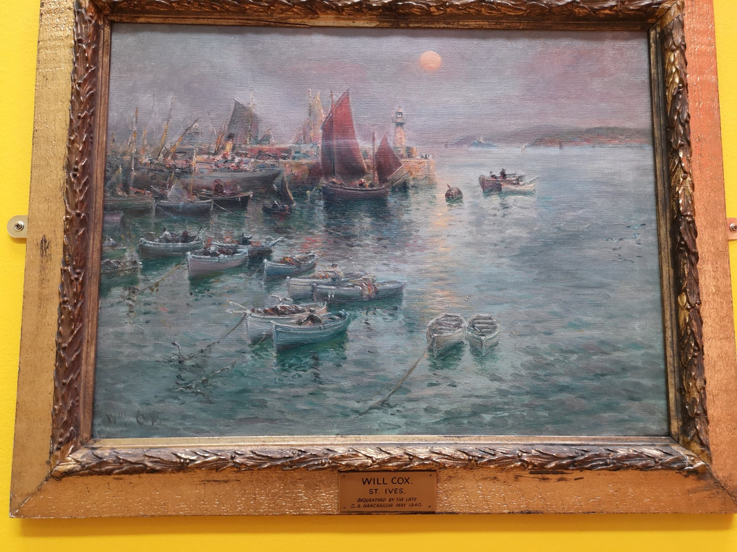
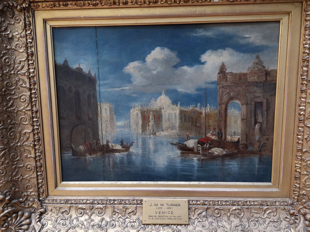
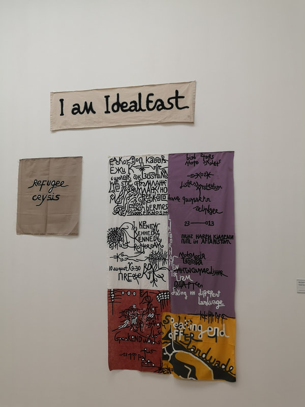
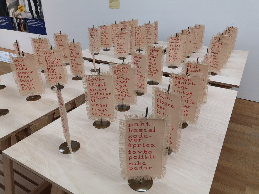
Journeying from the north I had a few hours to kill in Middlesbrough and the need for breakfast. The minimum amount of research I had done suggested that The Smeltery would serve for breakfast. And serve it did, turned out to be both reasonably priced and delicious. I recommend it. Because I hadn't been paying attention, what I didn't realise until I got there was that it was also the cafe/ restaurant for MIMA (the Middlesbrough Institute of Modern art pictured above). It is located in a very attractive square, just across from the looming gothic mass of the Town Hall. The short version of this post, is that it's good. Other small museums could learn allot. I was impressed. The staff there were super friendly and agreed to store my suitcase in the shops store room so I could look round the museum unencumbered. The building itself is three floors. The top floor is a viewing platform from which you can look out over the city. The 2nd floor contains a corridor full of art including a colourful mock up of a proposed redevelopment of Middlesbrough riverside (above, you can see the stadium) which was sadly derailed by the recession and government obsession with all things London. There were an number of other artworks in the same area, the best of which was a fine William Scott called rather simply Orange, Black and White (above). All the coloured are mottled to give a more interesting texture. The gallery on this floor is a large L shaped room which holds a cornucopia of contemporary arts in various media and by various people, the majority of whom (but by no means all), where British. There was a terrible Tracey Emin drawing for example, one suspects only there because of the name and completely eclipsed by the 4 horseman banners (three of which you can make out above). There are various vitrines of pottery in the gallery, including this quartet of wide mouthed pieces that I like. I like the subtle variations of blue to grey that you can see on the bottom (above left). You can also make out in the background a long cabinet of coloured pottery. Sitting in the middle of the floor there are also various installations, of varying quality but many of them good (such as the one above right). My only criticism is the labeling on the wall makes it difficult to work out which piece is which. However on the plus side, they have avoided art guff style explanation of the pieces and instead just tell you who its by, what its made of, and occasionally the history of the work. Squatting at one end of the L is this large beige box, with large slits in it. If you peer through the slits you can see piles of white crockery (above). It turns out to be by Edmund de Waal and is called, aptly, the cabinet of curiosity. Incidentally his book is very good. This is an odd piece. It is not much to look at from the outside, and frankly the white pottery is a bit dull and yet one feels compelled to try and look through the different apertures. I find that It allowed me to project my own story onto the thing. I also suspect I gave it more time than usual because of my admiration for its creator. Themed collections can often work well together. Also suitable subject matter can be enhanced by its location. Middelsbrough being an industrial city (at least in inheritance if less so now) does well in displaying these 15 etchings of the Steel making process by Viva Talbot (above). They manage that very difficult trick of being both artistic and educational. The etchings take you through in chronological order the process of making steel, rendering into a human and detailed experience. Just to the side of the door into the gallery are two stylistically similar paintings that caught my attention. Sadly the glass covering has made my photos a little indistinct. The one on the left is called Fortrenn by Kirkland Main. It is an abstract almost fantastical depiction of the Scottish Highlands. I like the flashes of orange and the tendril like way the land reaches into the water. Incidentally this is one of the things MIMA does well, introducing you to names you may never had encountered before. One of the ones I will be taking away with me is Vivian Sundaram with his Riverscape (above right). I am sucker for maps and anyone who finds an interesting new way to render them has my attention. This it seems to me is precisely what Sundaram has done. The second floor also has a window looking onto the entrance room of the ground floor gallery (above). The present display works quite well with this, particularly the pyramid of paintings, and I can easily see how some exhibits would benefit from such a vantage point. The first floor had a moving, and politically interesting display about rouge landlords, the housing crisis and the effect it has on people. Engaging but not aesthetically interesting so photos of it wouldn't really convey. In a similar way 3 rooms of the ground floor dealt with the issue of immigration and refugees, but here illustrated with art work. I shall come to that in a moment. In the centre of the ground floor are these series of glass cabinets containing a number of things, the most interesting to me where the ceramics (above). Again here the labeling made it difficult the only details being in a booklet on the wall. Being a man of little patience I wasn't really prepared to actually read beyond the first page. Therefore the only information I can give you is that in the photo on the right the spotty vase is by Poh Chap Yeap, and the other two by Elizabeth Fritsch. They are all though very good examples of pottery. I particularly like the rear of Fritsch's two vases, with its variation in colour and the two crossed stripes on its surface. Clustering paintings can work very well. The only downside is dome of them end up to high for you to be able to look at them properly. In a small museum like this though you have to be smart with your space. There were a number of interesting paintings in this room. From the photo on the left four pieces particularly caught my attention. The feathered black stripy one in the centre is by Hans Hartung. I like its dense, compact changing tone. The three beneath it are by Nayland Blake. Of the photo on the right i am drawn to the two seascapes both by Alfred Wallis, they are charming almost naive but there is something about them that elevates them above that. It is not all contemporary or 20th century works (although that is the focus of MIMA). Two more classical pieces caught my attention. One is a misty harbour scene by a Will Cox (above left). I like the way the see is rendered, and that red sail makes for a good contrast. The one on the right is a Turner.
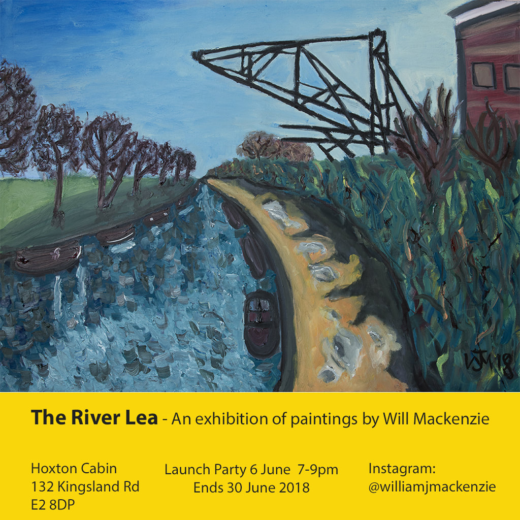
Thank you for reading this far. I shall leave you with a shameless plug for my show at the Hoxton Cabin, which finishes next week. Details below.
0 Comments
Leave a Reply. |
Archives
June 2024
Categories |
 RSS Feed