|
An unweildy title but a very good show at the British Museum and its free! Its hidden away a bit at the top of the curling stair case that ascends the central cupola. It runs until March 2023 so you have plenty of time to see it. It is however in my view worth a view, let me explain why and what I got out of it. 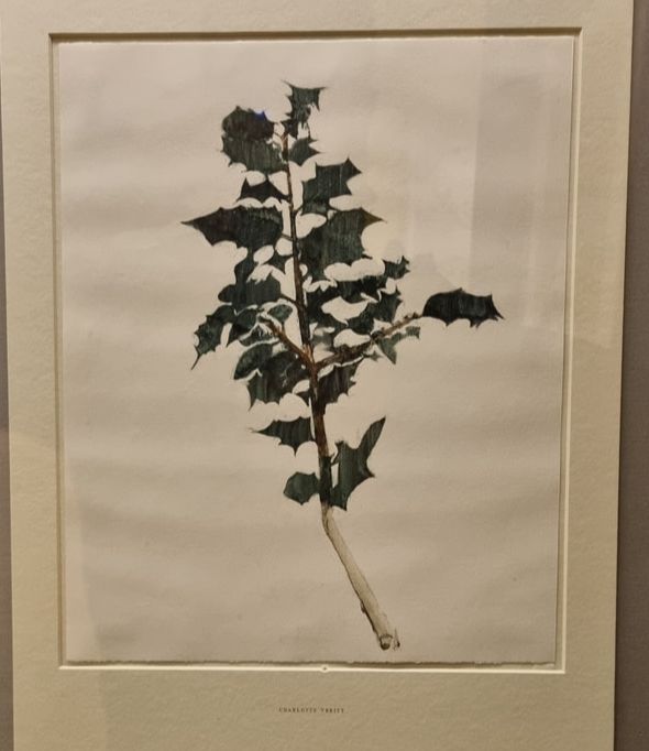 Works on paper often have a reputation as being less important, less interesting, more ephemeral. They labour under the sway of canvas and other proper surfaces of art. I suppose that this is because paper work and sketches are often see as the preparatory work for a more important work. This is of course because often it is true and there are some examples of this in the exhibition. But there are some other complete works which are very beguiling in their own right. I am a big fan of botanical art. I find it peaceful and contemplative as well appreciating the scientific accuracy of it. The one above, of Holly by Charlotte Verity produced in 2020 shows that the form is still alive and well, which pleases me. So some of the work on display is figurative and realistic but much of it is more abstract. 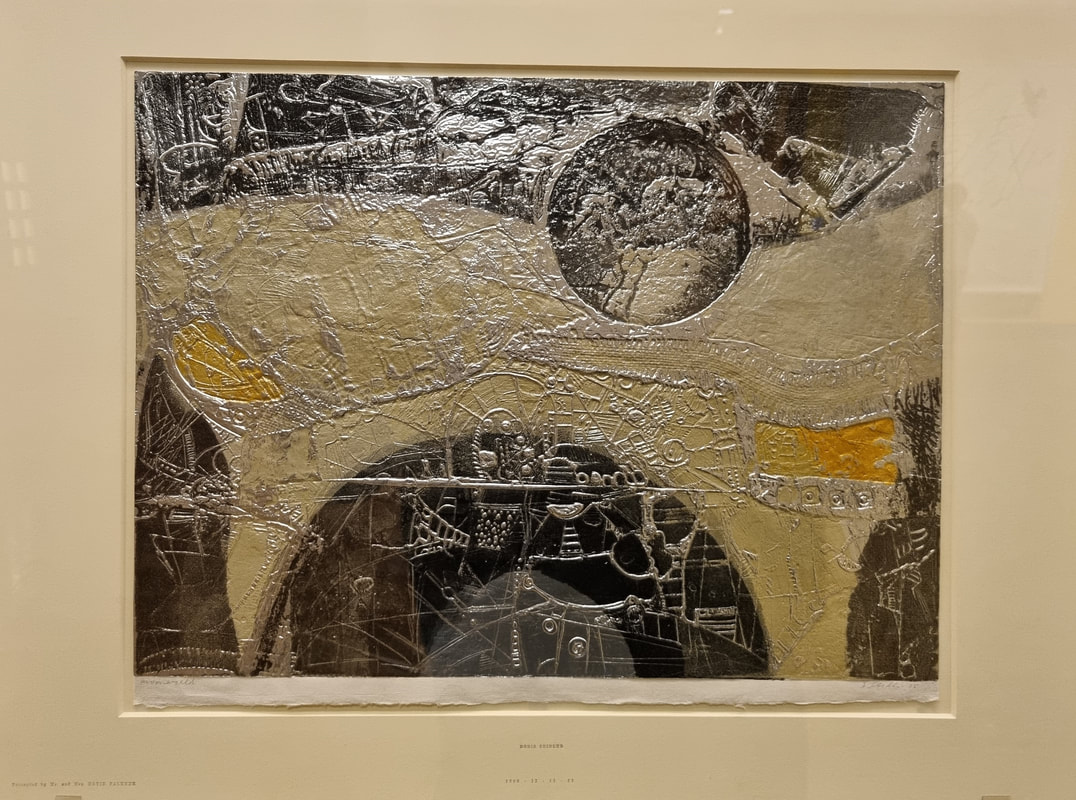 Doris Seidler's Moonworld (above) is one such abstract work. I love the shiny surface and the mapped-like texture of it, the building or streets that seem to be there. It is not only physically attractive but it allows you imagination to run. Is this perhaps a future moonscape? I found this quite inspiring, and I particularly like the ideas it gives me about material and this made me want to run off and play with Japanese paper (on which this is painted).
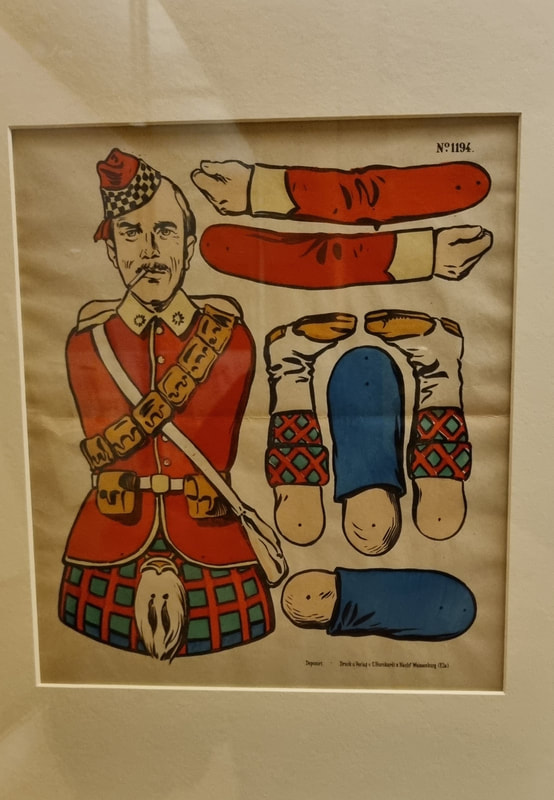
I do love a bit of humours in art. It is (as is humour in culture more generally, no comedy film has ever won the Oscars for examples) lacking in the same cache as more "serious" artistic subjects. So when I see it and it is done well, I do enjoy it. Particularly when it has a certain wistful air to it. Some of the works have a flippant feel that appeals to me and two such examples are above. The one above left is deceptively so in that it looks first of all like a tongue coming out of the picture, a gimmick almost. But then you look closer and realise it is perhaps a beach invasion scene. The one above right has a certain amount of personal relevance. My father is obsessed with military history and so a deconstructed soldier, particularly one with such excellent knees was always going to appeal. 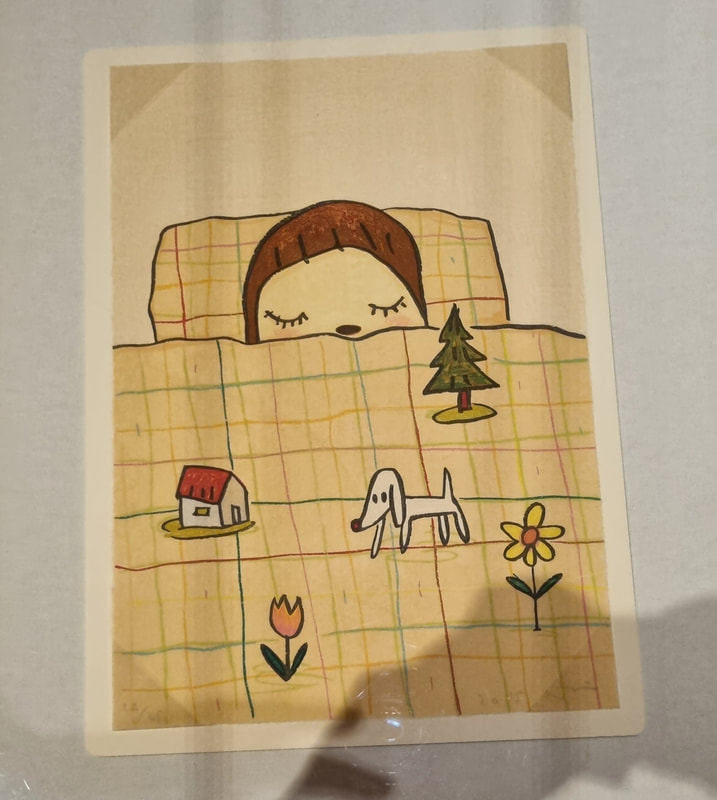 Cuteness has a similar problem as humour but there are works by Nara Yoshitomo such as Dream Time (above) that combine both but with a very beguiling effect. It has a great balance of colour and I like the geometric patterns on the duvet cover that set off the childlike images that are, presumably, being dreamed by the main character. You immediately identify with the central figure, or I do anyway. They look very peaceful.
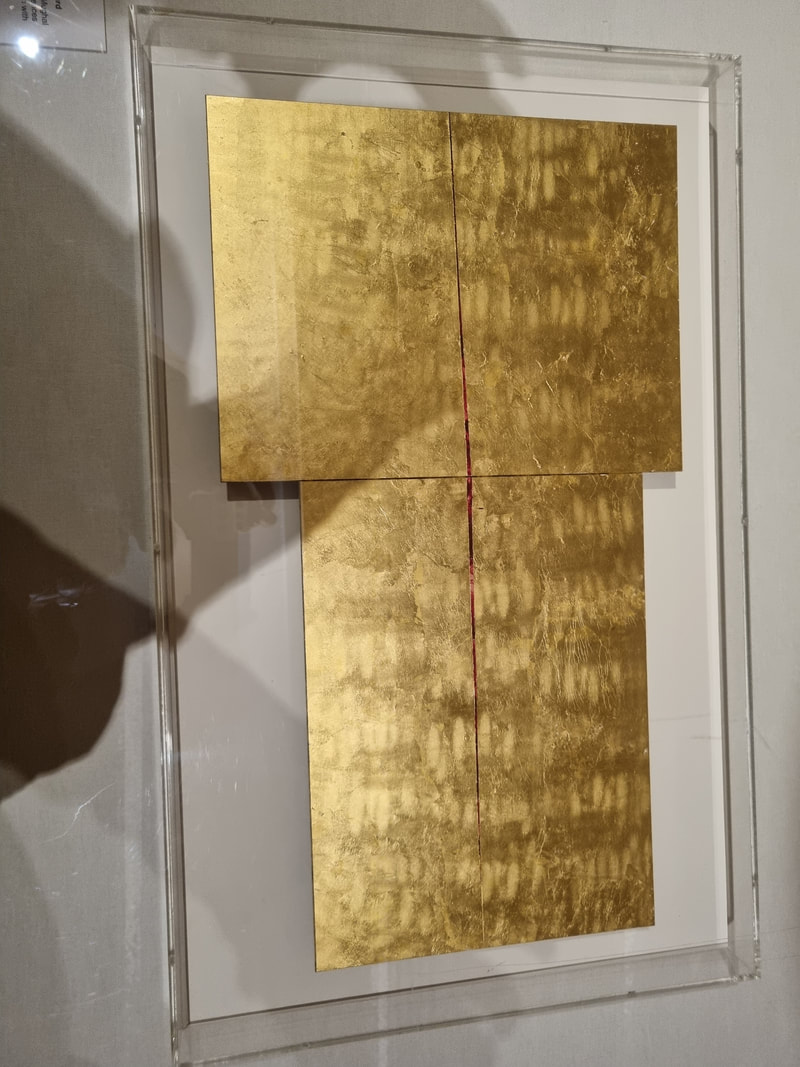
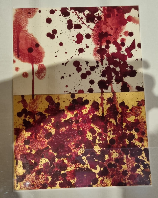
When you think of works on paper you have ideas like sketch and minimal, but like with Seidler, Imran Querishi produces these two sumptuous pieces (above). The patterned gold on the left is very striking. It shines and sparkles and you can't help but be drawn in. It has organic patterns in it that maintain the eye. The one of the right is more violent with these blood like spatters. I do like the way the pieces is divided between the gold and the white. You could project your own story onto that (as you can with all good art). 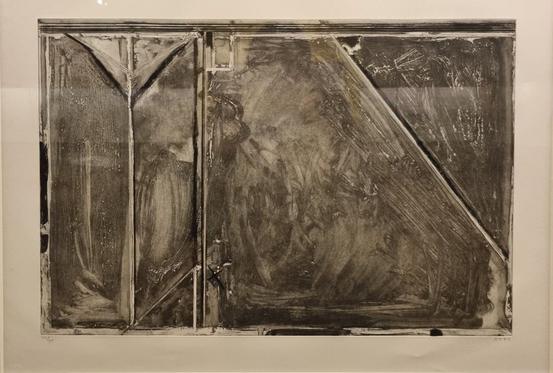 Richard Diebenkorn is famous for his sort of flat planar landscapes and you can read this piece above as one, as indeed the title of it says you should. It is quite simple just washes of gray with stripes of white and black dissecting it. The different intensities of wash with the bold lines make for a very interesting image. I particularly like the smaller shapes at the top, but there is something about the whole thing which I got lost in for quite a while. 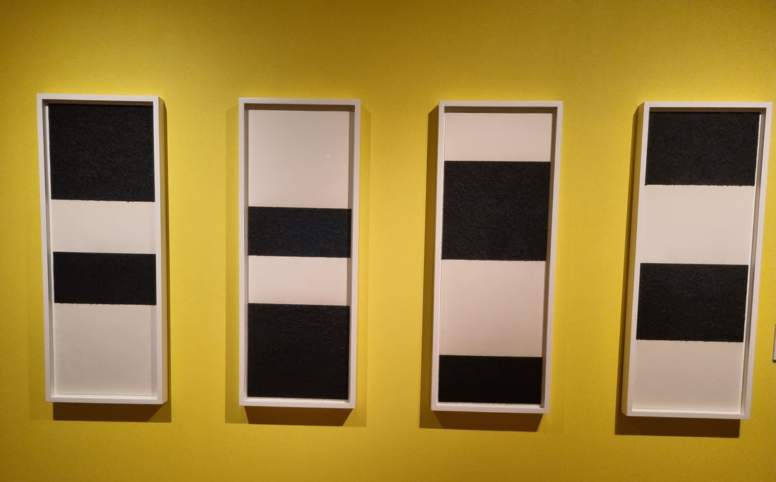 Simplicity can be extremely effective. People like patterns. I like patterns (I'm a big fan of Agnes Martin) and so Richard Serra's Reversal series (above) does this extremely well. It is an example of how just one of the series (these 4 of a series of at least 10) would not work as well. Although they are quite stark on themselves its the way they pay of each other and take your eye up and down that really works. I often wonder with series like this to what extent the artist intended them all to be displayed together or whether they were just enjoying riffing on a theme. I would quite like to see all of the series together that would be even more impressive. 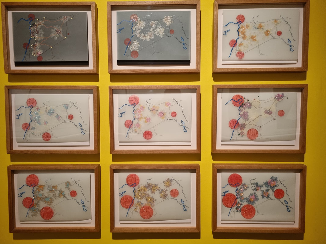 Another series that benefits from being together is Tiffany Chung's series (above). the changing patterns and lines, play off each other. In this case though each work of the series would stand well on its own. The interplay of red, god and blue makes for a sort of abstract flower like arrangement that reminded me slightly of Chinese flower paintings. When you read the label though your perception of the work completely changes. Its called UNCHR Red Dot Series- tracking the Syrian Humanitarian crisis. The work in fact shows the mass movement of people called by the civil war in Syria. And just like that what was just quite a pretty collage turns into something else. I like that. I often enjoy how knowing what a piece of work is about can completely change how you perceive this. Sometimes it can ruin it (and I have ranted about poor labelling before). It does not in this case.
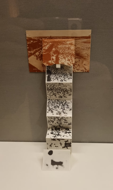
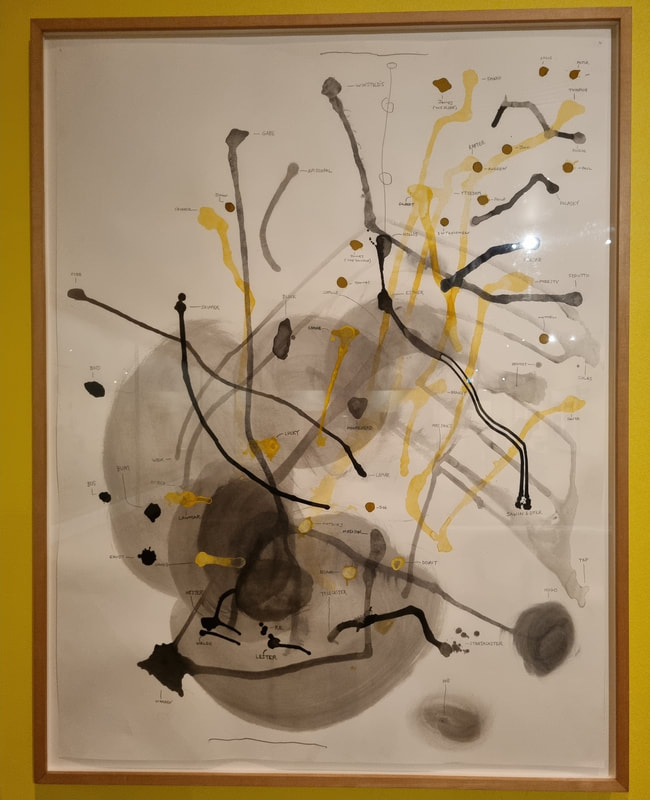
This is called trompe l'oeil a fancy work for optical illusion. Its difficult to do and I am always impressed when I see it. Very different to this is Al Taylors Peabody group. I like the image. I like the lines, the smudges of wash, the contrast between gray, yellow and black. I also like maps and particularly imagined maps and this is what this is. You can just about see the feint names marking parts of the image. These are made up names and create a sort of imagined connection and map. I like this very much and may steal it. 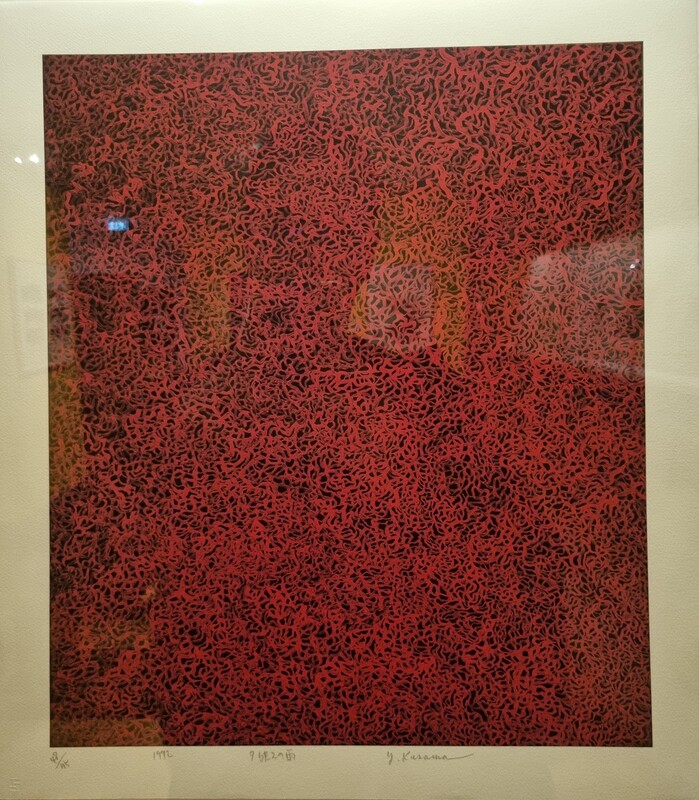 I will leave you with Kusama Yayol's sumptuous Rain in Evening Glow (above). Which is somehow comforting and calming, at least I found it so. This and the others featured here are just my personal highlights from what I think is an excellent show. Go along, decide for yourself.
0 Comments
Leave a Reply. |
Archives
June 2024
Categories |
 RSS Feed