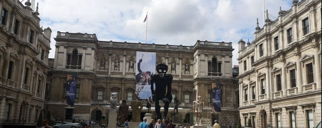
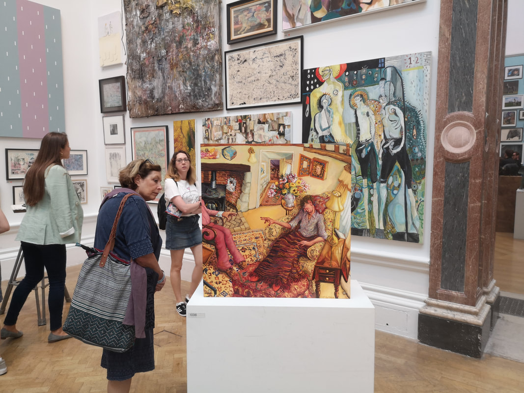
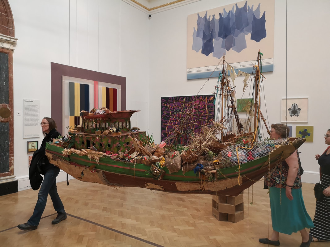
 The Royal Academy's Summer Exhibition is back, as a coruscating assault on the sense. Once you have made your way into the main building and past the strange robot skeleton (above) you are greeted with the usual coloured walls and large array of paintings, prints, sculptures and things that fit into none of these categories. I have blogged about this extensively in the past but am only going to do one post this year. There are large number of tips for seeing the Summer exhibition but my own way of doing it is as follows. Resign yourself to the fact that you cannot see everything. Firstly because there is just too much and secondly because not everything is worth seeing. If possible go on a weekday, it is less crowded. Tuesday's are good. Most people work Tuesday. Walk through the show, gently clocking those works that seem good. Either for later inspection or if you feel particularly drawn to them, straight away. Because of the way the show is hung, things are at odd positions, I therefore wander through in a number of different directions, and always notice something different. Finally, I select a few works before hand and try and find them. This is not as easy as it seems. Well the result of this year's trawl is as follows.
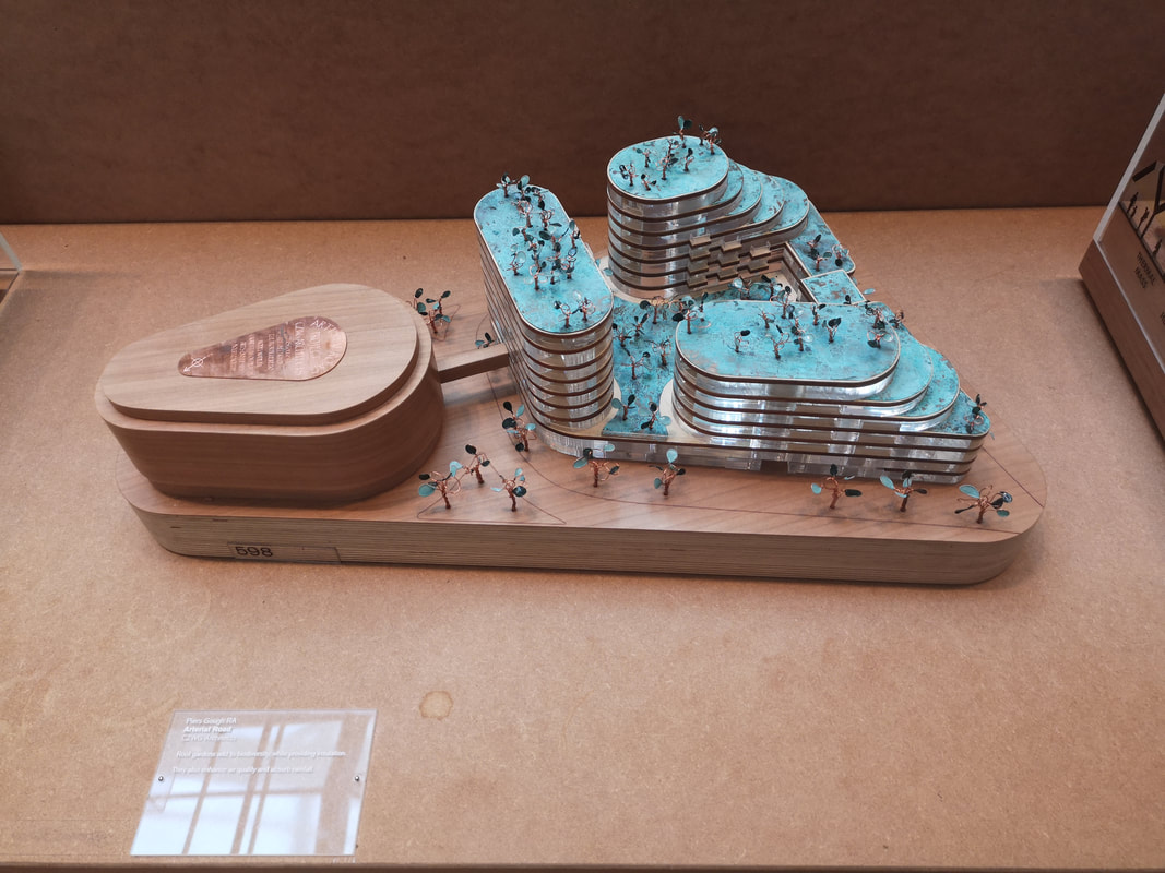
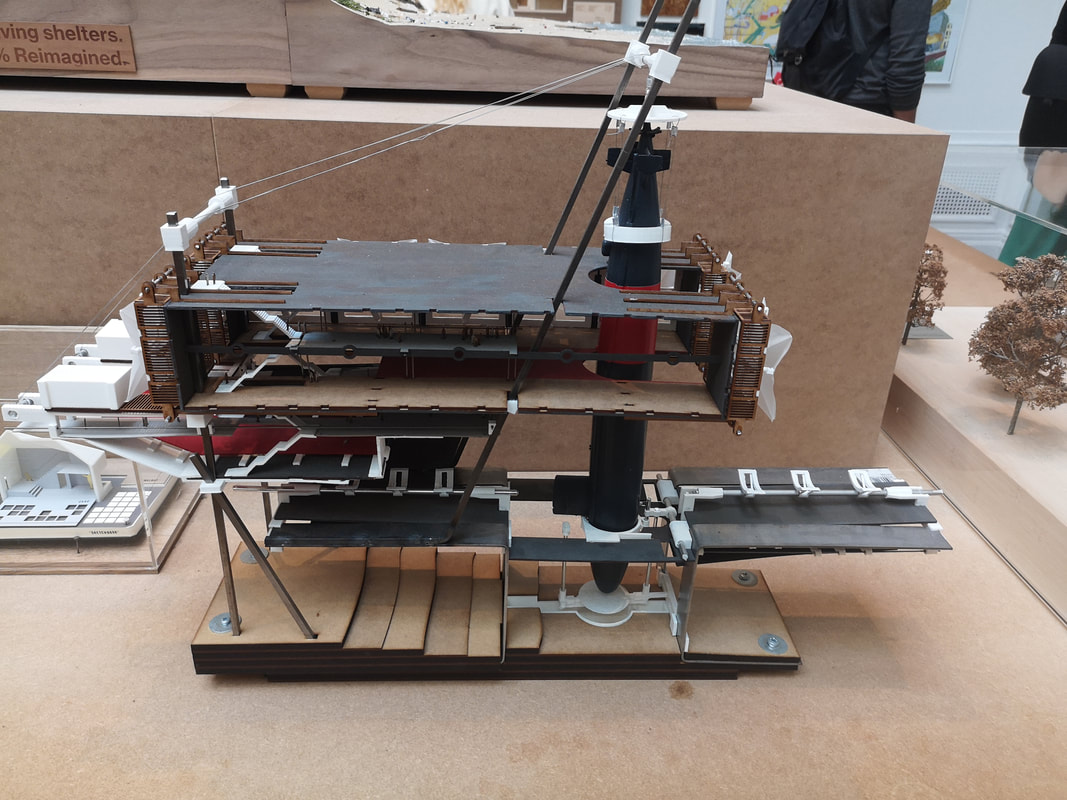
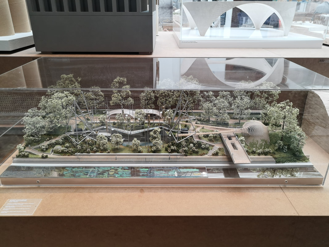
I shall start with the architecture. Often my favourite room. It is full of interesting ideas, brought to life with a high degree of skill and attention to detail. The architectural models, the good ones at least, are desirable both as artistic objects but also as concepts and the promise of something bigger. There were many I enjoyed but have decided to limit myself on this blog to just four. There was a theme in this year's exhibition of environmentalism and sustainability and this was reflected in what was on offer such as Piers Gough's Arterial Road (above left) which is all about roof gardens. The little trees are made I think of wire and copper and look like little earrings or other jewelry. I like also the stacked nature of the building with the green, bronze and then glowing perspex intervening layers. Suitably Jules Verne Sci-Fi esq in appearance is Katie Cunningham's design for a nuclear submarine reactor removal facility complete with public promenade (above right). It has that space station, battleship feel that appeals to me but I also enjoy the idea that there could be a public space in such a facility. The concept of trotting around above such delicate nuclear work creates a thrill but sadly, I suspect, one that will never come off.
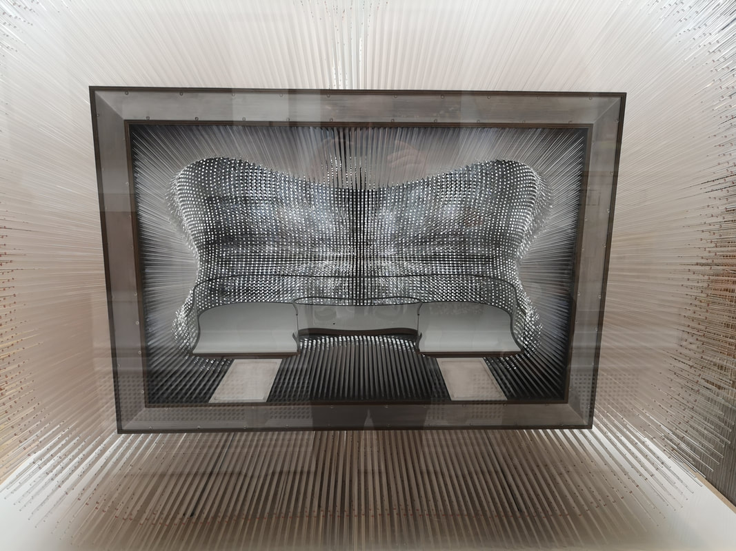
I like London Zoo. I like the aviary that sits beside the canal. I always enjoy the few pigeons that have snuck in there and are hanging out with the exotic birds. I was therefore intrigued to see Lord Foster's proposal for it's re-purposing as a monkey sanctuary (above left). It is a pleasing looking design complete with delicate trees, people and tiny swinging monkeys. The strip across the bottom, where I think the canal would be, contains detailed information about the design which is a nice touch.. I looks like a good design and I found myself wanting it to be built and to go around it. The next piece is not so much architecture as sculpture. It is made of a series of optic fibers arranged to give carved out interior. It is difficult to capture the shape and its effect properly in photography and I have not really succeeded (above right) but is has almost a cross between a spiritual and disco effect. It is apparently an idea for a seed bank by Thomas Heatherwick.
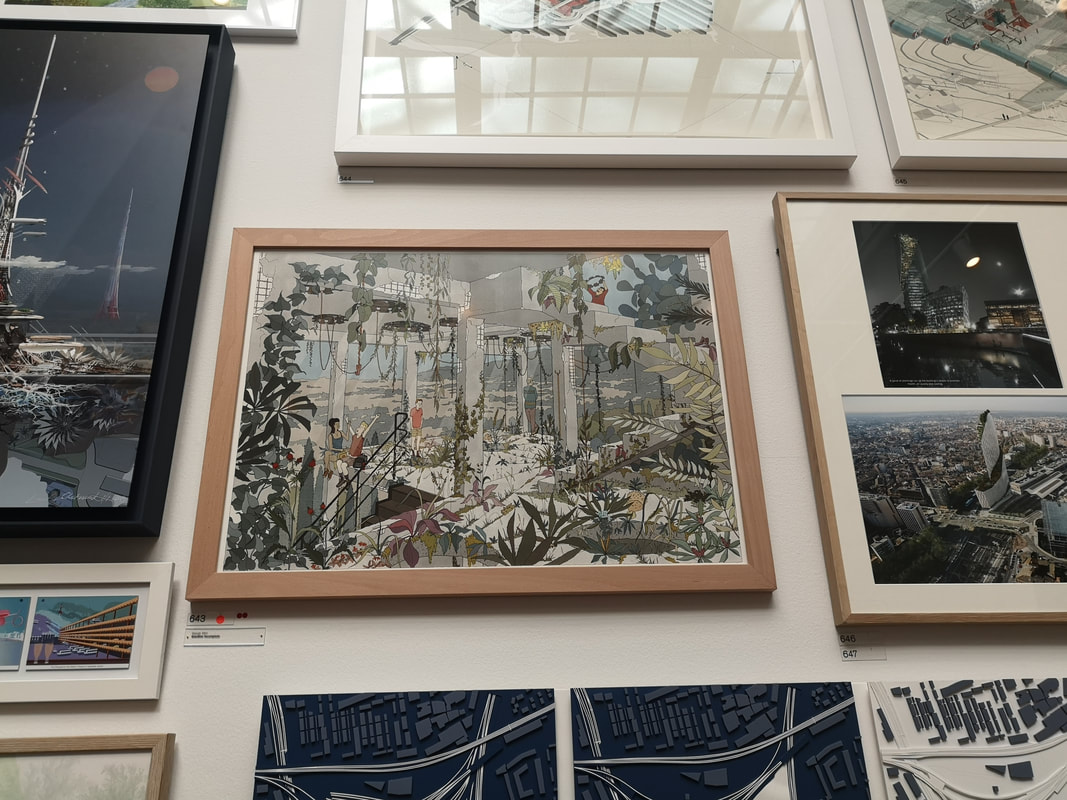
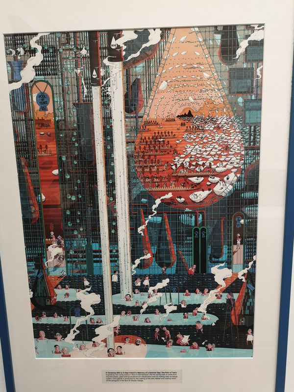
In a not to dissimilar style but much more steam-punk / dystopian future is Jason Hon Lun Ho's, The Pool of Tears (above right). The tears in this case being the both literal and metaphorical and the theme of climate change made very clear. I like the circularity of it. They way the elements of the picture lead into themselves. Anyway, enough architecture and affiliated ephemera. Onto the proper art.
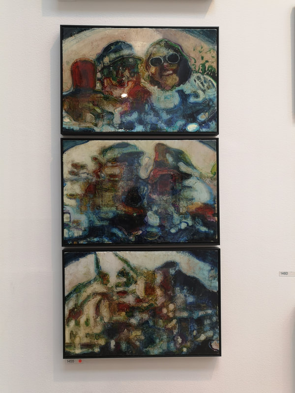
touchingly and powerfully sets out the effect of Parkinsons. This is done both in the central figure but also the slightly distorted view of the whole thing. There is an excellent second touch. You can just about see in this picture an eye at the end of the corridor, looking through the door at us. There is a whole second picture behind, of a second female figure (presumably the mother) of which only the eye can be seen from the front. A nice innovation. Triptychs and diptychs work really well. I keep thinking I should do some but I never seem to have an idea I think would work. Above left is a good example of a triptych in what appears to be an increasing abstracted selfie of a smug couple skiing. This assumption is supported by the name of the piece Graduation, its producer being Christopher Oldfield. It had sold, which is not a surprise. I like the blurry effect of the paint and the way that this is applied, the indistinct nature of the subjects and a good choice of dominate colours, blue and scarletty red.
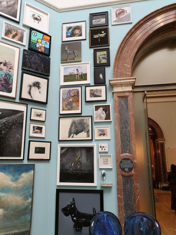
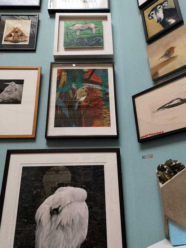
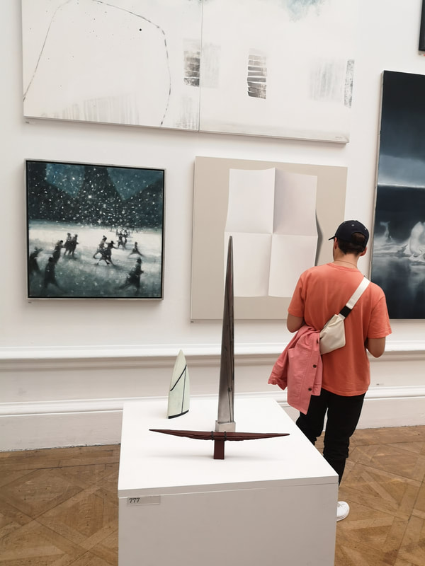
Now these two pictures demonstrate the slight animal obsession that featured in this exhibit. Particular small pictures of animals which were in preponderance as you can see of the above left. The small sheep appeals to me as does the very tiny dachshund. Can you see it? I'll give you a clue, the elephant have looked at it. Not just animals but birds too and I was particularly enamoured of, is it a wren, some kind of tit? anyway the one centre of the above right and is the work of Matt Collishaw. The muted colourful background is great, as is the slight fackout. The texture makes you think it is an oddly coloured tree whereas in fact you get closer (you have to be quite tall to do that) and then you see it is a nail hanging out of a graffitied wall.
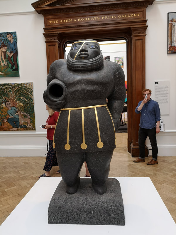
Simpler, more minimal and monumental is this fine figure clutching an empty vase (above right). It is called the scarred one, presumably due to the gold line that diagonally bisects the head. It has a great solidity to it, assisted by it Limestone material. Grey and Gold is always an excellent combination, and you end up wondering what that vase is for. The artist is Benedict Byrne.
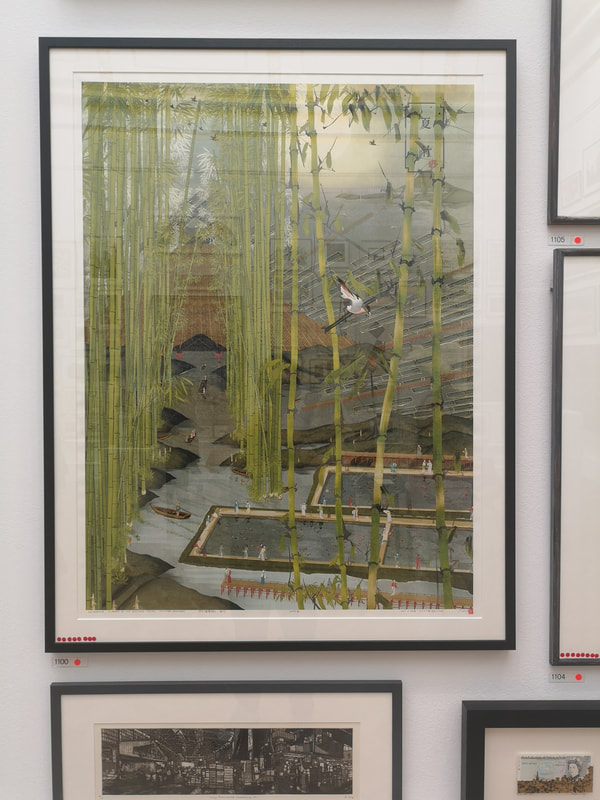
The way to really cash in as an artist on the Summer Exhibition is to sell prints. If you produce a good and interesting print you can sell multiple copies. You can come away with quite a lot of money. A print that sold well that I also like is Freja Lijia Bao's - Splendour - A Dream of Eastern Capital-Summer Bamboo (above left). It quite an unwieldy title for what is quite a beautiful piece. Those great towering bamboos striking up out of grey ground, with a classic Crane flying past, all dwarfing the tiny people. It is dreamlike, Bao has fulfilled her own brief. I like little constructions. This one (above left) is by Stuart Wroe (with the unexciting name of untitled 1). It is a cityscape, presented as though you are looking through a constructed building, at least that how it appears to me. At the bottom are these tiny oil barrels. Every time I look at it I see more tiny details. The dark wood colour appeals to me.
I have managed to capture a number of works in the other picture (above right). There is a Bill Jacklin snowscape in the left hand corer. These two matching sail like sculptures and one horizontal piece. I like them all and they work of Ann Christopher. Simple lines, elegant constructed.
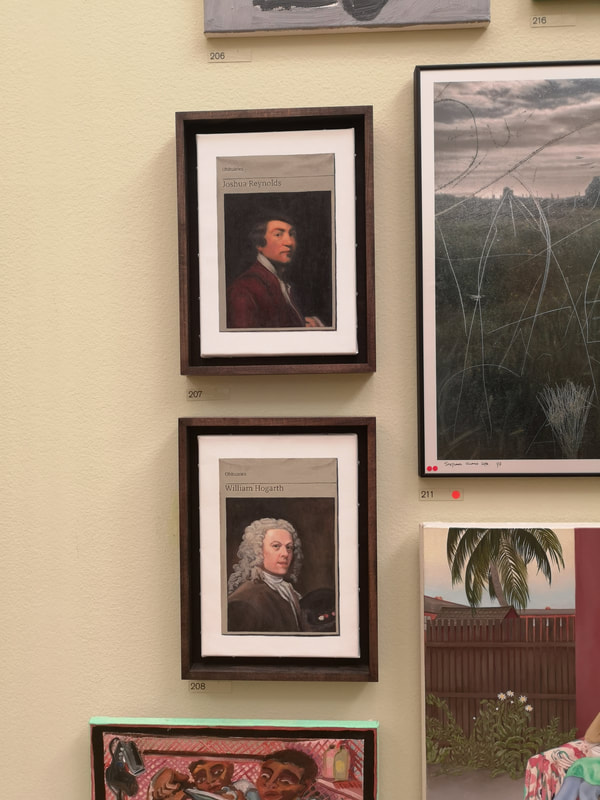
Nice to be in the show but unless you knew they were there I imagine most people would miss them. Also you cannot see the detail, which is a shame because the detail is superb on Alastair's work. Those elements are all painting on by the way, nothing is stuck on the pieces. Hugh was easier to find, excellent and primly displayed with two founders of the RA gazing out of us . I have spent many weeks seeing these two paintings produced so it was thrill to see them in such a show.
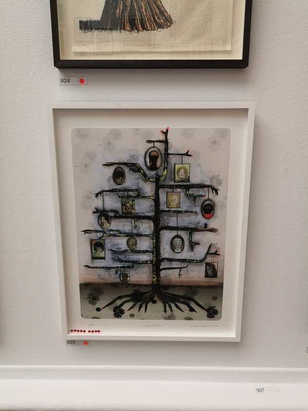
Another successful print comes to us courtesy of Cathie Pilkington with her Lady Garden (above left). It is elegant piece and I like the sort of blotchy texture on the background as well as the fir tree geometric construction of the tree, with the female faces hanging off the branches like Christmas baubles (presumably purposely).
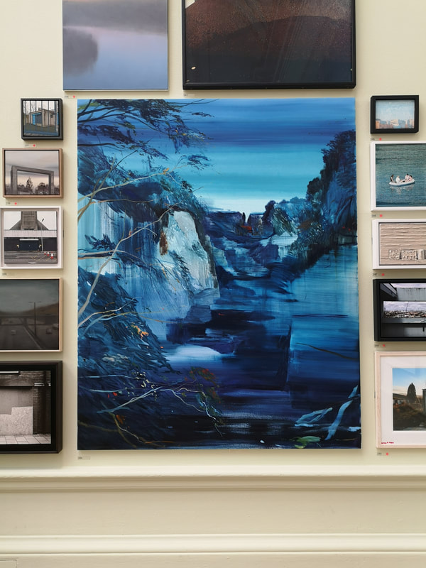
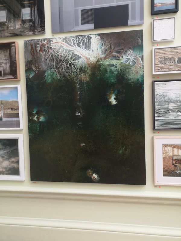
Two big paintings now. Big paintings can make quite an impact but then when you get closer they can be disappointing. These did not fall into that trap. Calum McClure's appropriately Fissure in Blue (above left) is wonderfully calming. I like the way there are blocks different blue tones, especially in the water, the way the cliffs stand out and the little sparks of colour in the trees. The other one is from Michael Porter (above left). It reminds me a little of Michael Andrews. I am not sure exactly what it is, possibly it is a seascape. The neuron like top half of the painting, that bleeds into the dark bottom half. An almost one colour dominant part of a painting is something I've never had the confidence to do. I should, but what you need to do, is as Porter does, is with little pockets to break and subtle tones withing the colour.  I shall leave you with an excellent piece from the superb Frank Bowling (above). I particularly appreciate his use of purple. This is here for two reasons. The first is I like it. The second is there is a show of his work at Tate Britain, which I shall be talking about next week.
0 Comments
Leave a Reply. |
Archives
June 2024
Categories |

 RSS Feed