|
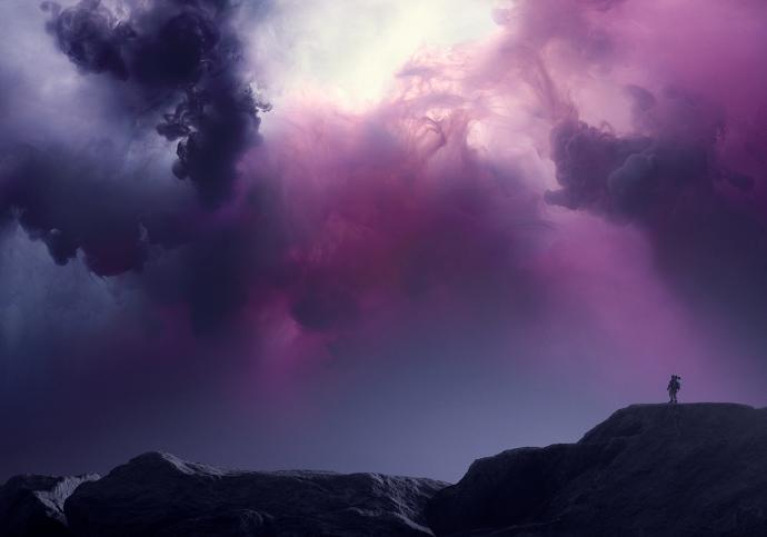
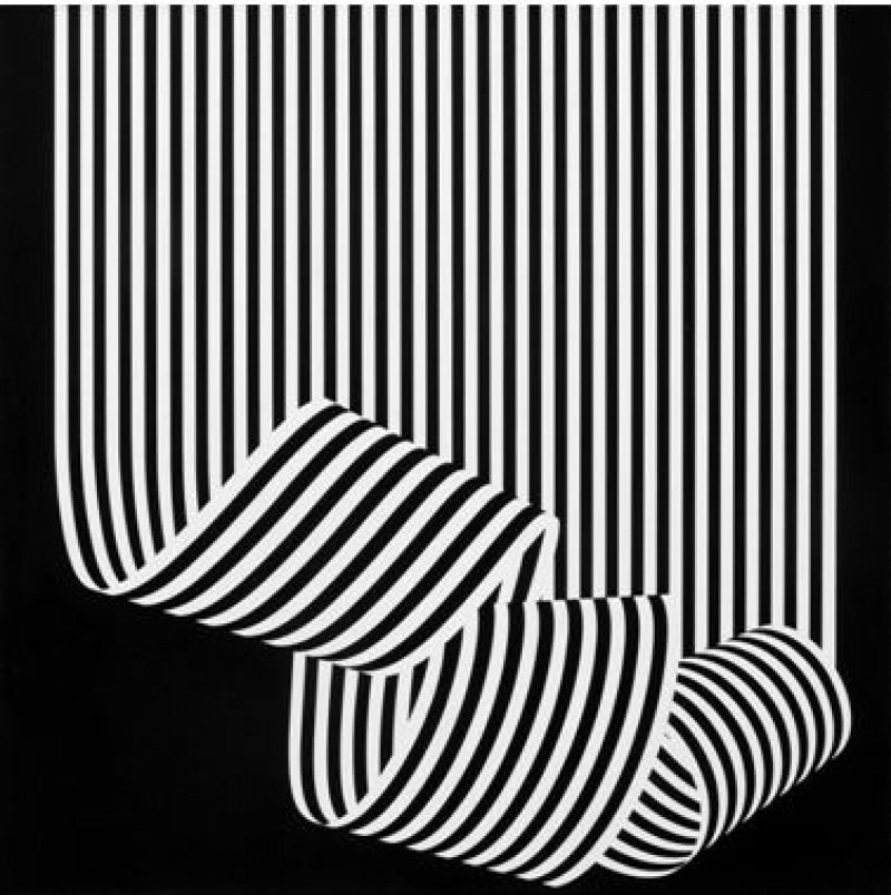
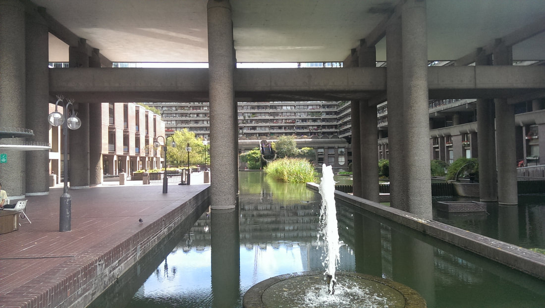
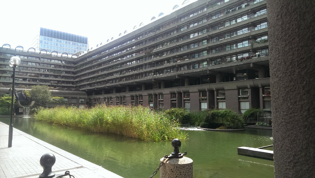
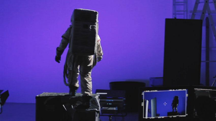
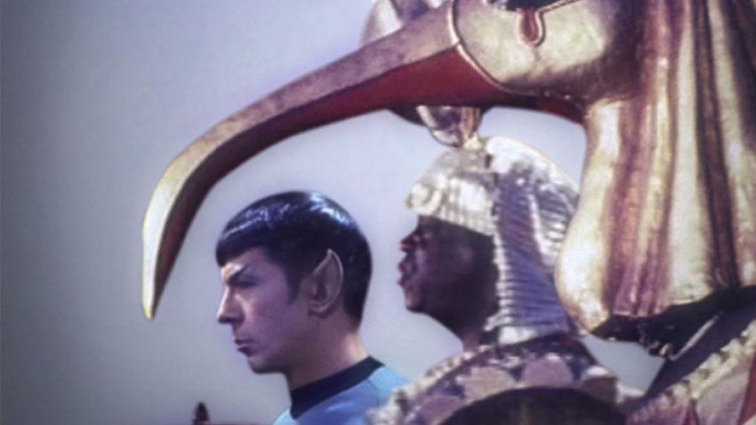
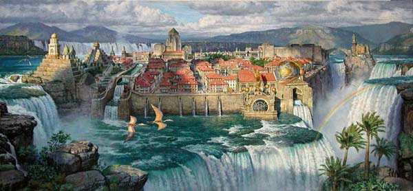
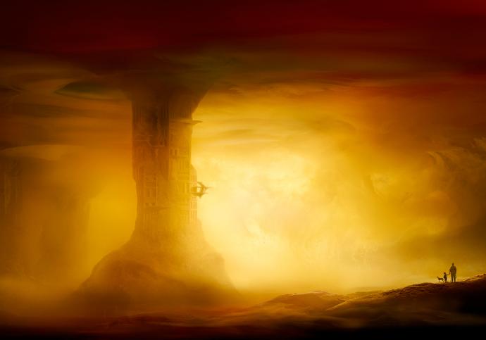
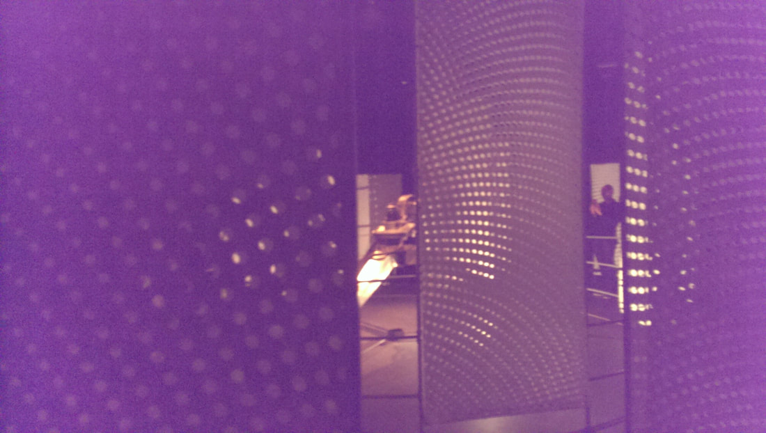
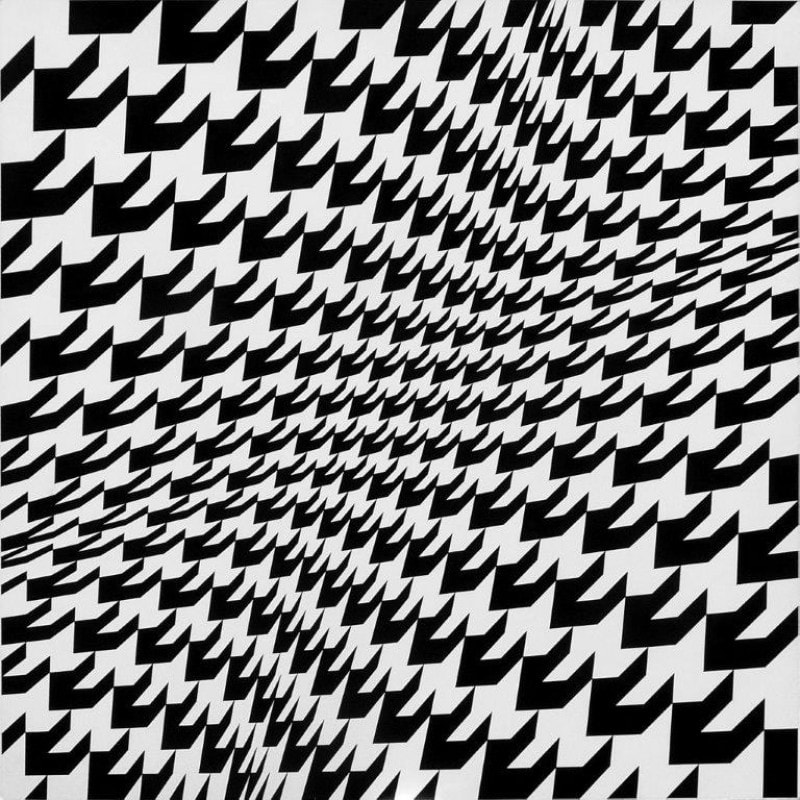
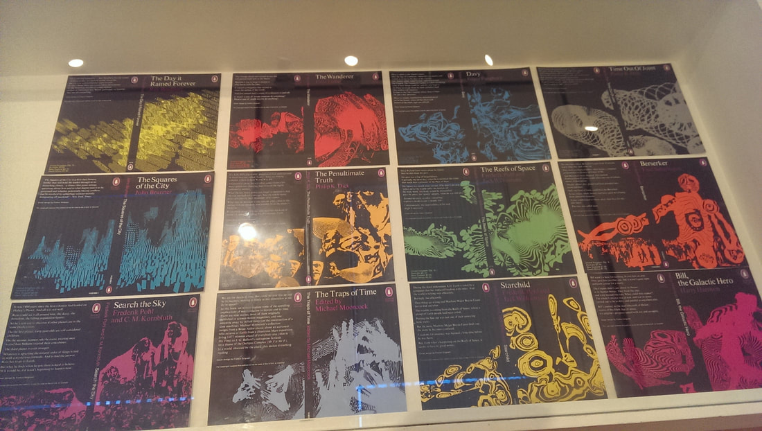
Continuing the grand tradition of public service this is a review of two exhibitions that have now finished. I have been catching up on my art viewing having spent most of the summer preparing for my show. There is a tenuous link between these two shows which I shall shortly reveal. I have not been to the Barbican for years and never before to the gallery. I was lured their by the Into the Unkown, a journey through science fiction exhibition. The barbican with its modernist brutalist lines, appearing like something from the set of 2001 or Total Recall is a very good venue for such a show. It is a cool, dark, cavernous space, with great concrete pillars and wall (as shown above for example). If you are a fan of sci-fi and films the exhibition was very interesting. There were original props and costumes from films such as Moon, Star-Wars, Star Trek and Inception. There were miniatures and more interesting to me concept art and designs for the film and the sets. One of the most interesting was HR Geiger designs for a Dune film that was never made. What a film would that have been. In addition to this there were sci-fi book covers from various eras (see above). The bit I most enjoyed was the art, book covers and models from the Victorian era of Sci-fi. Models of the Nautilus, great cities with bi-planes flying through, airships and my favourite Dinotopia, a fantasy land of people living with Dinosaurs (see above). I really like these very complex city pictures and they used to fire my mind in my youth. As well as all this there is some art commissioned espsecially for the show. Several works by Dan Tobin Smith (above left and top of the blog, left), dusty, misty pictures of fantastic or futuristic landscapes. Then down in the basement an installation by Conrad Shawcross called the Light of the Machine (above right) in which a very sci-fi looking robotic arms moves a light which cast interesting shadows through the paper screens that surround it. Not an easy thing to find though as the Barbican is a fair old maze. After the show I wondered outside to the lakeside. A most pleasant aspect and various elements of it like the be-flowered balconies and the waterfalls running out of the building reminded me of the Dinotopia picture I had just seen. Now onto Franco Grigani at the Estoric. You will almost certainly know his work as he came up with the woolmark logo (above right). He was chair of the committee to decide on it but they were different times. It’s a good logo though. His work is mostly of a similar style. Black and white geometric lines and designs several of which do funny and alarming things to the eyes (above). All impressively designed and eye catching but don’t give you much more than that. I can appreciate the mathematics thing in art but after a few moments of appreciating the idea there is nothing else left for me. What is the link I here you ask. Well at the Sci-Fi show were several book coves. I was therefore amused to see that Grigani had designed several Sci-Fi book covers all of which I liked (above). They were the best things in the show.
0 Comments
Leave a Reply. |
Archives
June 2024
Categories |

 RSS Feed