William Mackenzie
  • Gallery
  • Blog
  • Podcast
  • About Me & Contact

The Best of the Others

11/13/2016

0 Comments

 
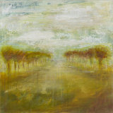
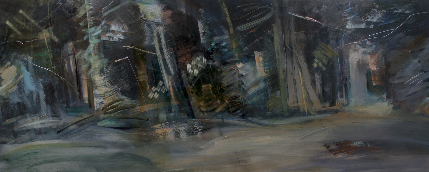
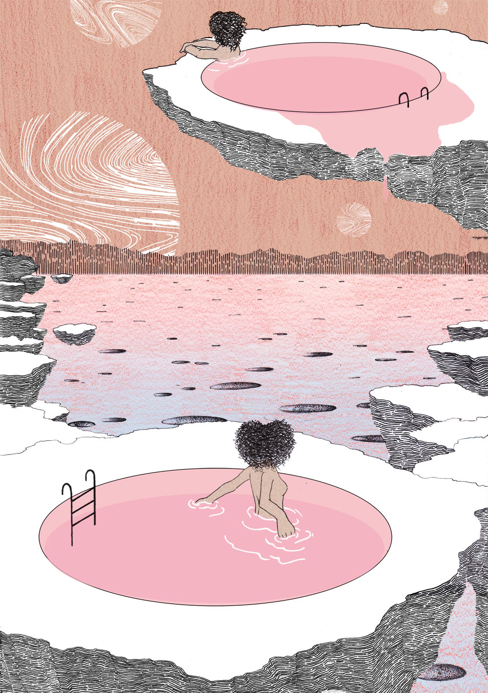
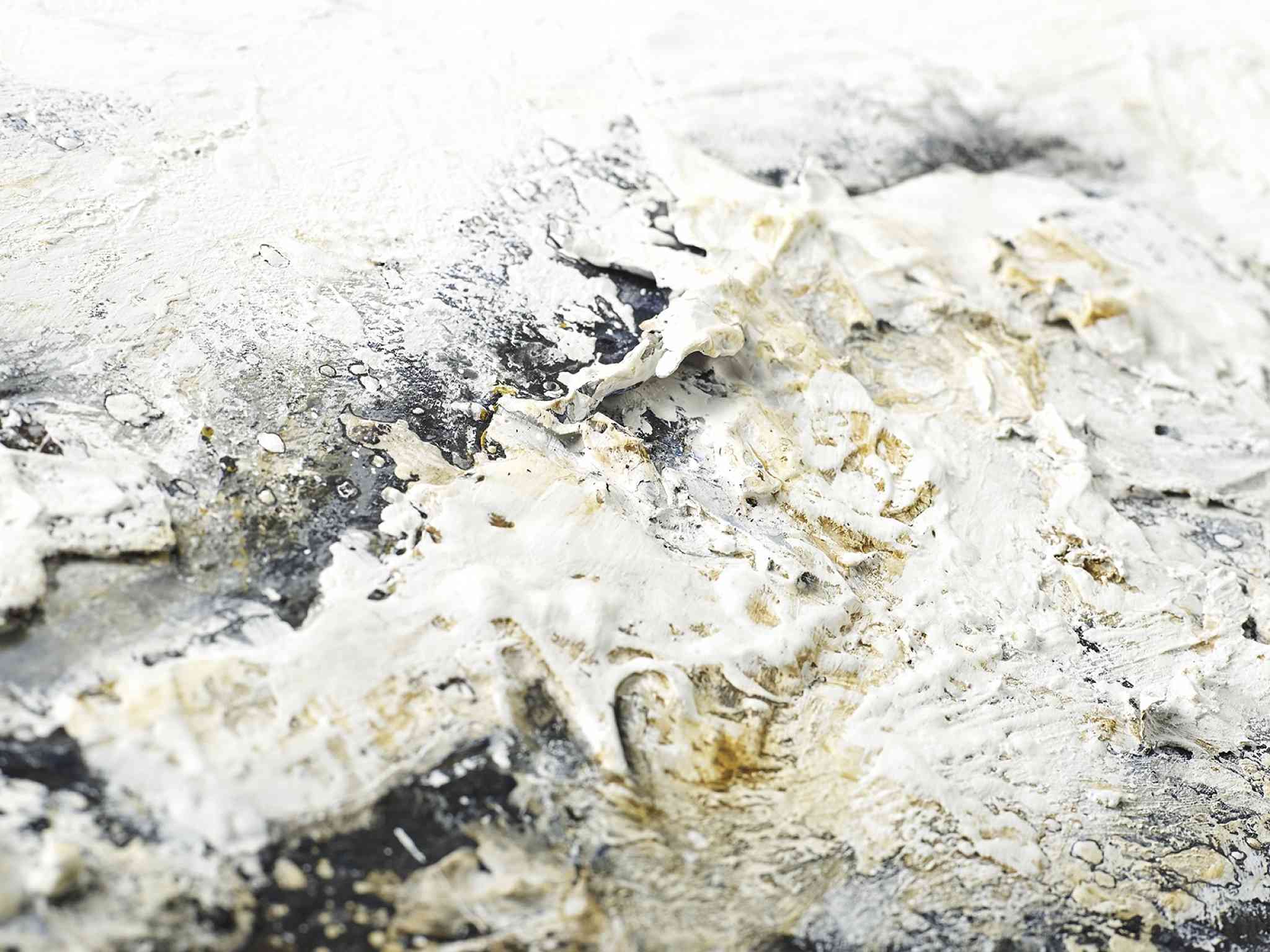
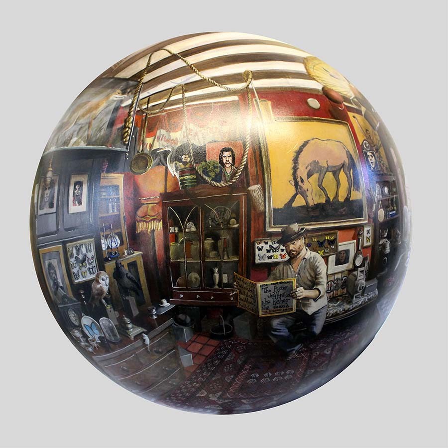
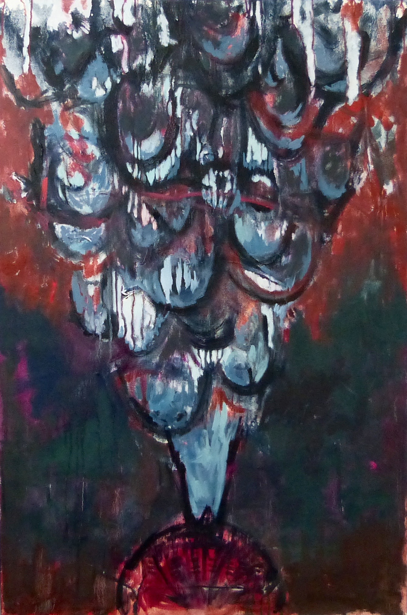
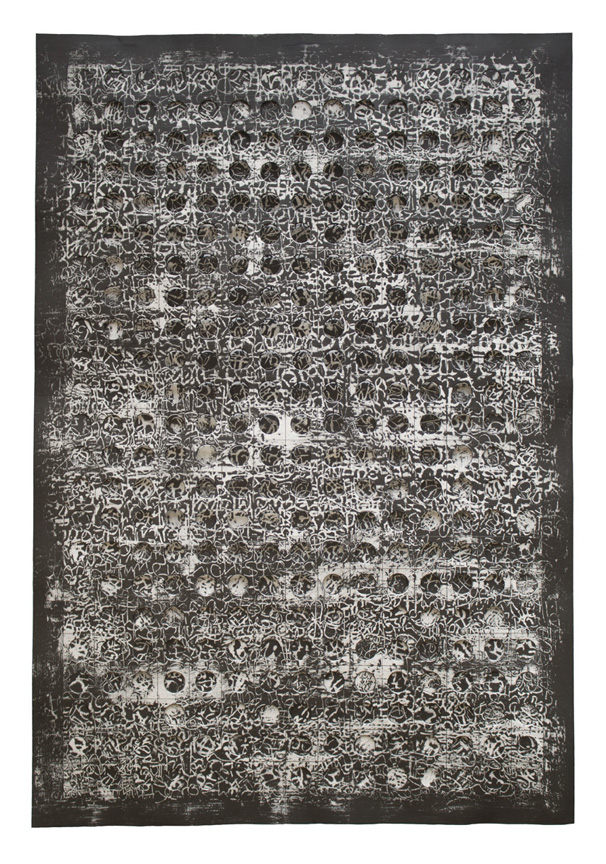
It has been quite some time now but earlier in October I attended the other art fair.  I found it a difficult fair to go round.  It is very bright,  it is very crowded,  it is very nosy,  it has stark white walls.  Much of the art work is indifferent. 

​I do enjoy going though as there are always some people who shine out of the dross.  This year the select few are. 
Picture
Emma Rose.  Emma produces these nice dreamy almost Turneresq landscapes (left).  The work has a nice quite quality.  It doesn't hit you round the head with (for instance) a naked woman with an animal head.  It just quietly draws you in with subtle blending of different colour tones.  

This is good art you can actually live with. 
Charlotte E Dey.   Charlotte says she is an Illustrator.  Quite what the difference between artist and illustrator is has always been something that slightly baffles me but Charlotte is also definitely and artist in my view.

She produces this deceptively simple, quirky surreal landscapes one of my favourites can be seen right.   Her other work is in a similar style, line drawing of strange moss covered sculptures, Esher type geographies and buildings but all of it characteristically her.  

Actually this is something you can say for everyone or at the Other Art Fair is that they all have developed their own characteristic style.  The more successful ones have, in my view something that makes them a little bit more distinctive. 

She also does ceramics,  nice gold edged plates with interesting line illustrations on them.  He drawings are better though. 

Also until now I have always wondered what the point of Tumblr was.   Charlotte's website answers that question.  
Picture
Picture
Caroline Hall.   I am a fan of abstracted landscapes and this is what Caroline does and the picture on the left is a good example.  Thy have a sort of metallic sheen and smoothness to them which in her hands I really quite like.  Some of her work is a great deal more abstract than others but all of it is quite interesting and though provoking. 
Will Teather.  It is not easy to produce paintings in a non traditional format and have it look good.  It can too easily look try hard and over done.  Will Teather manages to avoid this trap.  

The picture on the right is in fact from a globe (or sphere) painted in arcylic, giving you this odd, doorknob like reflection of this seemingly normal but actually quite strange indoor scenes.    

Its an effective strategy and in the crowded art market coming up with a novelty that works is always to be welcome.  He does more classically presented pieces as well but it is the globes that are his forte.  It must take quite some skill to render the picture in the difficult perspectives required for this. 
Picture
Picture
Charlotte Black.  Charlotte Black produces this crusty, organic looking pieces that appear to be closes up of rocks, or strange alien landscapes.  

The one pictured on the left here reminds me of the sea becoming foam and washing up the beach.

The pieces on display at the art fair all had a very adept application of splashes of gold to bring a nice vivid contrast to the whole thing.  It would have been nice to see some of the black pieces in person that you can see on her website. 
Anita Ford.  The work seen on the right is one of her paperworks,  which I think are her best things.  
They are slightly three dimensional in that the layer with the holes in it stands on top of another layer.  Through the holes you can if you look close enough glimpse letters and words.  

The simplicity of the black and white married with the complexity of the covering design makes for a cohesive whole.  There is a solidity here which is appealing.  I actually managed to speak to the artist herself.  She explained that the pieces reflected her own struggles with going deaf.  

As we all art once you know this it changes your perception of the piece and I can see how the idea works and she has presented it well.  However it also works on its own without this context.  

Sitting on its own it is an attractive and mysterious piece.   She also does black and white drawings which are similar in style and have many of the same qualities but the paperworks are superior.  Again a good use of novelty. 
Picture
Picture
I have saved my favourite to last,  Sophie Zhang.  Sophie has made the basic error of not having a website.  She also presented me with a postcard, while having a nice version of one of her pieces on it has no contact details on it at all.  

This is a basic error yet someone makes it every year.  I don't understand why you would go to the effort of going to the art fair but not have a website.  Some of the sale and interest has got to come from people after the event. 

Anyway, her art is good.  She produces these lose slightly abstracted pictures.  I couldn't find a photo of my favourite of her's which is called Fish in Light Red and Blue but you can see from the picture to the left the style.   

Done in oil they are lose strong marks over and blending with the background.  They are (and you will have to trust me on this) something that looks much better than it photographs.  There is a playful energy about her work (contrasting with her shy in person demeanor).  She may be someone to watch, but then without anyway to go to find out where she will be exhibiting this may prove difficult to do. 
The above are not everyone I like.  They are everyone I like whose websites (or elsewhere) would consent to provide me with photos of their work that are compatible with this blog.  There are two more artists whose defense of their IP is more rigorous and prevents such activities.  They are:

Olivier Leger:  Oliver makes this very detailed drawings of animals, such as Orcas.  They are incredibly complex and on close inspection the whole is made up of a series of smaller intricate drawings such as water spouts, fish, giraffes etc.  There is a lot of skill on display here.  His pitch was good, a massive Orca original drawing you in and more reasonably priced prints to actually sell. 

Corinne Natel;  Lovely, splashy, organic colourful paintings.  They are like different waves of colour crashing into each other,  or attractive plumes of oil mixing.  Very pretty things.  

That's it folks.  
0 Comments


Leave a Reply.

      Keep in Touch

    Subscribe to Newsletter

    Archives

    January 2025
    September 2024
    July 2024
    June 2024
    May 2024
    April 2024
    March 2024
    February 2024
    January 2024
    August 2023
    July 2023
    June 2023
    May 2023
    March 2023
    February 2023
    December 2022
    November 2022
    July 2022
    June 2022
    May 2022
    April 2022
    October 2021
    September 2021
    July 2021
    June 2021
    April 2021
    March 2021
    February 2021
    December 2020
    October 2020
    May 2020
    April 2020
    January 2020
    December 2019
    November 2019
    October 2019
    September 2019
    August 2019
    July 2019
    June 2019
    May 2019
    April 2019
    March 2019
    February 2019
    January 2019
    December 2018
    November 2018
    October 2018
    September 2018
    August 2018
    July 2018
    June 2018
    May 2018
    April 2018
    March 2018
    February 2018
    January 2018
    December 2017
    November 2017
    October 2017
    September 2017
    August 2017
    July 2017
    June 2017
    May 2017
    April 2017
    March 2017
    February 2017
    January 2017
    December 2016
    November 2016
    October 2016
    September 2016
    August 2016
    July 2016
    June 2016
    May 2016
    April 2016
    March 2016
    February 2016
    January 2016
    December 2015
    November 2015
    October 2015
    September 2015
    August 2015
    July 2015
    June 2015

    Categories

    All

    RSS Feed

Proudly powered by Weebly
  • Gallery
  • Blog
  • Podcast
  • About Me & Contact