|
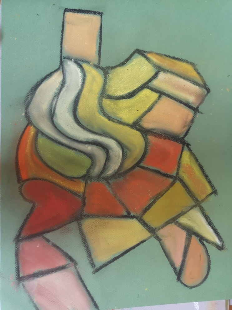
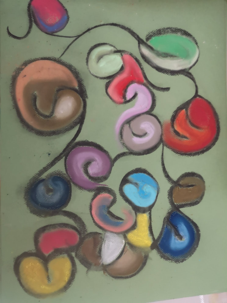
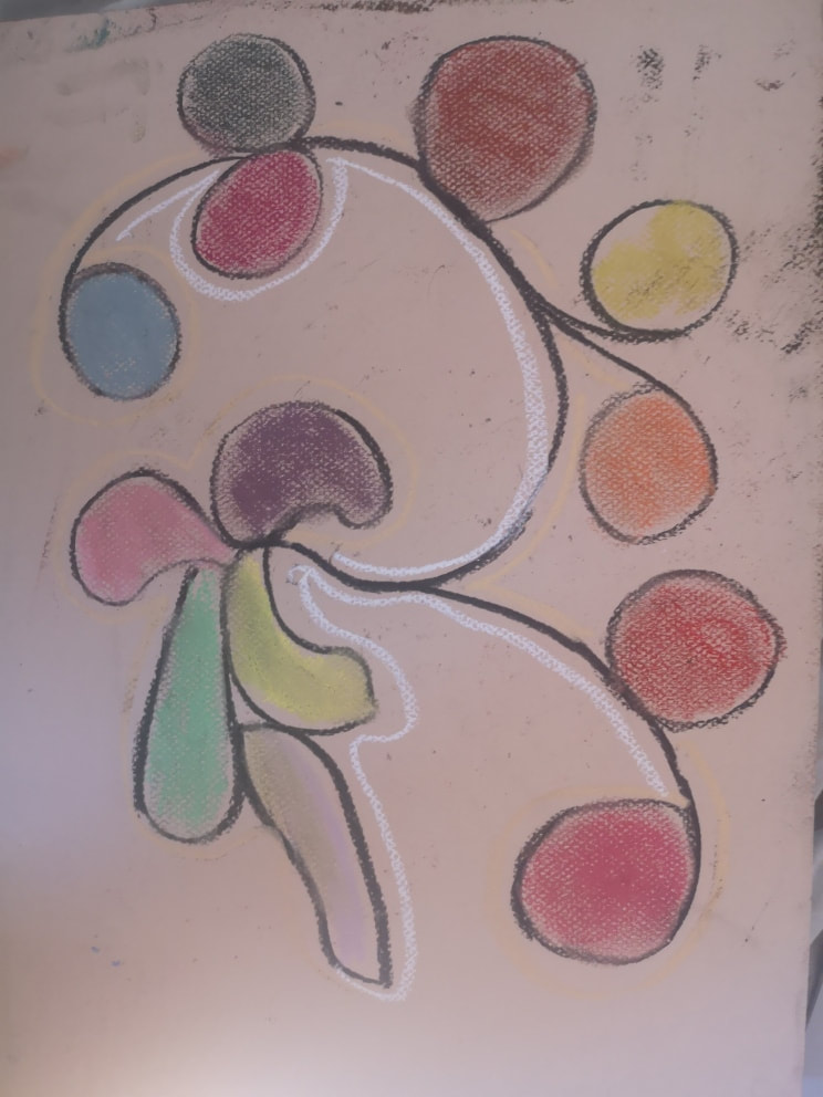
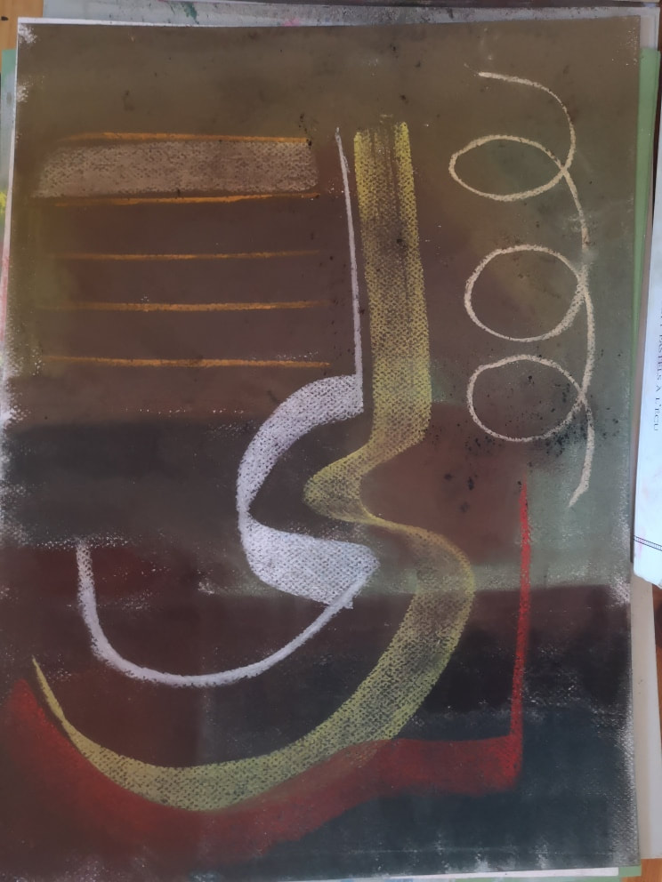
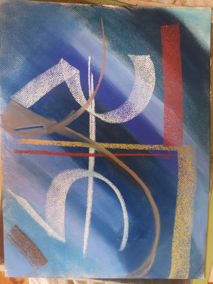
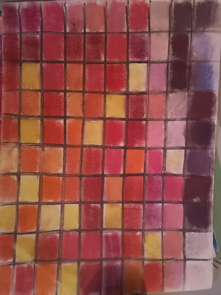
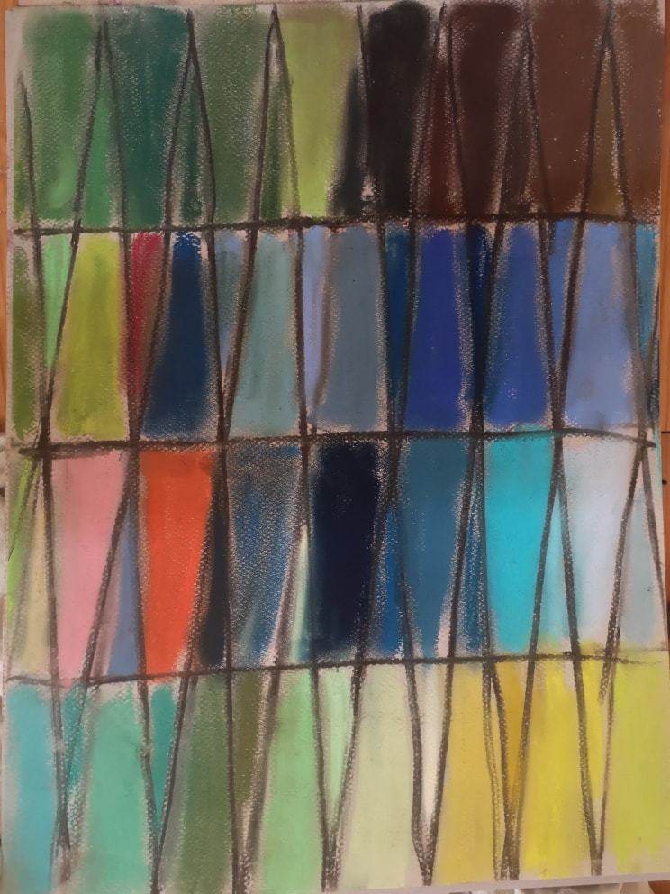
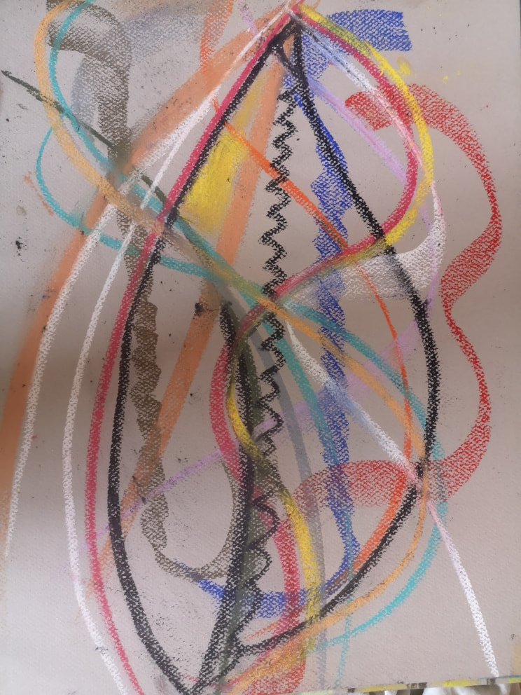
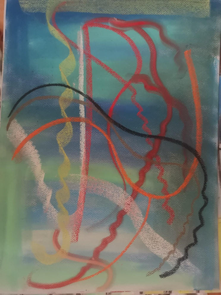
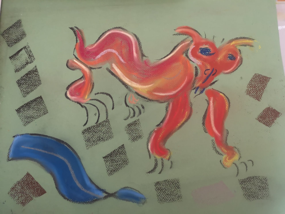
The in-and-out nature of lockdown has, in part, led me to explore a variety of different media. I spent many months conducting a rather maudlin exploration of watercolour and gauche. I then moved onto play with pastels. A few years ago, I was given a large 120-piece set of Sennelier soft pastels by some good friends of mine. I decided to use these and made a considered decision to make a more joyous and hopeful series. I called it the Road Up and posted it almost daily on my instagram feed. Pastels are joyously messy and very therapeutic to use. There were a number of themes in what I did. One, as can be seen above, is riffing on similar colour ranges, in this case red and yellow, encased in charcoal borders. The other theme, again featuring charcoal shapes, was the construction of florid designs that I would then infill either with solid colour (like the above right) or with a gradation of colours (like the above left). Often I would not consciously choose what I was going to do when I started, but would be either guided by instinct, the amount of time I had available or a strange desire not to leave out some of the pastels. Looking back on it now, I prefer the results of the above left but gained equal pleasure from producing both. The next theme was a design based on a field of colour. The field of colour would not be uniform but would again use blended colours from the same range, in this case brown (above left) and blue (above right). On top of these I formed sigils of various designs, the yellow gold pastel being a favourite. I particularly like the effect when you move the pastel in a wave or curve, with its longest edge pressed flat on the paper. You can see this in both of the above. Two of my favourite artists are Agnes Martin and Sonia Delaunay. They have been influences of mine for a while and both of them can be seen in this series. Never is this more obvious than in the above, where you have Martin's formal geometric shapes combined with Delaunay's bold, even brash colours. The red-themed squares (above left) are, I think, the more effective of the two and I did a number of these. The triangles are more of an experiment and were less successful. Again, they are very tactile and therapeutic to produce. Sometimes though, you just have to go a bit crazy and let out a burst of energy in high speed mark making on either a blank page (above left) or again on a field of colour. Some of my friends find these the best of these series, saying they have a tremendous sense of energy to them. I find them cathartic to do but to messy to contemplate afterwards. I prefer the above right, probably because it is calmer. Half the fun here though is applying the pastel in different ways and at different angles (and speeds). Of course, sometimes you have to draw a tiger/chinese dragon.
0 Comments
Leave a Reply. |
Archives
June 2024
Categories |
 RSS Feed