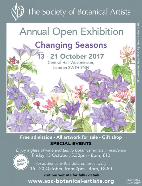
 The Society of Botanical Artists exhibition is one of my favourite of the year. My tip for artistic fashions is that this type of art is due for a comeback. There is something very modern about the sparseness and simplicity of the work against white paper. I am a big fan of Japanese art and this reminds me of this in a way. It has an old fashioned, amateur reputation which is entirely undeserved. There is a very high standard of talent and skill on display. I first went last year and bought the below by Sandra Wall Armitage, who is the president of the society and who I happened to meet when I went this year. 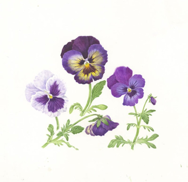 No doubt due to my patronage I was invited to the private view this year, so along I went. The theme this year was Change of Seasons and the standard is as high as ever. I was instantly gripped with a desire to purchase something and there was much to choose from. Interesting things happen when you go to a specialist show such as this. Because the style and subjects are similar it causes you to really focus. Slowly you begin to see the things you prefer, how the subject is set out, how depicted, the use of colour, the size, the application of paint. From all this preferences form. This show has the extra level of interest in that the society also judges on scientific merit, so how accurate is your picture compared to the plant. Awards are given to this. It therefore has two avenues of appeal. Unlike most shows, women are in the majority of artists. Who then did I like. You cannot take photos at the show so I have taken pictures, where available from the artists bio on the societies website. The pictures are often not the pictures I saw but give you an idea. If you want to see them, and I suggest you do, then go on down to Central Hall, in Westminster. The show is on until 17:00 on 22nd October. 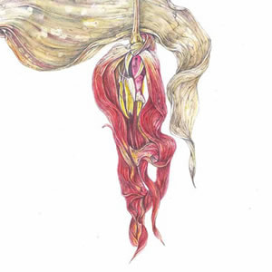 First out of the blocks, and we are going in alphabetical order, is Vicoria Braithwaite with a lovely picture of Tulips, or as the naming convention is to give the scientific name Tulipa 'Vaya Con Dios'. A sumptuous, large piece and at £3,450 pretty much the most expensive thing in the show and the quality is there to justify the price. Next we have Lynne Buckler, an example of whose work is above. She is interesting in that she combines pencil with watercolour. Actually the piece of hers that I liked best was this very succinct black and white picture of Italian Alder. It had a sort of warm, sparse simplicity and made my shortlist of things to buy. Indeed I am slightly regretting that I didn't. 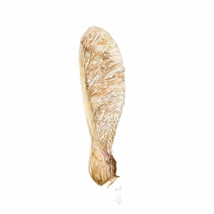 Gill Cann (example above) does a fine line in seeds, leaves and leaf debris. What attracted me more though was her Eucalyptus. It has a nice sort of spiky contrasted with soft quality which I think Gill does well. By the way not all the artists appear on the website, so for example Helen Cavalli's globe artichoke and Giovanni Cera's Labruso di Grasparossa (grapes) both of which are rendered such as to make you actively want to go out, buy such things and eat them, must go unlinked and un-illustrated. Hopefully though these snippets will tempt you to go and look them up for yourself. Likewise Helen Cousins who delicately renders the intricate folds of her Peony in Bloom with skillfully applied shades of pink. Not easy to do that. 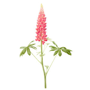 I can show you Angeline de Meester (see above), although the pictures in the exhibition that attracted me were a Rose, Gertrude Jekyll, and a Dahlia, Karma Chocolate. As possibly the picture above and the names give away her style is a single bloom is you like with lots of white space around it and then colour contrast. Particularly the Karma chocolate where you have this brown moving to purple. Mally Francis enticing, waxy Lemon must tantalise you as indeed must Sandra George who can wield a colour pencil to bring to life in this case Gladioli.  Have you heard of Iokta paper? Neither had I before I came across Amber Halsall's work, particularly her piece Autumn rain. The style and feel is very similar to the picture hyou see above with this sort of dirt and moss extending out from the subject matter. The paper itself has this yellowish quality, like velum but more so which aids the presentation. 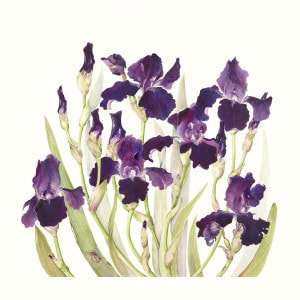 Irises make good paintings and Alice Harman had two such on display (above). They are a deep purple and this makes for a good contrast both with the blank white of the paper and the more subtle colours of the plant. Additionally they are an interesting shape. As such they are quite a common subject but if you are adept at your purple tones and your composition you can produce something quite special. 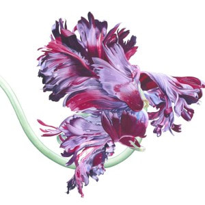 Elizabeth Hellman has a thing for Parrot flowers (like the above). She had several such on display indeed all five or her paintings were of excellent quality and had this vivid bright colour, focusing almost exclusively on the bloom. They are very eye catching but for me almost too bright. 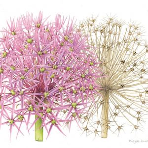 Bridgett James was another who made it onto my almost purchased list and this time I can actually show you a portion of the actual picture (See above). The original is wider and you can see the entire plants. I like the pinks and the shape but what I especially like, and made this picture stand out is the juxtaposition with the dead flower and the way one is arranged in front of the other. It is a clever piece of composition. 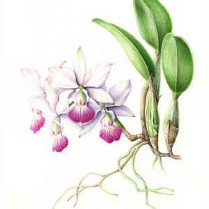 Tomoko Nakamoto produced this piece called Amethyst Dream, it is not the picture above but that is an example of her work. Knowing almost nothing about plants I don't know what an Amethyst dream but purple flowers are a popular choice and that is because they work so well as mentioned before. You can see in the picture above how she has contrasted purple with some of the rest of the flower and you get a real sense of a growing thing. 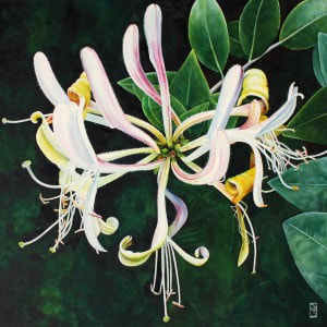 Almost all the paintings on display are plants on a white background. Occasionally you come across an exception and of these I think Julia Patience's Agapanthus was the best. You can see how it might work from the picture above. Rendering the plant this way allows you to make different stylistic choices but also if you are produce a picture of a mostly white flower it is often the only viable way. It also allows you to put it in context. The bright, solid colours are achieved by using watercolour and ink. 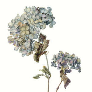 I did in the end buy something. I bought a picture of an Iris by Gael Sellwood, an example of her work is pictured above. What was interesting about the piece I bought was that the Iris was different from normal, it was towards the end of the bloom and done in soft purples and oranges, slightly raggedy at the edges. The picture above is quite a good example of the sort of end of bloom decay thing that I think she does really well. The picture is still there, adorned with a red dot, and I am looking forward to the end of the show when I pick it up. 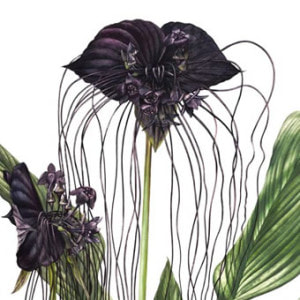 There is no doubt that one of the stars of the show is Billy Showell who is due to become president of the society next year. An example of her work is above. She had 5 pieces on display my favourite of which was the Black Pearl. She has won numerous prizes and you can see why. Not only are these extremely skillful with a depth of colour and a surity of line but the composition is excellent. The one above for example where the central flower is well framed in that v shape.
There were many more I could mention, mainly I have left them out because they are not on the society website but look out for Nessie Ramm, Doreen Taylor, Hwee Lee Debbie Teo and Heidi Venamore, all of them excellent. It is a very good show and I highly recommend it.
0 Comments
Leave a Reply. |
Archives
June 2024
Categories |
 RSS Feed