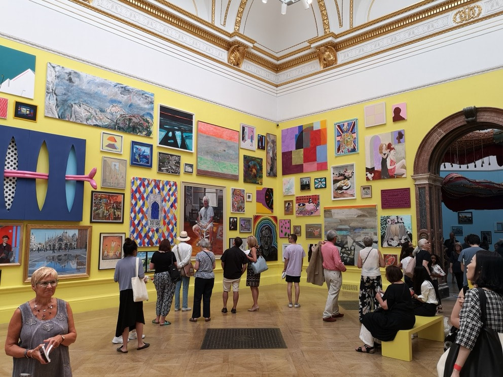
 Partly out of interest, partly out of duty, and partly to escape the sweltering heat I went to the Royal Academy summer exhibition. Its only on until 19th August so by the time this comes out you will only have one week left. It is as usual an assault on the senses, especially so the main room which had been painted an eye watering bright yellow. Overwhelming is one word. Horrendous was the way someone I know described it. After a while, though, especially as you progress your eye adjust and you begin to see things you like. This blog is about some of them and focuses on things that would fall under the general category of paintings.
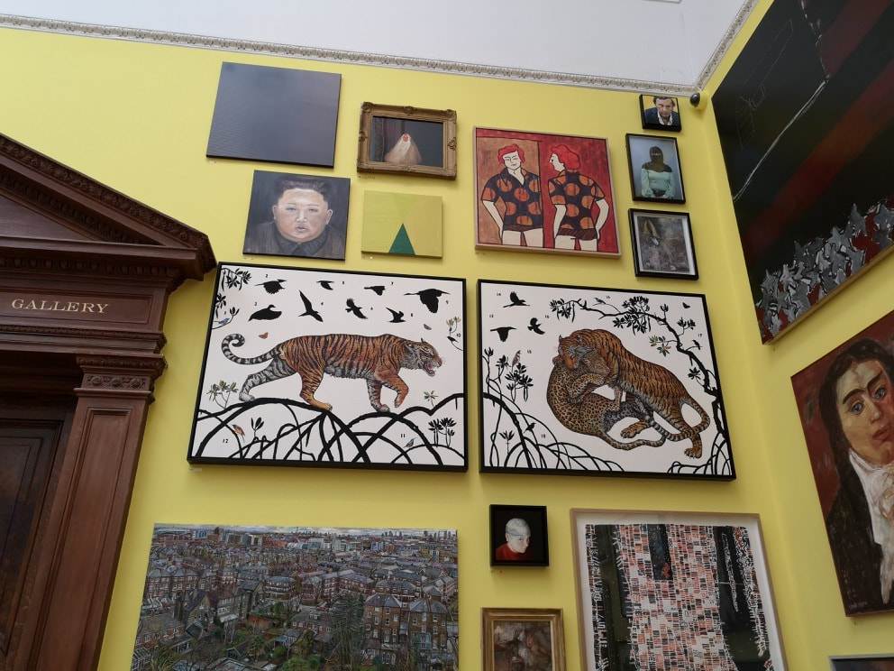
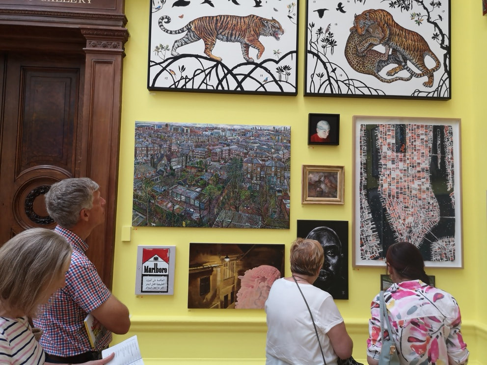
In this main room, amidst the panoply of paintings, I found four I liked, well five. The first one (well two) are the pair of animal paintings on the white background that you can see above left. They go together and are called a Tyger for William Blake by James Prosek. I love the dynamism of the subject matter and the way particularly in the right panel they are framed by that arching piece of foliage. Underneath, and in many ways opposite in style is Melissa Scott-Millers View of Islington from a Tenth Floor Window (above right). Densely packed with urban detail, which fills the canvas, leaving only a peeping skyline right at the top. The intricacy of it all causes you to stop stare, and pick out the details.
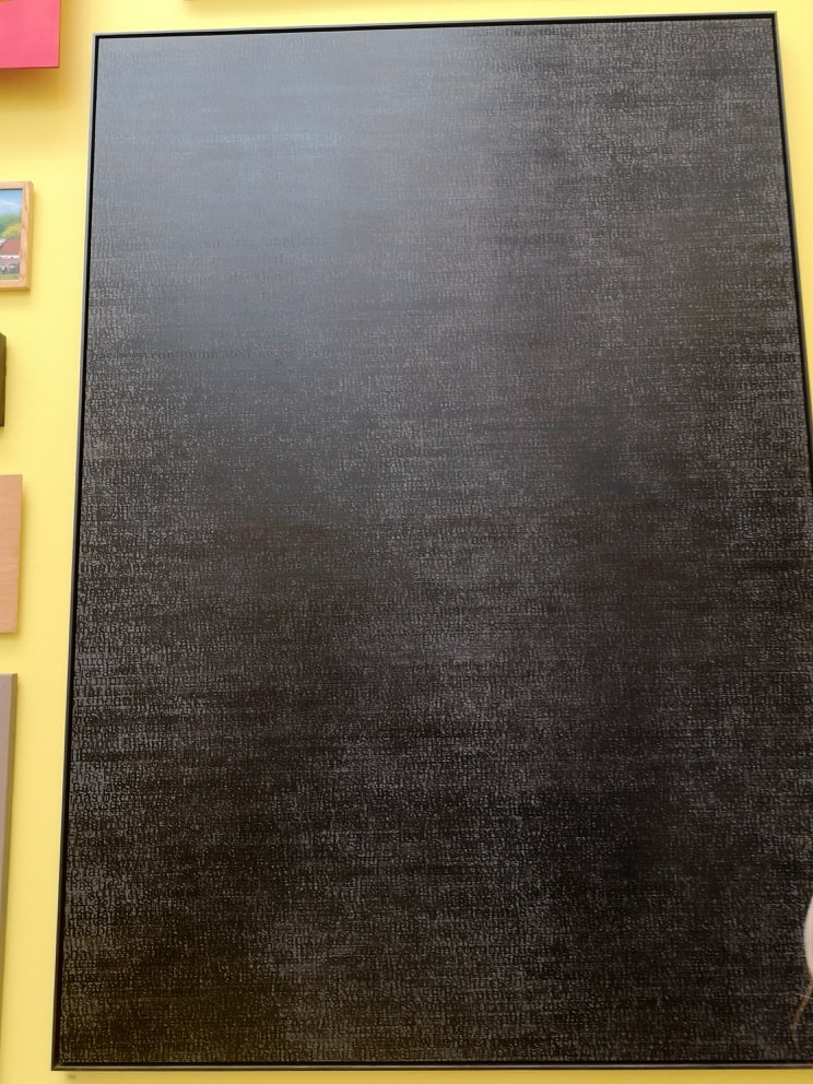
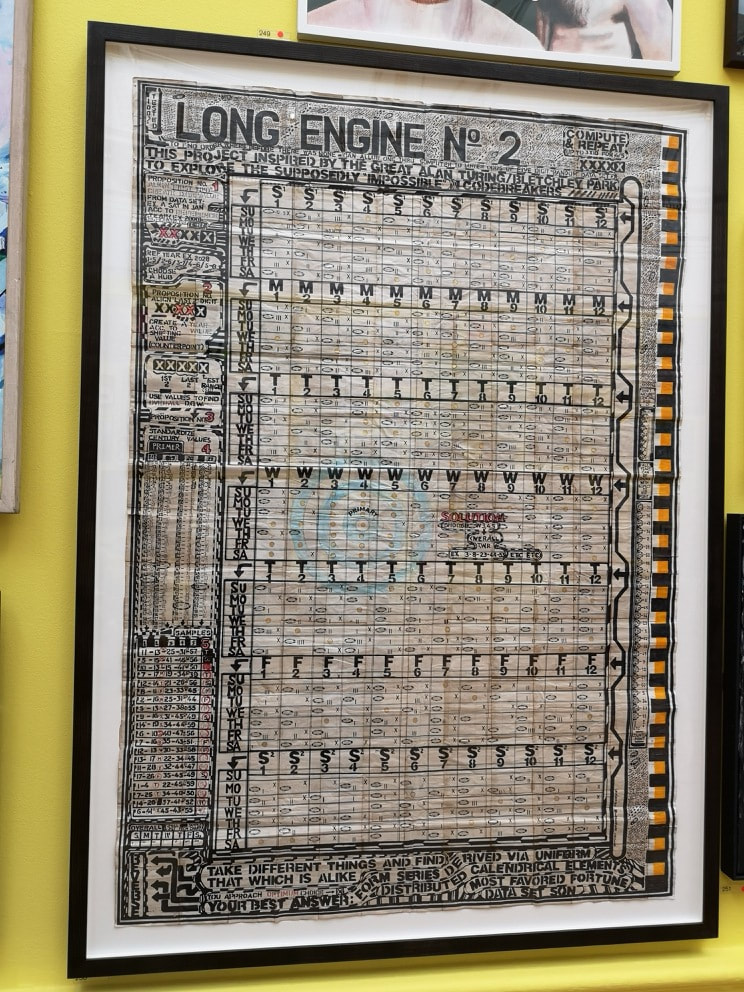
The solid black canvas was like an oasis of calm, a rest for the wearing eyes after the deluge of colour that is the rest of the room. Then you look closer and realise it is mottled in different shades of black. Then you look closer still and realise it is letters. It has the rather pretentious title of The Pain of Others (No3) and is by Idris Khan. I am prepared to overlook this because of its other qualities. The code like diagram on the right is called Long Engine No.2 by George Widener. It is I believe inspired by Babbage's difference engine. Superbly complex pseudo science art has long held an appeal to me, arrows, and columns and often meaningless jumbles of letters. Is this in fact a calendar? The odd splashes of colour like the orange down the right hand side make it somehow more human. 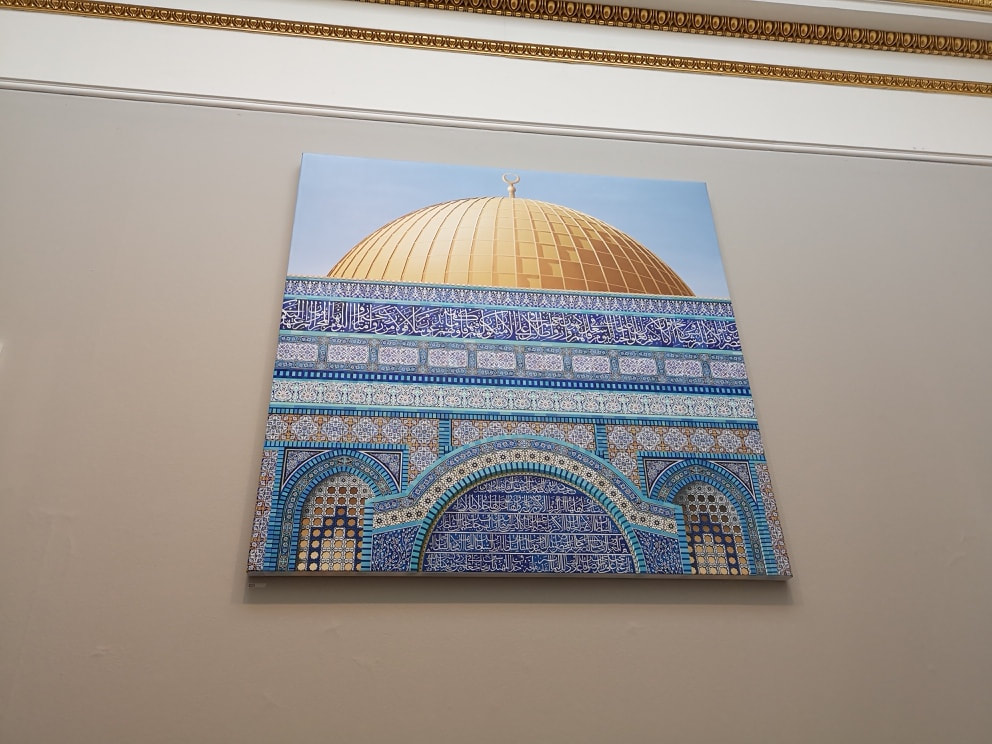 Dominating the next room was this almost photo realist piece called Dome of the Rock Facade by Ben Johnson (above). Again a masterpiece in intricate detail, showing off those elegant turquoise tiles. It made me want to go and see the original. It was a good idea to include the golden dome at the top as it makes for a nice contrast, and I like the way Johnson has captured the shadow on it. My favourite feature though are the two inset arches, which are possibly windows, either side of the main arch. 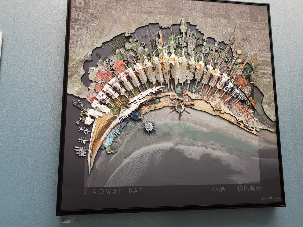 The best room in the whole show for me was the Architecture room. I shall talk more about that next week when I deal with sculpture and architecture, however I thought I would include one piece from there in this blog which is the above, Xiaowan Bay, China by Laurie Chetwood. I love the sweeping curve of the bay and the way it is overlaid with these feather type objects, and the strange gem like roundals on the sea front, jutting out into the sea and morphing like some organic lichen. Then behind the white feathers it gets more mechanical, resembling a circuit board.
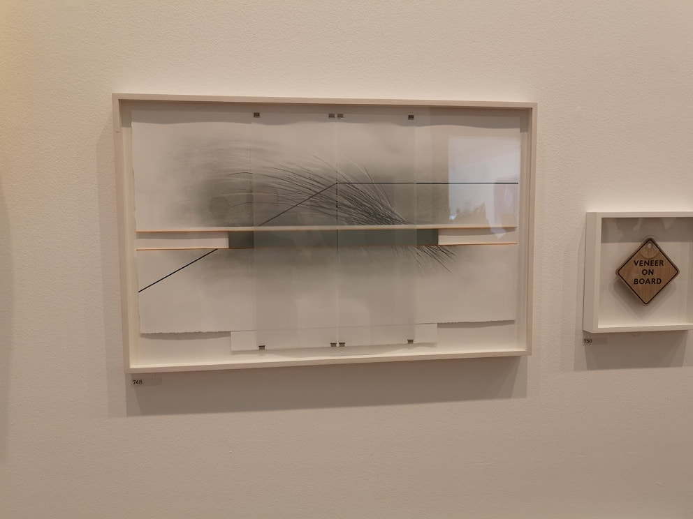
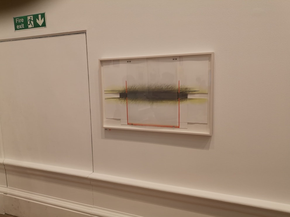
Skipping over the mediocre horrors of room VII (we started in room III), we land in the more relaxed environment of room VIII. Here we get established professional artists, who had exhibited by invitation. Better quality of work, well on the whole yes, but more importantly the work was given more room and space to breathe, making it easier to look at. Two works by the same artists, Ann Christopher, attracted me. Called respectively Flowing lines -3 (above left) and Flowing Lines 5 (above right). These don't come across well photographed, and it is not easy to capture their slightly opaque coolness, There is as you can probably see a depth to them , with sharp geometric shapes overlaying charcoal shading. This room will appear more next week, when I talk about "sculpture".
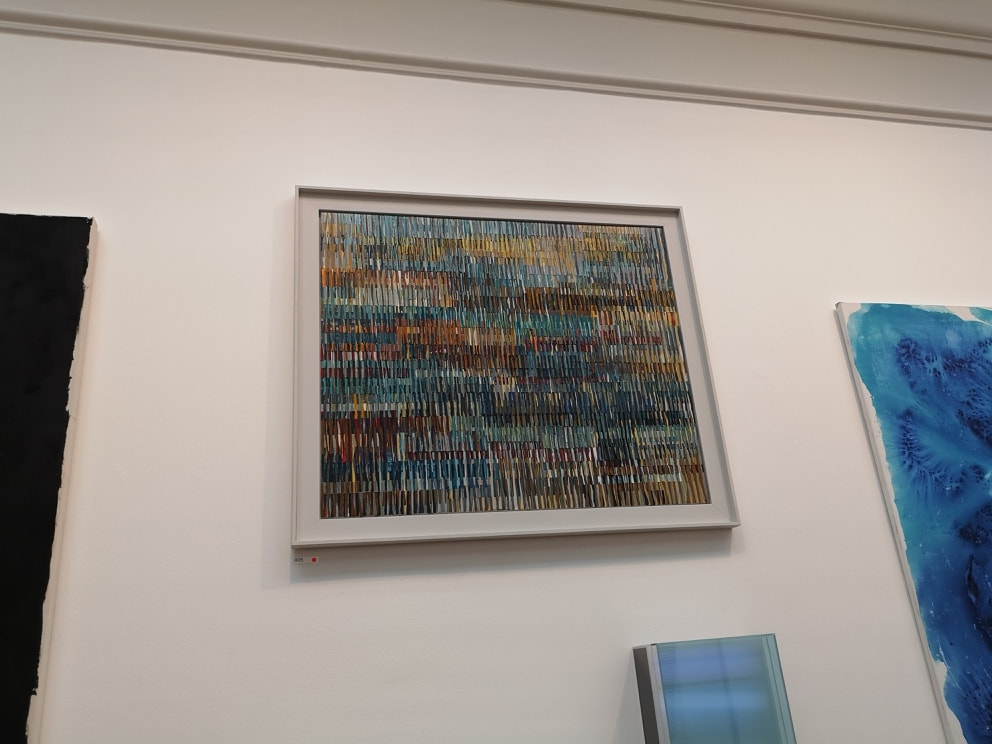
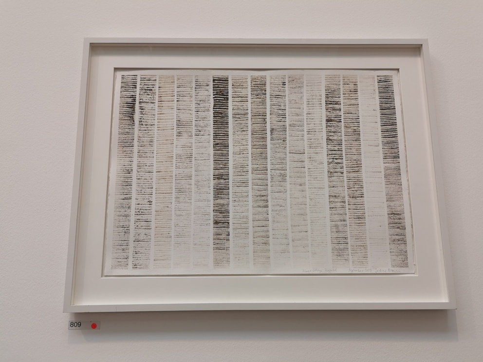
The perennial problem of this show is the hanging of the pictures, with works spread out to the ceiling making them difficult to view and, in a crowded room, to photograph except from a jaunty unhelpful angle. So apologies to Mark Habrisrittinger (above left) whose multicolured, pixelated piece is not shown to better effect. It is nice to look at though, and after a while you begin to see/imagine patterns in the colour. Is it a crowd of people? Completely different is Kings College Hospital by Jackie Brown (above right), the soothing, fading columns in fact made up of dirt. You see if you are going to use statement materials they you also have to produce something worthwhile with them. I like this, It puts me in mind of a forest of regular pine trees.
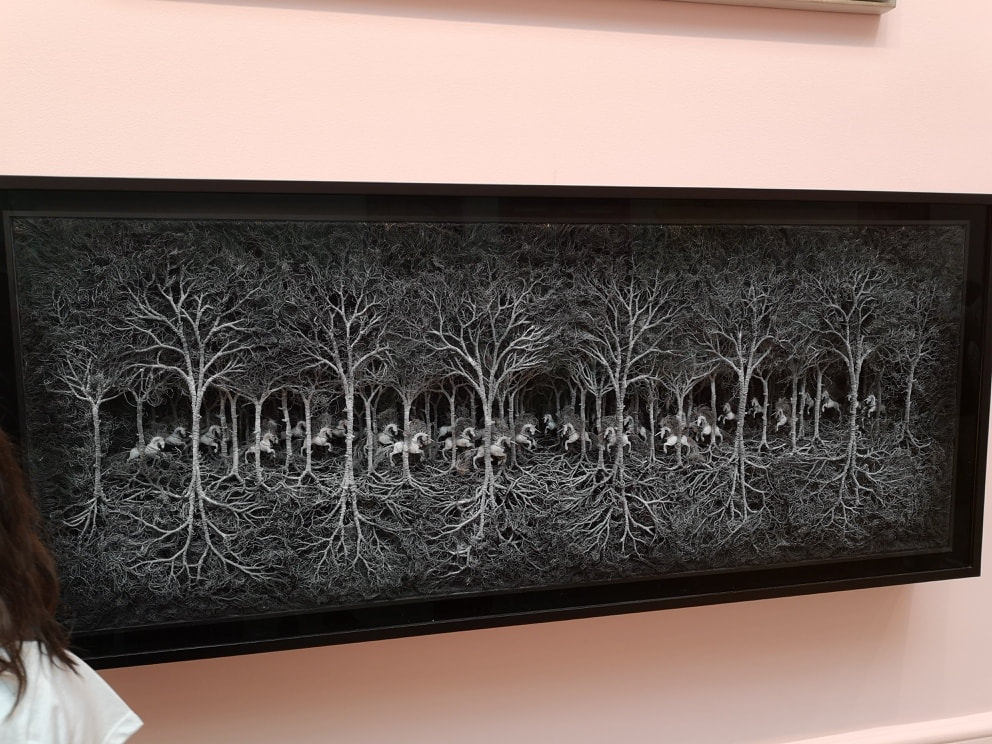
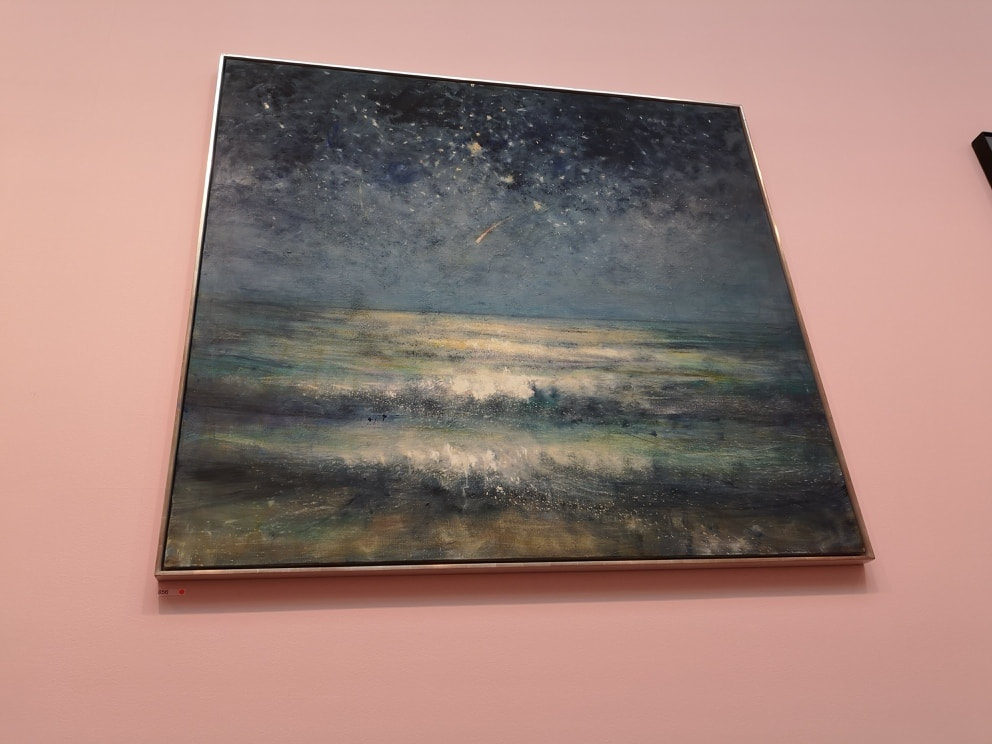
The Lecture Room, or the room of monumental paintings, or the room of two enormous indifferent Hockney's is next up. Here we have BIG works, mostly by RAs. Refuge (above left) by Cathy de Monchaux. Made from cooper wire it is a 3d depiction of unicorns trampling through a wood. I like the way you have the roots, as well as the canopy. Next to it, all dreamy seas and starry skies, is an old favourite of mine by Bill Jacklin. His paintings have a nice mesmeric quality to them, all soft focus and dreamlike. This one (above right) is called Shooting star.
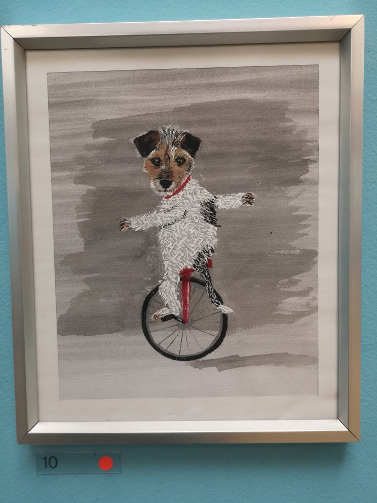 Finally we reach the point where in fact you enter the show, the Central Hall. This is dominated by a hanging thing I shall talk about next week. Of the paintings on the wall, I only liked the above, the extremely charming dog on a unicycle. It is called Peggy and is by Les Deacon, and at £150 I imagine sold straight away. It is well done and amusing, and sets the tone very nicely for what you are about to see.
No doubt there will be others that deserve to be in this blog. The deluge of visual information though, makes it difficult to pick them out. Next week, architecture and sculpture.
0 Comments
Leave a Reply. |
Archives
June 2024
Categories |
 RSS Feed