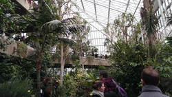
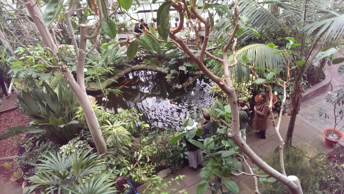
The Barbican is a weird building and every time I go there I am exposed to more of its strangeness. It reminds me of the tower block described in Broken Homes. This time I went to see the Turning Earth. The exhibition was housed in two small halls, just off the two storey conservatory that for reasons that no doubt make sense to someone, occupies the 3rd and 4th floor of Barbican Floor. It is a strange place, a combination of brutalist architecture, swathed with exotic tropical plants, ponds and fish. You feel a bit like you are on the set of Logans Run
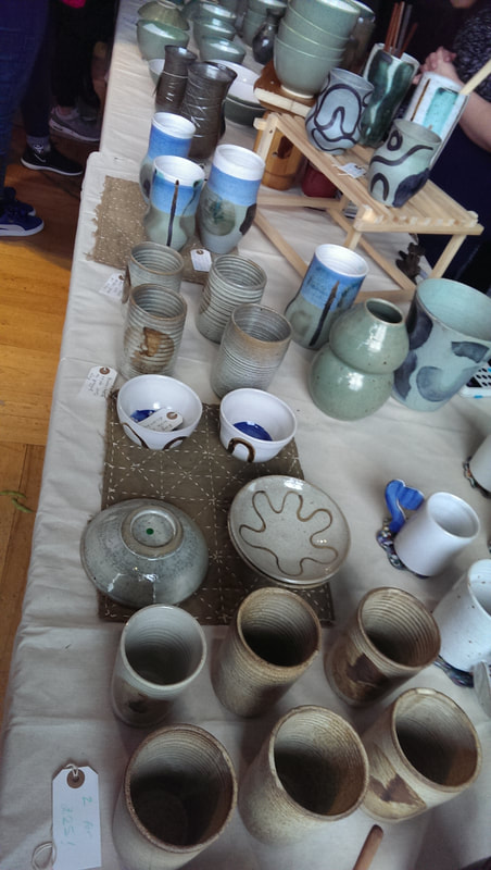
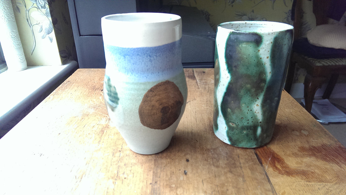
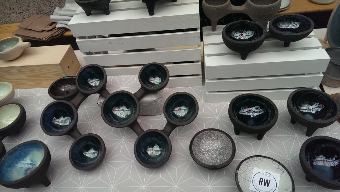
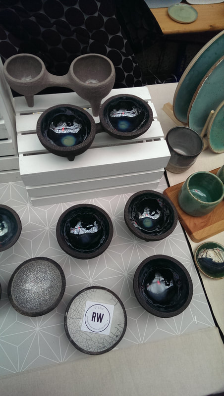
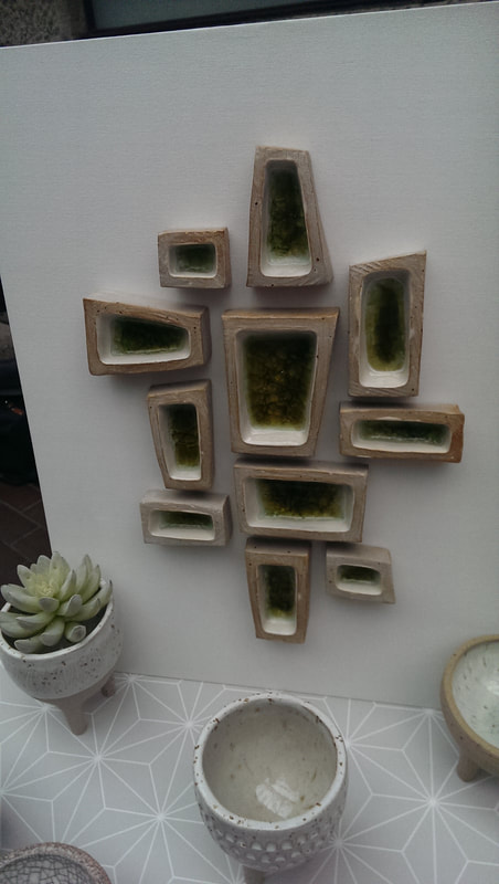
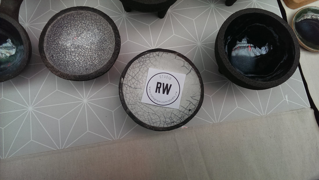
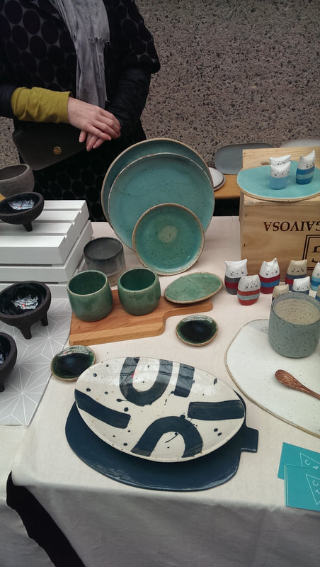
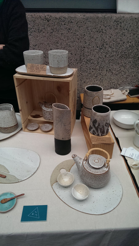
Indeed it was quite a high quality show all round. Here is a trot through some of my favourites. I also came away with a small tripod pot from RW pottery (above). She has a good combination of gnarly rough iron like outside and a smooth lustrous interior. There was a very interesting version of this with several such pots, joined together to form a sort of hexagonal shape. Mixing the styles up a bit there is also a series of small amber filled rectangles, like a minimalist bee hive. 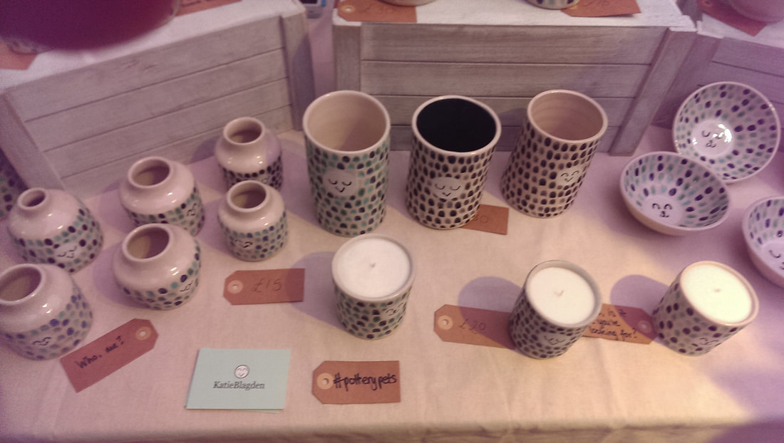 Katie Blagden has a sort of cat animal thing going on. Little smiley faces appears on lots of her works. It is mainly white with dimples of lustrous blues and turquoise. The contrast between the two is effective and of course they have a nice tactile quality. 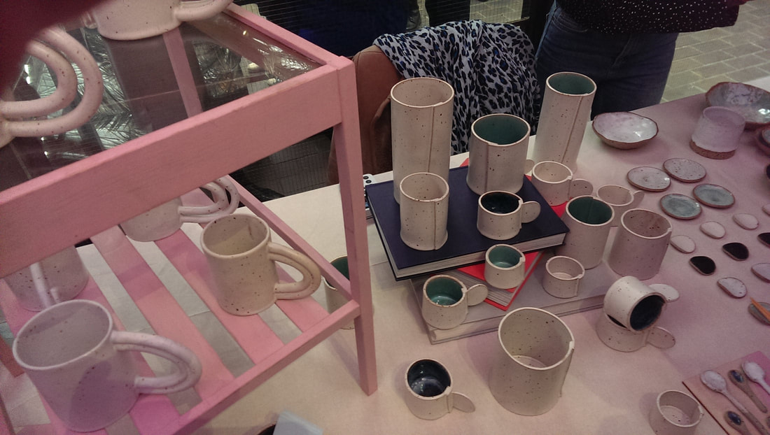 Miyelle Ceramics does a smooth white/beige exterior, spotted with brown flecks. With the tall vases and the cups, the surface wraps around over itself, so you get a lip or edge up the side, that attracts the eye. The best ones are with the striking blue interiors. Blue can be very effective in pottery and appeals to me considerably.  L’Atelier M (above) has gone for well wrought simplicity, with beige or black interior against a white exterior. The designs seem quite simple, but are slightly misshapen (in a deliberate way) which give them a unique charm. I liked the small plates in the wooden shelves the best, particularly the one where the blue intersects the white. 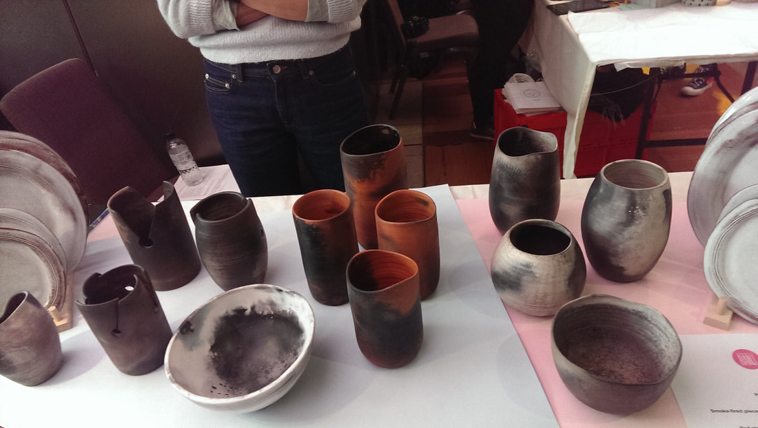 Studio Ran J (above) does this burnt effect, solid looking pottery. They look a bit earthenware but are in fact pottery or porcelain. My favourites are the orange and black flamed pots, and the cups with the slits and circles cut through them. I had already exhausted my budget so sadly could not take either of these. 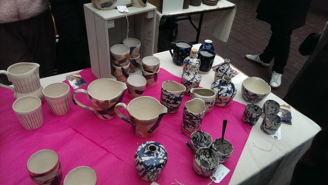 Sally Dawson has a slightly Jackson Pollock (above) thing going on with colours splattered, although in a controlled and pleasing fashion. I particularly like the cups under the wooden stands. They had a good tactile quality and I like the way the yellows and the blue swathes of colour interact.
Glazeycat Ceramics has, as the name might suggests small pottery cat creatures that are very sweet, but it is the turquoise glazed plates that I thought were particularly good and her crazed cracked folded vase. 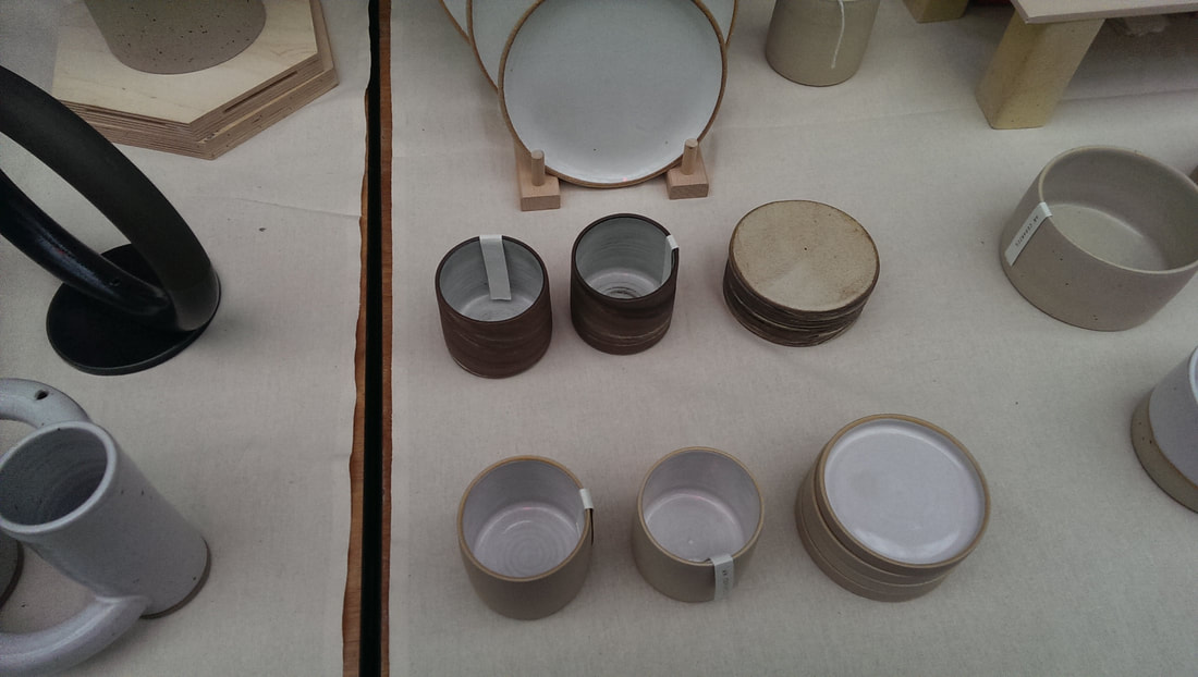 Diana Ng produces these solid, well shaped classic Japanese style mugs, with a signature stamped into the base. 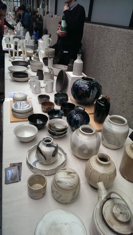 Guy Brain Ceramics has an elegant range of dark blue lustrous vases (above) which really shout out of you from the stand. 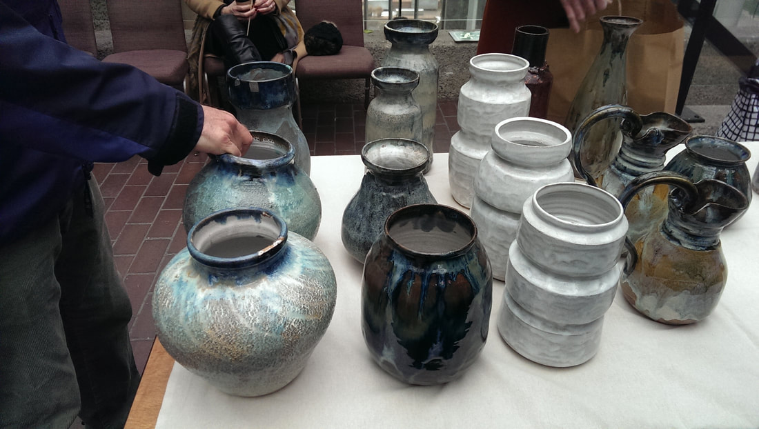 Then Ryan Barret, who has gone for size and heft. Done it quite well. In other exciting news I have a solo show of paintings of the RIver Lee (below) starting at the Indo bar for the whole of April. It starts on Wednesday 4th April with a opening night party from 7 - 11pm. Feel free to attend. 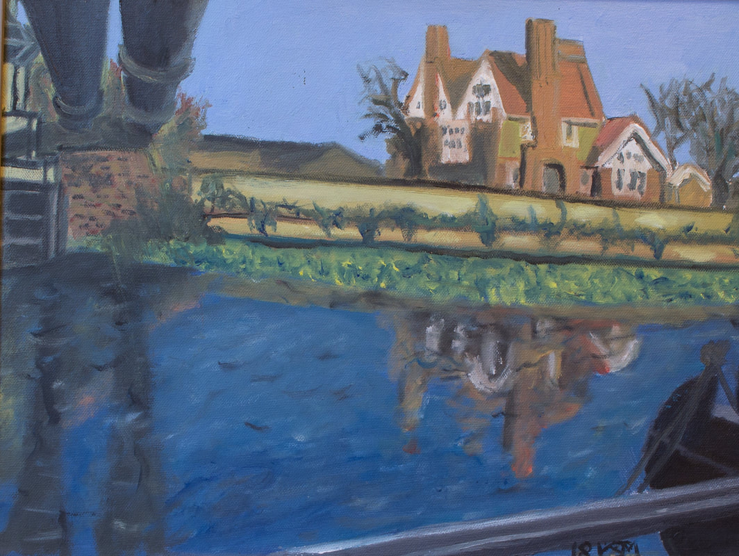
0 Comments
Leave a Reply. |
Archives
June 2024
Categories |
 RSS Feed