 Let us be Frank for a few minutes. Frank Bowling has a picture in the RA. He has a major retrospective of his work at the Tate. He is one of Britain's prominent internationally renowned artists. He is still alive and painting at the age of 83. His work sells for a fortune. Yet not many people have heard of him and the show of his work at Tate Britain got precious little advertisement or promotion. I got given Tate membership for my 40th and it came with a list of current shows. This one wasn't on it. Bowling is also black. It is difficult not to be suspicious and see a link between these two facts. If I was that Tate I would be making a very big deal of this. The show is on until 26th August and you should totally go. Don't worry the show won't be busy. It will be good though as I shall hopefully now demonstrate.
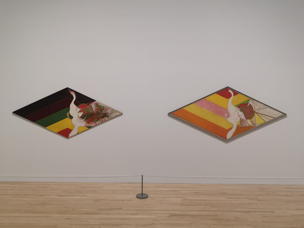
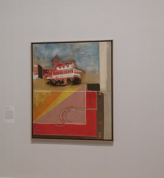
It is the motif on the right that I particularly like with that flower like structure that has a whirlpool quality that draws you into the piece. Although there were nods and similar stylistic points to other artists I had never seen anything quite like these before. Quickly though you are into the next room and Bowling has developed a more singular style and iconography. He has Ghanaian roots and the family home there (depicted above right) and Ghanaian elements features quite heavily. There is a very neat combination of abstraction and figurative elements in these paintings, and again this high colour quality.
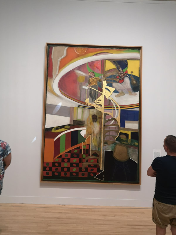
In the same room is one of the stars of the early part of the show and possibly my favourite painting of the whole thing. It shows a spiral staircase descending into a kitchen. It is a strangely familiar image and I do wonder if I had seen this painting somewhere before. The rails of the painting are highlighted in gold, the perspective distorted and the figures Baconesque and clownish. It is a powerful image.
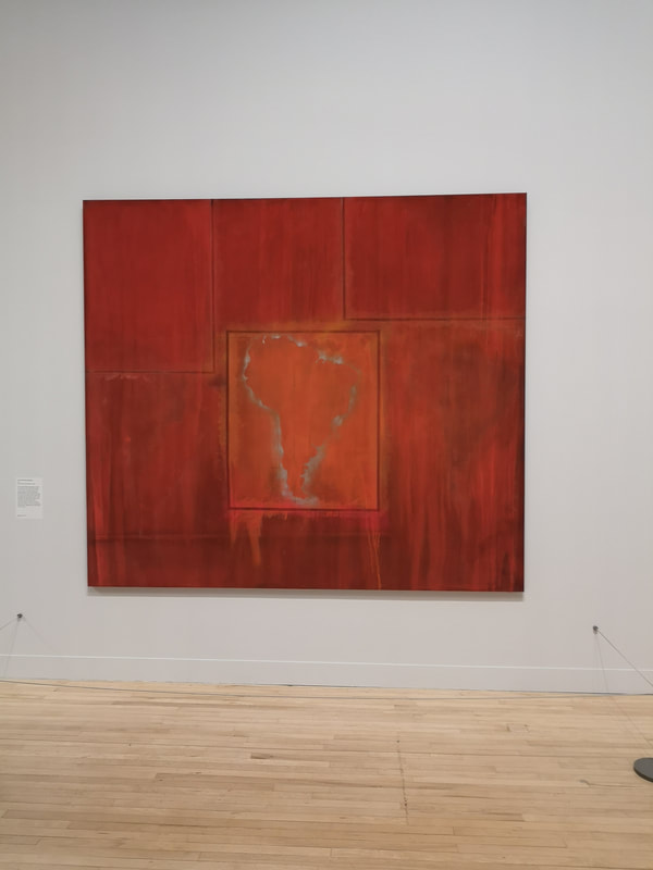
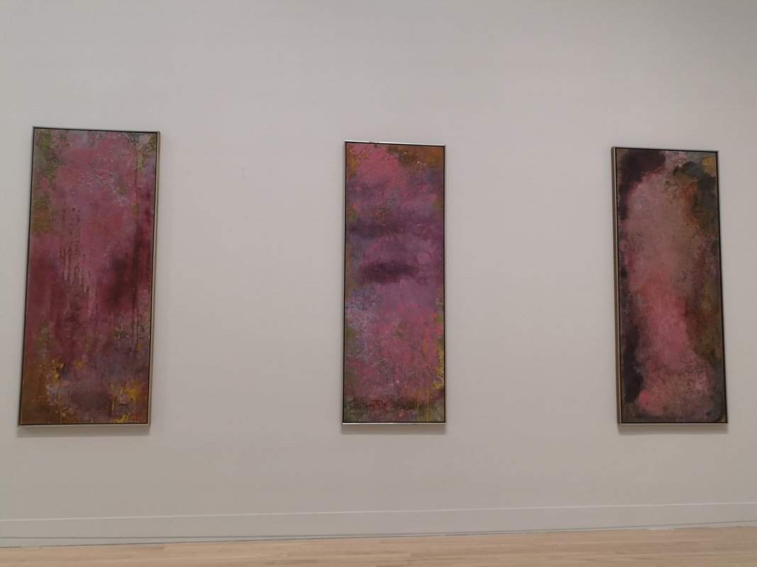
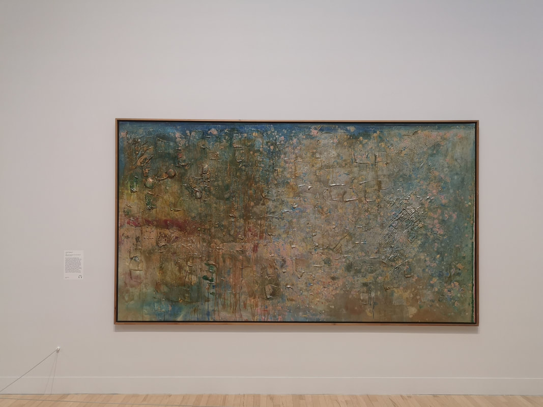
From here on in things get a bit more abstract, although the high degree of colour remains, for the most part. The first expression of this abstraction, is a room of maps, swathed in different colour or mixes of colour, visually violent images often and the Africa drenched in red I am sure has another message 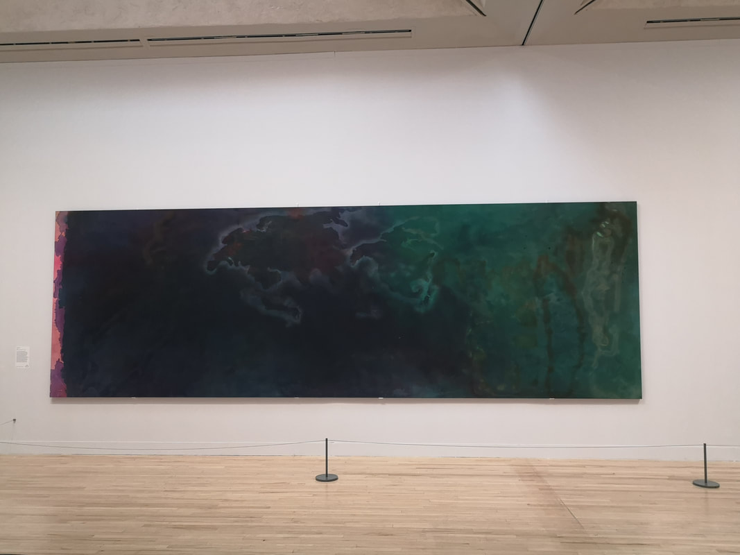 For me the more successful ones are the more sombre ones such as the one above, a vast canvas with eh earth merging from dark green in blue and almost black. It is like those images you see of the earth rotating from light into darkness. The one purple line at the end makes it look like an old fashioned photo negative. The deep colour gives it a aquatic more soulful feeling that I respond to.
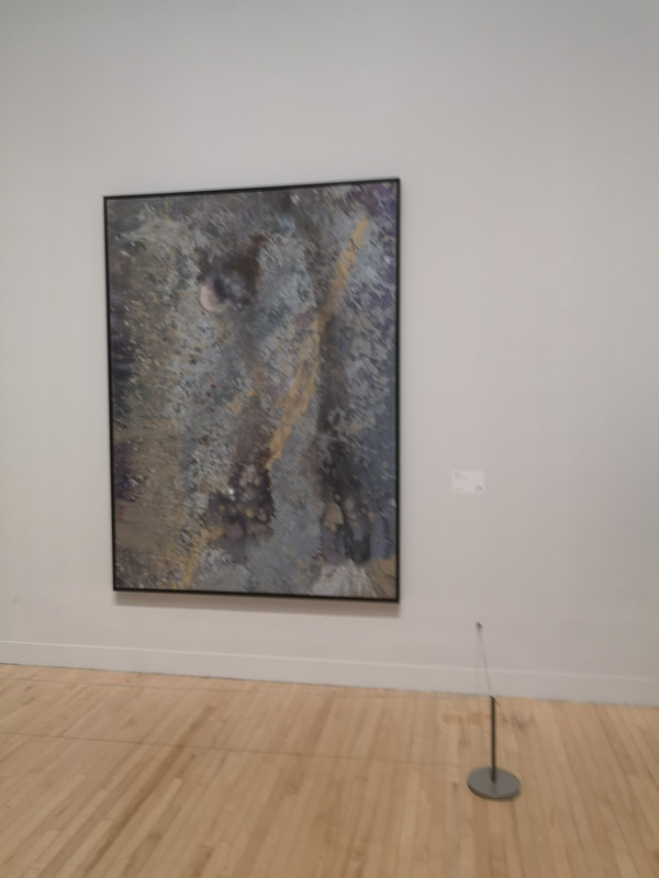
Similar tonally, do a me tonally, well similar in feel is a mainly gray piece (above right). It feels like a close up of the moon. A mottled grey field, with pits and ridges and that broken swathe of orange arcing across the picture lifts the picture and give the grey more depth. It is possibly my favourite piece in the show, I love seeing more details and imagining it is a different thing. This was also my favourite room in the show.
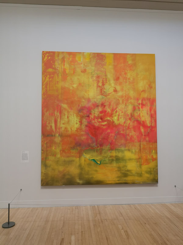
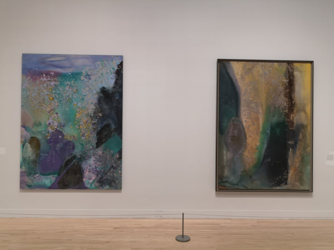
This develops into a theme called cosmic space. It has the flowing current feel to it. And of course like all good abstract art you see what may or may not be there. So the one the left seems to me to be a wave exploding over rocks, with that golden spray, and the one on the right looks like a stream of muddy water flowing into the water. Then Bowling gets all lumpy. A bit like Auerbach or a more cheerful Kiefer. Indeed if you pop back to my previous post or along to the Summer Exhibition you will see a very recent example. For me though, as interesting these one are, they are mainly only intellectually interesting. I like the colours but the ridges, as we Auerbach act as a barrier for me and stops me engaging.
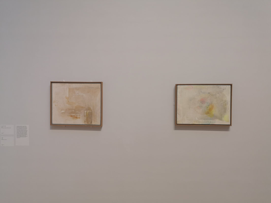
This develops into two themes, at least two groups that the show puts them in and it seems to work. One is land and the other, and the one I prefer is water and light. Again, and this probably tells you more about me than the painting I prefer the water and light section of which the above left is an example. I like the subtle blue and greens. Again the lumps are not as intrusive. Onto the next room and in this room, lots of colour, lots of lumps but for me the two best paintings of the room were these two pale, very indistinct paintings in the corner of the room. Just white and cream and soft yellow washed over each other.
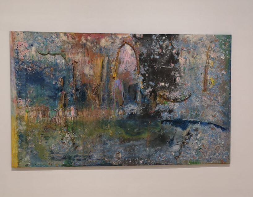
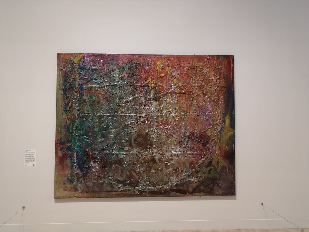
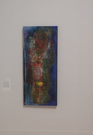
Those lines in the middle really work. They are like scratches through the painting exposing something underneath. Beguiling isn't it. The other (above left) is a mess of blue, red, yellow, white etc, but that reductive description completely undersells this column of paint. The dark blue surrounding the colours gives that center piece a three dimensional feel, like a swirling portal.
Its a great show. It is open for another couple of weeks. Go along. See a less sung British great.
0 Comments
Leave a Reply. |
Archives
June 2024
Categories |
 RSS Feed